
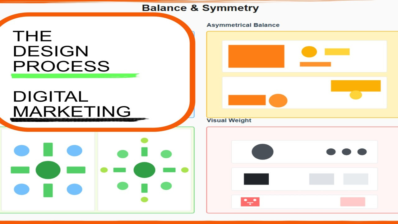
Putting Ads Together, Creating Ads with Systematic Excellence
Creating Ads with Systematic Excellence

A promising startup founder showed me their new ad campaign. The designer had clearly studied design principles. The visual hierarchy was textbook perfect. The golden ratio governed every proportion. The grid system was immaculate. The color theory was sophisticated. The typography was chef’s-kiss beautiful.
The ad bombed completely.
Why? Because the designer had applied each principle in isolation, creating seven perfect elements that fought each other for attention. The color scheme undermined the hierarchy. The grid system strangled the composition. The typography competed with the imagery. Perfect execution of individual rules produced collective chaos.
They redesigned with integration as the priority. Each principle still mattered, but now served the others. The hierarchy dictated color contrast. The grid enabled composition. The typography enhanced imagery. The mathematical ratios created harmony across all elements.
Response rates jumped 8× overnight. Same principles, completely different results.
This is the difference between knowing design rules and mastering how they work together systematically.
Today we’re exploring Part 8 of The Complete Ad Design Guidebook: Putting It All Together—understanding not just individual principles in isolation, but how they integrate into a cohesive system producing ads that actually work.
The Integration Problem Nobody Warns You About
You’ve studied visual hierarchy. You understand color theory. You’ve mastered typography. You know grid systems, mathematical ratios, composition techniques, and image-to-text balance.
Congratulations. You now face the problem that defeats most designers: applying all of these simultaneously without creating contradictory chaos.
The Reality Check:
Individual Principle Mastery ≠ Integrated Design Excellence
Knowing seven principles doesn’t automatically translate to implementing them together coherently. Each principle makes demands. Each has ideal applications. And sometimes those ideals directly conflict.
The Common Mistakes:
Mistake #1: Sequential Addition Designer applies hierarchy, then adds color, then adds typography, then realizes the grid won’t accommodate what they’ve already created. Result: Forced compromises undermining earlier decisions.
Mistake #2: Favorite Principle Dominance Designer loves typography, so every decision prioritizes type at the expense of hierarchy, composition, and color strategy. Result: Beautiful typography, ineffective advertising.
Mistake #3: Equal Treatment Paralysis Designer tries giving equal attention to every principle, creating bland designs that excel at nothing because everything gets watered down. Result: Technically correct, completely forgettable.
Mistake #4: Random Application Designer applies whichever principle comes to mind first for each element, with no overarching integration strategy. Result: Inconsistent, amateur-looking work despite understanding individual concepts.
The solution isn’t trying harder at individual principles. It’s understanding the hierarchy of principles themselves—which ones drive decisions first, and which ones serve supporting roles.
The Design Decision Sequence That Actually Works
Great design isn’t about applying all principles simultaneously. It’s about applying them in the right order, letting each inform the next.
Phase 1: Foundation (Visual Hierarchy)
Before touching colors, fonts, or grids, answer one question: What matters most?
Your visual hierarchy isn’t just another principle to consider—it’s the foundation every other decision builds upon.
The Critical Questions:
What is the single most important element a viewer must see?
What comes second in importance? Third? Fourth?
What can be eliminated entirely without losing effectiveness?
How quickly must viewers grasp the core message?
Once you’ve established hierarchy, you’ve created the organizing principle for every subsequent decision.
The Hierarchy Test: Show your concept to someone for 2 seconds. What did they see first? Second? Third? If the answer doesn’t match your intended hierarchy, nothing else matters.
Every other principle now exists to serve and reinforce this hierarchy.
Phase 2: Structure (Mathematical Ratios and Grids)
With hierarchy established, impose mathematical structure creating harmonious relationships between elements.
Mathematical Ratios Define Proportions:
Your dominant element (hierarchy level 1) might occupy the golden ratio’s larger segment (approximately 62% of available space).
Secondary elements (hierarchy level 2) get the smaller segment (approximately 38%).
Tertiary elements use proportions derived from these primary relationships.
This isn’t arbitrary—it creates visual satisfaction viewers feel unconsciously. The proportions “feel right” even when viewers can’t articulate why.
Grids Provide Placement Framework:
Now that you know what matters and how much space each element deserves, grids tell you where to place them.
A simple column-based grid might work for straightforward messaging. A modular grid handles more complex information architecture. A manuscript grid serves text-heavy approaches.
The grid system you choose depends entirely on your established hierarchy and proportional decisions.
The Critical Integration: Ratios determine size relationships. Grids determine spatial relationships. Together they create structure serving your hierarchy rather than fighting it.
Phase 3: Attention Direction (Color Strategy)
Color’s primary job isn’t beauty—it’s reinforcing hierarchy through contrast and directing attention strategically.
Color Serves Hierarchy:
Your most important element (top of hierarchy) needs maximum contrast with its surroundings. This might mean vibrant color against muted background, or stark black against white—whatever creates strongest differentiation.
Secondary elements use less dramatic contrast. They’re visible, but don’t compete with your primary element.
Tertiary elements blend more with the background, present but not demanding attention.
The 60-30-10 Rule Becomes Strategic:
60% dominant color (usually background/supporting color) creates environment 30% secondary color supports without competing 10% accent color highlights your hierarchy’s apex (usually the CTA or primary message)
This isn’t arbitrary aesthetics—it’s mathematical attention engineering.
Color Psychology Reinforces Message:
Now that color contrast serves your hierarchy, specific color choices communicate emotional associations supporting your message.
Financial stability? Blues and grays reinforce trust. Urgent action? Reds and oranges create energy. Premium positioning? Black, white, and gold signal luxury.
But psychology always defers to hierarchy. A beautiful color scheme that undermines your visual hierarchy is worse than ugly colors that reinforce it.
Phase 4: Information Delivery (Typography)
With hierarchy established, structure imposed, and color directing attention, typography makes your information actually consumable.
Type Hierarchy Mirrors Visual Hierarchy:
Headline (hierarchy level 1): Largest, boldest, maximum contrast Subhead (hierarchy level 2): Smaller, medium weight, supports headline Body copy (hierarchy level 3): Smallest, lightest, provides detail CTA text: Size varies by importance, but always maximum contrast
Font Selection Serves Function First:
Readability trumps personality. Always. Beautiful typography that can’t be read comfortably is failed typography.
Display fonts grab attention for headlines but become illegible in body copy. Sans-serif fonts ensure clarity for most digital applications. Serif fonts work beautifully for print body copy and formal messaging.
Spacing Creates Hierarchy:
Generous spacing around important elements makes them feel important. Tighter spacing groups related information visually. Line spacing ensures comfortable reading without conscious effort.
The Integration Point: Your typography doesn’t exist to look pretty. It exists to make information hierarchy visible and consumable instantly.
Phase 5: Visual Flow (Composition)
Now that elements are sized, positioned, colored, and typeset, composition techniques direct viewers through your ad in the sequence you’ve designed.
Common Composition Patterns:
Z-Pattern: For ads with horizontal orientation. Eye enters top-left, sweeps right to top-right, diagonally down to bottom-left, then right to bottom-right. Place elements along this natural path.
F-Pattern: For text-heavy vertical layouts. Eye scans top, drops down left side, makes horizontal sweeps for important information. Structure content for this reading pattern.
Golden Triangle: For dynamic, asymmetric layouts. Creates energy and movement while maintaining sophisticated balance.
Leading Lines and Directional Cues:
Physical lines (actual lines in design) guide eyes toward important elements. Implied lines (created by element alignment or gaze direction) subtly direct attention. Negative space (intentional emptiness) creates pathways for eye movement.
The Integration: Composition isn’t about making things look balanced (though that happens). It’s about controlling the sequence viewers experience your carefully crafted hierarchy.
Phase 6: Balance Point (Image-to-Text Ratio)
Finally, calibrate the balance between visual and verbal communication based on your specific context.
The 70/30 Starting Point:
For most advertising, 70% imagery and 30% text creates effective balance. Visuals capture attention, text provides necessary information.
But this isn’t a rule—it’s a starting point that gets adjusted based on:
Product Complexity: Simple products (beverage, fashion): 80/20 or even 90/10 visual-heavy works beautifully. Complex products (software, B2B services): 50/50 or even 40/60 may be necessary for adequate explanation.
Audience Sophistication: Familiar audiences need less explanation—visual emphasis works. New audiences require more context—text becomes more prominent.
Campaign Objective: Brand awareness: Visual-heavy (recognition matters most). Direct response: More text (information drives action). Education: Text-heavy (understanding is prerequisite for conversion).
The Critical Integration: This ratio isn’t decided in isolation. It’s the final calibration after all other principles are working together harmoniously.
The Real-World Application: Three Scenarios
Let’s see how this integrated approach works across different advertising contexts.
Scenario 1: Premium Fitness App Launch (Social Media)
Foundation (Hierarchy):
Transformation image (before/after or athlete in action)
Transformation promise headline (”Transform in 30 Days”)
App interface preview
CTA button (”Start Free Trial”)
Structure (Ratios & Grids): Golden ratio split: 62% image, 38% text/interface. 6-column grid: Image spans 4 columns, text elements align to remaining 2. 8-point spacing system ensures consistent gaps between elements.
Attention Direction (Color): Background: Vibrant gradient (orange to red—energy, transformation). 60% of space, creates emotional environment. Dominant color provides backdrop reinforcing energetic brand personality.
Body text: Clean white (maximum contrast with colored background). 30% of visual attention, supports headline without competing.
CTA button: Complementary cyan (stands out dramatically against warm gradient). 10% of space but commands disproportionate attention through color contrast.
Information Delivery (Typography): Headline: Bold geometric sans-serif, 48pt (impact, modernity). App preview labels: Light weight same family, 18pt (consistency, readability). CTA text: Medium weight, 24pt (confident, clear). Single font family with weight variations creates unity without monotony.
Visual Flow (Composition): Main image: Athlete facing inward toward headline (directing attention). Headline positioned at natural Z-pattern reading point. App interface preview: Positioned at eye flow’s next natural stop. CTA button: Terminal position in Z-pattern flow.
Balance (Image-to-Text): 70/30 split: Image dominates appropriately (fitness is inherently visual). Transformation is shown (image) then explained (headline) then enabled (CTA).
The Result: Every principle reinforces every other principle. The hierarchy dictated proportions. Proportions informed color strategy. Color reinforced hierarchy. Typography made hierarchy scannable. Composition directed viewers through intended sequence. Image-to-text ratio matched campaign objective.
Nothing conflicts. Everything cooperates. That’s integration.
Scenario 2: B2B Software Ad (LinkedIn)
Foundation (Hierarchy):
Results-oriented headline (”Reduce Support Tickets 47%”)
Dashboard visualization (proof/credibility)
Three key features (bullet points)
CTA (”See the Platform”)
Structure (Ratios & Grids): Root 2 rectangle (√2:1 ratio): Professional, technical feeling. 8-column grid: Headline spans full width, dashboard image occupies 5 columns, features sidebar uses 3 columns. Mathematical structure creates sophisticated layout matching enterprise audience expectations.
Attention Direction (Color): Background: Professional navy blue (60%—trust, stability, corporate credibility). Dashboard visualization: Full color preserved (30%—showing actual product interface). CTA button: Vibrant green (10%—action, growth, positive change).
Color psychology reinforces enterprise positioning while making CTA unmissable.
Information Delivery (Typography): Headline: Bold sans-serif, 36pt, white text (clarity, impact). Feature bullets: Regular weight, 16pt, light blue text (readable, secondary). CTA: Medium weight, 20pt, white text on green (clear action prompt).
Professional typography communicates seriousness appropriate for business decision-makers spending significant budget.
Visual Flow (Composition): F-pattern structure: Headline at top (horizontal scan 1), dashboard image left-aligned (vertical scan down), features sidebar (horizontal scan 2), CTA bottom-right (terminal point).
Matches how business audiences actually consume information—scanning for relevance before committing to details.
Balance (Image-to-Text): 50/50 split: Dashboard image proves capability, but text provides necessary context for complex B2B purchase decision.
Technical audiences need information—pure visual approach would feel superficial.
The Result: Every principle serves the enterprise audience and complex product context. Nothing feels consumer-y or oversimplified. The integration creates credibility essential for B2B conversion.
Scenario 3: Local Restaurant Weekend Special (Instagram Story)
Foundation (Hierarchy):
Food photography (appetite appeal)
Offer headline (”Weekend Brunch Special”)
Price point (”$18”)
Time urgency (”This Weekend Only”)
Structure (Ratios & Grids): Vertical 9:16 Instagram Story format demands different approach. Golden spiral composition: Food image follows spiral for natural eye flow. Simple 4-row grid ensures text elements don’t overlap safe zones or get cropped.
Attention Direction (Color): Food image: Full saturation, warm tones dominate naturally (60%—appetite appeal). Background: Soft complementary blue-gray (30%—makes warm food tones pop without competing). Price callout: Bright yellow highlight (10%—creates urgency, focuses attention on value).
Information Delivery (Typography): Headline: Casual handwritten-style font, 28pt (approachable, friendly, weekend vibe). Price: Bold display font, 48pt (impact, value emphasis). Urgency text: All caps sans-serif, 20pt (creates FOMO appropriately).
Friendly typography matches casual weekend brunch context without sacrificing clarity.
Visual Flow (Composition): Food image: Top 65% of frame (immediate appetite appeal). Text elements: Overlaid on bottom third with semi-transparent gradient ensuring readability. Upward swipe CTA: Bottom 5% (Instagram Story action convention).
Vertical composition respects platform viewing behavior and interaction patterns.
Balance (Image-to-Text): 80/20 image-heavy: Food sells food. Minimal text communicates essential offer details without distracting from mouthwatering visual.
The Result: Platform-optimized integration where every principle acknowledges mobile-vertical viewing context and casual audience scrolling behavior.
The Integration Checklist: Your Pre-Launch Quality Control
Before any ad launches, run through this systematic evaluation ensuring all principles cooperate rather than conflict:
Hierarchy Verification
The 2-Second Test: Show the ad to someone unfamiliar with the project for exactly 2 seconds. Ask them: “What did you see first? Second? Third?” If their answer doesn’t match your intended hierarchy, something isn’t working.
The Squint Test: Blur your vision or view the ad from across the room. What stands out most? Does it match your hierarchy’s top level? If not, contrast or scale needs adjustment.
The Element Removal Test: What happens if you remove the second-most-important element? Does the ad still work? If yes, good hierarchy. If it falls apart, you have dependency problems (elements competing rather than supporting).
Structure Verification
The Proportion Test: Measure your element sizes. Do they follow mathematical relationships? Is your dominant element roughly 1.6× larger than secondary elements (golden ratio)? Or do sizes feel arbitrary and random?
The Alignment Test: Turn on your grid overlay. Does everything align to grid lines? Are there orphaned elements floating without structural relationship to other elements? Floating elements suggest your grid isn’t serving your needs—adjust grid or element placement.
The Spacing Test: Measure white space between elements. Is it consistent and proportional? Random spacing values (12px here, 19px there, 24px elsewhere) indicate lack of systematic approach. Consistent spacing (8pt system: 8px, 16px, 24px, 32px) indicates professional discipline.
Color Verification
The Hierarchy Reinforcement Test: Does your most important element have maximum color contrast with its surroundings? Do secondary elements have noticeably less contrast? If all elements have equal contrast, color isn’t serving hierarchy.
The 60-30-10 Test: What percentage of your ad is dominated by primary color? Secondary color? Accent color? If you’re at 33-33-33, you have no color strategy—just color chaos.
The Accessibility Test: Check color contrast ratios between text and backgrounds. Minimum 4.5:1 for normal text, 3:1 for large text. Failing accessibility isn’t creative—it’s negligent and potentially illegal.
Typography Verification
The Readability Test: Can you read all text comfortably at intended viewing distance? Mobile ad viewed on phone? Readable at arm’s length. Billboard viewed from car? Readable in 2 seconds at 50 mph.
The Hierarchy Reflection Test: Does your type hierarchy mirror your visual hierarchy? Most important text = largest, boldest, maximum contrast. If your headline is smaller than your body copy, something’s fundamentally wrong.
The Font Limit Test: Count your font families. If more than 2, you probably lack discipline. 1 family with multiple weights = sophisticated. 5 families = amateur chaos.
Composition Verification
The Flow Test: Trace your eye path through the ad. Does it follow intentional pattern? Do directional cues (lines, gazes, shapes) guide you toward important elements? Or does your eye wander randomly without clear path?
The Balance Test: Cover half the ad. Does each half feel intentionally structured? Perfect symmetry isn’t required, but intentional balance is. If one side feels empty and accidental, composition needs work.
The Negative Space Test: Is white space intentional and purposeful? Or is it just “leftover space” after placing elements? Intentional negative space creates breathing room and sophistication.
Ratio Verification
The Image-Text Balance Test: What percentage is imagery vs. text? Does this match your campaign objective? Brand awareness campaign with 50% text = too much explanation. Complex B2B product with 90% image = insufficient information.
The Context Appropriateness Test: Does your ratio match audience needs? Sophisticated audience + familiar product = image-heavy works. New audience + complex product = text-heavier required.
The Platform Optimization Test: Does your ratio work for the platform? Instagram favors visual-heavy. LinkedIn tolerates more text. Fighting platform norms means fighting user expectations.
Integration Verification
The Cooperation Test: Do all principles support each other or fight each other? Does color reinforce hierarchy or undermine it? Does typography work with composition or against it? Does grid system enable balance or constrain it awkwardly?
The Consistency Test: If you’re creating multiple ads, do they feel systematically related? Same hierarchical approach? Consistent color strategy? Related typography? Or does each ad feel like it came from different designer?
The Message Clarity Test: Can a distracted viewer understand your core message in 3 seconds? If not, integration has failed—no matter how beautiful individual elements are.
When Integration Fails: Warning Signs
Even with systematic approach, integration can break down. Watch for these red flags:
Warning Sign #1: The “Everything is Important” Problem
Symptoms: Every element is large, colorful, and demanding attention. No clear entry point—eye doesn’t know where to start. Viewer feels overwhelmed rather than guided.
Root Cause: Hierarchy failure. You haven’t made difficult decisions about what truly matters most.
Fix: Force-rank every element by importance. Accept that some things must be small, subtle, or eliminated entirely. Hierarchy requires sacrifice.
Warning Sign #2: The “Beautiful But Confusing” Problem
Symptoms: Design looks gorgeous as art piece. Viewers say “that’s pretty” but can’t recall what it advertised. Low engagement despite high aesthetic praise.
Root Cause: Aesthetics prioritized over communication. Principles applied for beauty rather than effectiveness.
Fix: Return to hierarchy. What’s the message? Does every design choice serve that message or just serve aesthetics? Kill your darlings.
Warning Sign #3: The “Technically Perfect But Boring” Problem
Symptoms: Everything aligns perfectly. Colors balance beautifully. Typography is flawless. Nobody remembers the ad five minutes later.
Root Cause: Over-prioritized technical execution at expense of emotional impact or differentiation.
Fix: Once technical foundation is solid, push one element strategically—unusual color choice, unexpected composition, dramatic scale contrast. Perfect execution needs personality.
Warning Sign #4: The “Different Every Time” Problem
Symptoms: Each ad feels like it came from different brand. No consistent visual language across campaigns. Audience doesn’t recognize your ads as yours.
Root Cause: No systematic approach. Each ad treats principles as fresh start rather than building on established system.
Fix: Create design system document: your specific application of these principles for your brand. Then apply consistently.
Warning Sign #5: The “Platform Punishment” Problem
Symptoms: Ad looks great in design file, terrible on actual platform. Critical elements cropped off. Colors render differently. Text becomes illegible.
Root Cause: Designed for wrong context. Ignored platform requirements and real viewing conditions.
Fix: Design in actual platform dimensions from start. Test on actual devices. Respect safe zones. Optimize for reality, not idealized design environment.
The Integration Mastery Timeline
Understanding integration isn’t binary (you either get it or don’t). It’s developmental journey with recognizable stages:
Stage 1: Checklist Dependence (Months 1-6)
Characteristics: You need explicit checklist for every decision. Systematically working through each principle sequentially. Everything takes longer because you’re consciously applying framework.
What This Looks Like: Literally printing out integration checklist and checking boxes. Frequently revisiting guidebook to verify approach. Feeling overwhelmed by keeping all principles in mind simultaneously.
This is Normal: Everyone starts here. Conscious, deliberate practice is how principles become internalized.
Next Stage Indicator: You start naturally thinking “does this color choice reinforce my hierarchy?” without checking your notes.
Stage 2: Conscious Integration (Months 6-18)
Characteristics: Still consciously thinking about integration, but it’s becoming more fluid. Can hold multiple principles in mind simultaneously. Starting to see how principles reinforce each other naturally.
What This Looks Like: Making hierarchy decision and immediately knowing rough color implications. Setting up grid system and naturally thinking about how typography will align. Catching conflicts between principles before creating them.
Progress Marker: You’re designing faster while maintaining (or improving) quality.
Next Stage Indicator: You start seeing integration problems in others’ work automatically.
Stage 3: Intuitive Application (Months 18-36)
Characteristics: Integration feels natural rather than forced. Principles flow together without conscious effort. You make integrated decisions instinctively.
What This Looks Like: Designing feels effortless—principles inform choices automatically. Rarely needing to backtrack or make major revisions. Explaining your choices to others reveals deep integrated understanding.
Progress Marker: Junior designers ask how you make it look so easy.
Next Stage Indicator: You start innovating beyond the framework while maintaining its integrity.
Stage 4: Systematic Innovation (Years 3-5+)
Characteristics: Deep enough understanding to bend principles strategically. Can achieve same outcomes through multiple integrated approaches. Teaching others with clarity because you see underlying patterns.
What This Looks Like: Solving problems others think are impossible. Finding elegant solutions that use fewer elements more effectively. Creating distinctive work that’s recognizably yours while remaining systematically sound.
Mastery Marker: Others study your work to understand integration.
Evolution: Mastery never stops. You continue discovering new implications and applications indefinitely.
The key insight: You cannot skip stages. Trying to operate at Stage 4 with Stage 1 understanding produces amateur results disguised as confidence.
Your Next Steps: From Knowledge to Application
You now understand how all principles integrate systematically. Here’s how to start applying this immediately:
For Your Very Next Ad
Step 1: Before opening design software, write down:
Your hierarchy (rank every element by importance, 1-5)
Your intended emotional response
Your platform and viewing context
Your image-to-text ratio goal
Step 2: Create rough layout prioritizing hierarchy only. Boxes and labels, no aesthetics yet.
Step 3: Apply mathematical ratios to your boxes. Golden ratio for primary split, consistent spacing system.
Step 4: Impose grid system. Align your boxes to grid, adjust as needed.
Step 5: Add color strategy explicitly serving your hierarchy. Maximum contrast for priority 1, decreasing contrast for lower priorities.
Step 6: Select typography that makes hierarchy visible and information readable.
Step 7: Refine composition ensuring natural flow through intended sequence.
Step 8: Adjust image-to-text ratio based on real needs, not arbitrary preference.
Step 9: Run through integration checklist. Fix conflicts.
Step 10: Launch, measure, learn.
For Your Next Campaign (Multiple Ads)
Step 1: Create system document defining how you’ll apply each principle consistently:
Hierarchy approach for this brand
Grid system specifications
Color palette with strategic usage guidelines
Typography system (fonts, sizes, weights)
Composition patterns you’ll use
Image-to-text ratios for different objectives
Step 2: Apply this system across all ad variations, creating family resemblance while allowing contextual adjustments.
Step 3: Measure which integrated approach performs best, then optimize system based on data.
For Building Long-Term Mastery
Daily Practice:
Analyze one professional ad identifying how principles integrate (or fail to)
Spend 15 minutes redesigning weak ads you encounter, consciously applying integrated approach
Keep integration checklist visible during all design work
Weekly Review:
Look at week’s design output. Does integration quality improve over time?
What integration mistakes did you make repeatedly? How will you catch them earlier next time?
Which principle integration still feels awkward? Focus conscious practice there.
Monthly Assessment:
Compare month-old work to current work. See improvement?
What integration aspects became more natural? What still requires conscious effort?
Are you moving through maturity stages or stuck?
Quarterly Deep Dive:
Return to this guidebook. You’ll see new implications you missed initially.
Your understanding deepens with experience—concepts that seemed simple reveal complexity.
Mastery is spiral, not linear. Each return reveals deeper layers.
The Transformation That Awaits
Systematic integration transforms everything about your advertising effectiveness:
Immediate Design Improvements
Visual Coherence: Ads feel unified rather than like collections of random elements. Every element clearly belongs and serves specific purpose. Professional polish that’s immediately recognizable.
Communication Clarity: Messages land instantly because hierarchy guides attention effectively. No confusion about what matters or what action to take. Viewers understand your message in seconds, not minutes.
Production Speed: Decisions become faster because framework eliminates paralysis. Fewer revisions needed because integration prevents conflicts. Consistency across multiple ads achieved systematically rather than coincidentally.
Measurable Performance Gains
Attention Capture: 25-50% improvement in stopping power (proper hierarchy grabs attention). Longer viewing time because composition guides rather than confuses. Better pattern interruption because systematic differentiation.
Message Comprehension: 40-60% improvement in message recall (integrated design makes information stick). Faster comprehension because hierarchy and typography work together. Higher brand recognition because consistent integration across campaigns.
Conversion Performance: 30-70% improvement in conversion rates (clear CTAs and reduced friction). Lower cost-per-acquisition because better performance. Higher ROI because systematic approach compounds improvements.
Strategic Business Impact
Brand Consistency: Systematic integration creates recognizable brand visual language. Audiences start identifying your ads instantly. Brand equity builds through consistent, professional execution.
Competitive Advantage: While competitors randomly apply principles, you’re systematically integrating. Your ads consistently outperform because they’re structurally superior. Market position strengthens as professional execution builds trust.
Operational Efficiency: Design team productivity increases 30-40%. Review cycles decrease 50%+ because systematic approach catches problems early. Budget efficiency improves because fewer revisions and better performance.
Professional Reputation: Clients trust you because you can articulate strategic reasoning for every choice. Premium positioning becomes possible because execution quality is consistent. Word-of-mouth referrals increase because results speak for themselves.
The Real Cost of Integration Failure
Every day you design ads without systematic integration, you’re:
Wasting Money Directly: Paying for ads that don’t capture attention because hierarchy fails Buying impressions that don’t convert because conflicting principles confuse viewers Funding revisions because lack of system creates preventable problems
Losing Competitive Ground: Competitors applying these principles systematically are outperforming you Market share shifts to brands with better-integrated advertising Your category position weakens while others strengthen
Damaging Brand Perception: Inconsistent execution confuses brand identity Amateur integration signals amateur business Professional opportunities go to competitors with more sophisticated approach
Missing Compounding Growth: Every poorly-integrated campaign is wasted opportunity for learning and improvement Lack of systematic approach means you can’t diagnose what works and why Random successes can’t be replicated because you don’t understand what caused them
The cost isn’t just immediate waste—it’s the compounding effect of underperformance and missed learning opportunities over months and years.
Why The Complete Ad Design Guidebook?
The Complete Ad Design Guidebook: Mastering Visual Principles for Maximum Impact

Picture two advertisements side by side. The first is cluttered with information, competing colors, multiple fonts, and no clear focal point. Your eyes dart around the page, unsure where to land, and within seconds you’ve moved on without absorbing the message. The second ad features a striking product image positioned deliberately off-center, complemen…
You could spend years figuring out how principles integrate through expensive trial and error.
Or you could implement the complete, tested system immediately and start seeing results in your next campaign.
What The Complete Guidebook Provides:
Comprehensive Integration Framework: All nine parts working together as unified system. How each principle serves and reinforces others. The decision sequence that prevents conflicts before they start.
Practical Application Tools: Integration checklists preventing costly mistakes. Real-world scenarios demonstrating systematic approach. Decision frameworks for every common situation.
Professional Standards: Industry-proven approaches tested across thousands of campaigns. Not theoretical concepts—battle-tested integration strategies. The systematic approach top agencies use but rarely share.
Strategic Flexibility: When to follow conventions and when to break them strategically (Part 9). How to adapt integration approach for different contexts. Building your own design system on solid foundation.
Ongoing Reference Resource: You’ll return to this guidebook for every major campaign. Each reading reveals new integration insights as your skills develop. Mastery requires both initial learning and continued refinement.
The difference between knowing principles individually and understanding how they integrate systematically is the difference between amateur and professional advertising design.
You now have the framework. The question is: will you apply it systematically, or continue hoping individual principle knowledge somehow produces integrated excellence?
The choice is yours. The system is waiting.