
The Complete Ad Design Guidebook: Mastering Visual Principles for Maximum Impact
Create Ads That Capture Attention, Drive Engagement, and Convert Viewers into Customers

Picture two advertisements side by side. The first is cluttered with information, competing colors, multiple fonts, and no clear focal point. Your eyes dart around the page, unsure where to land, and within seconds you’ve moved on without absorbing the message. The second ad features a striking product image positioned deliberately off-center, complementary colors that guide your eye naturally to a bold call-to-action, and generous white space that lets every element breathe. Before you consciously realize it, you’ve understood the message, felt an emotional response, and remembered the brand. This is the difference between design that happens accidentally and design that happens intentionally.
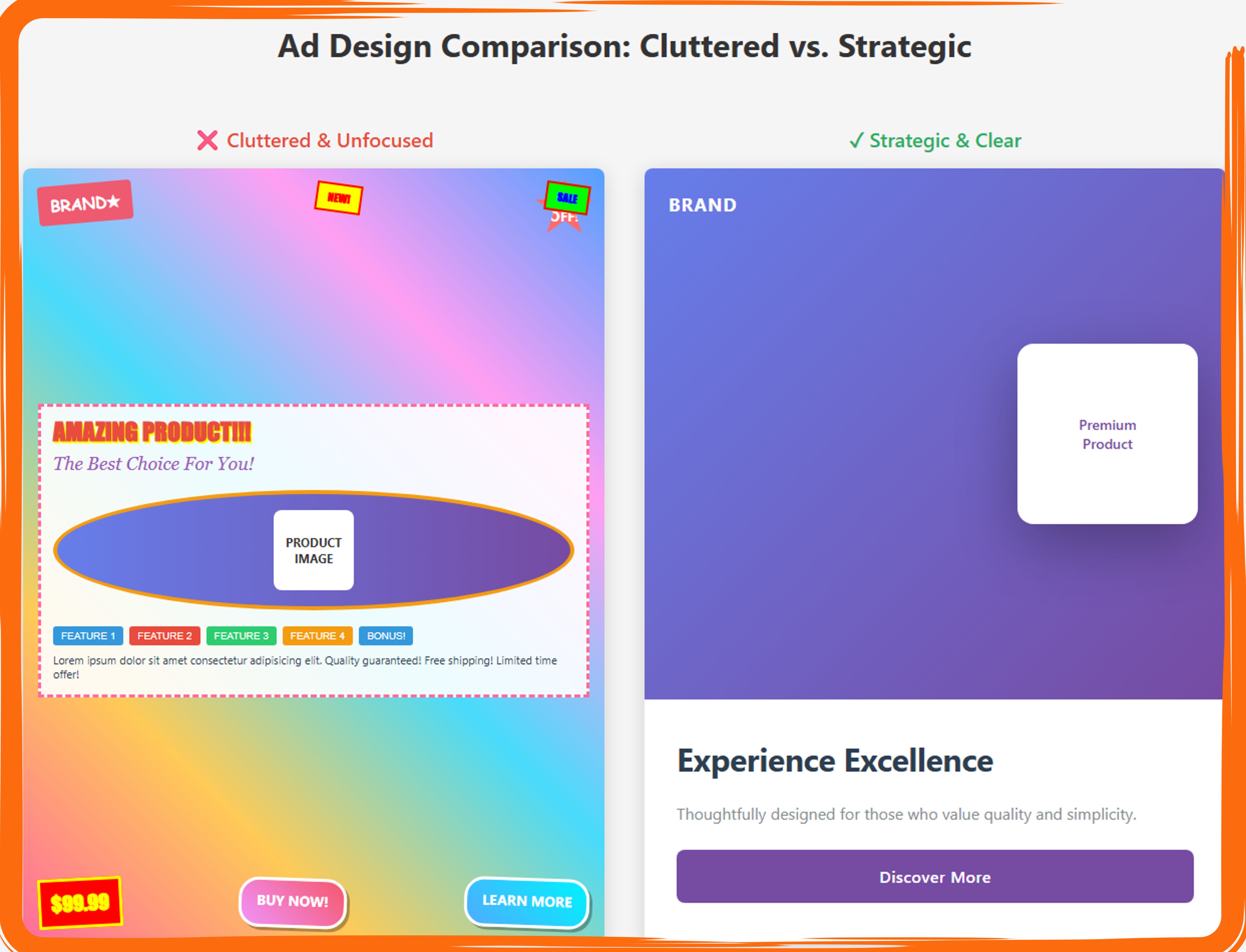
Side-by-side comparison demonstrating the impact of cluttered versus strategic advertising design principles. The left panel (labeled “Cluttered & Unfocused” with red X) exemplifies poor design practices through multiple competing visual elements including scattered brand badges, a busy rainbow gradient background, oversized red headline text (”AMAZING PRODUCT!!!”), decorative bordered content box, five separate colored feature buttons, excessive promotional text, clashing price badge, and two competing call-to-action buttons (”BUY NOW!” and “LEARN MORE”), creating visual chaos where no single element commands attention and the viewer’s eye has no clear path through the content. The right panel (labeled “Strategic & Clear” with green checkmark) demonstrates effective design through minimalist composition featuring a clean purple gradient background, single “BRAND” text in upper left, one prominent product card with “Premium Product” label positioned in the upper right with generous white space, clear headline “Experience Excellence” in large typography, single line of supporting text, and one definitive “Discover More” call-to-action button in branded purple, illustrating how strategic restraint, clear hierarchy, intentional white space usage, and singular focus create professional, effective advertising that guides viewer attention naturally toward the desired action without overwhelming or confusing the audience.
The contrast clearly demonstrates how intentional design principles (golden ratio positioning, 60-30-10 color rule, clear hierarchy, white space) create an ad that communicates instantly and memorably, while the cluttered version creates confusion and cognitive overload.
This visual comparison can serve as a perfect opening for your article or as a teaching tool to immediately show the dramatic difference between following design principles and ignoring them!
Visual principles in advertising aren’t just aesthetic considerations. They’re psychological tools that determine whether your message gets ignored or remembered, whether viewers scroll past or stop to engage, and ultimately whether your ad converts browsers into customers. In an attention economy where the average person sees thousands of ads daily, the difference between effective and ineffective design can mean the difference between a successful campaign and wasted budget. Every color choice, every spacing decision, every ratio you employ either works with human psychology or fights against it.
This comprehensive guide will take you through the mathematical ratios, composition rules, and psychological principles that separate amateur design from professional advertising. You’ll learn how the golden ratio can create naturally pleasing layouts, how the 60-30-10 color rule can make your designs cohesive without being boring, and how simple grid systems can transform chaotic compositions into clear, compelling messages. More importantly, you’ll understand not just what these rules are, but when to apply them, how they work together, and even when breaking them might serve your purposes better.
Think of these principles as tools in a designer’s toolkit rather than rigid restrictions. A carpenter doesn’t use a hammer for every job, and a designer shouldn’t apply every rule to every project. The key is understanding what each tool does, recognizing which situations call for which principles, and developing the intuition to combine them effectively. By the end of this guide, you’ll have a comprehensive understanding of the visual language that makes great advertising work, along with practical methods for applying these principles to your own projects. Whether you’re designing social media ads, print campaigns, or digital banners, these foundational concepts will elevate your work from good to exceptional.
Part 1: Foundation - Understanding Visual Hierarchy
The Psychology of How People Scan Ads
Human beings don’t read advertisements the way they read books, moving methodically from top to bottom and left to right. Instead, our eyes follow predictable patterns shaped by millions of years of evolution and decades of reading habits. Understanding these patterns is the foundation of effective ad design because it allows you to position your most important elements exactly where viewers will naturally look. Eye-tracking studies have revealed that people scan content in distinctive patterns depending on the type of content they’re viewing, and these patterns remain remarkably consistent across cultures and demographics.
The F-Pattern emerges when people encounter text-heavy content, whether it’s a webpage, a newspaper ad, or a content-rich advertisement. Viewers typically read across the top of the content in a horizontal line, then move down the page slightly and read across in a second, shorter horizontal line, before finally scanning down the left side of the content in a vertical line. This creates a shape that resembles the letter F. For advertisers, this means your headline at the top gets attention, as does the beginning of your first few lines of body copy, but elements positioned on the right side of text-heavy ads may receive significantly less attention. Smart designers place their brand logo, headline, and opening value proposition in the horizontal bars of the F, ensuring maximum visibility.
The Z-Pattern, also called the Gutenberg Diagram, applies to designs with less text and more visual hierarchy. Viewers enter at the top-left corner, which eye-tracking researchers call the “primary optical area.” Their gaze then sweeps across to the top-right corner (the “strong fallow area”), descends diagonally to the bottom-left (the “weak fallow area”), and finishes at the bottom-right corner (the “terminal area”). This pattern explains why so many effective ads place their logo in the top-left, a hero image or headline in the top-right, supporting information in the bottom-left, and their call-to-action button in the bottom-right. The Z-pattern works particularly well for simple, visually-driven advertisements where you want to guide viewers through a story or sequence.
The 5-Second Rule recognizes that viewers won’t study your ad like a fine painting in a museum. In most contexts, you have approximately five seconds to communicate your core message before someone scrolls past, turns the page, or shifts their attention elsewhere. This doesn’t mean your ad should be simplistic or boring, but it does mean that your primary message should be graspable almost instantly. Test your designs by showing them to someone unfamiliar with the project for exactly five seconds, then asking them what they remember. If they can’t articulate your main message, your visual hierarchy needs work. The 5-second rule forces designers to prioritize ruthlessly, eliminating unnecessary elements and strengthening the visual prominence of essential ones.
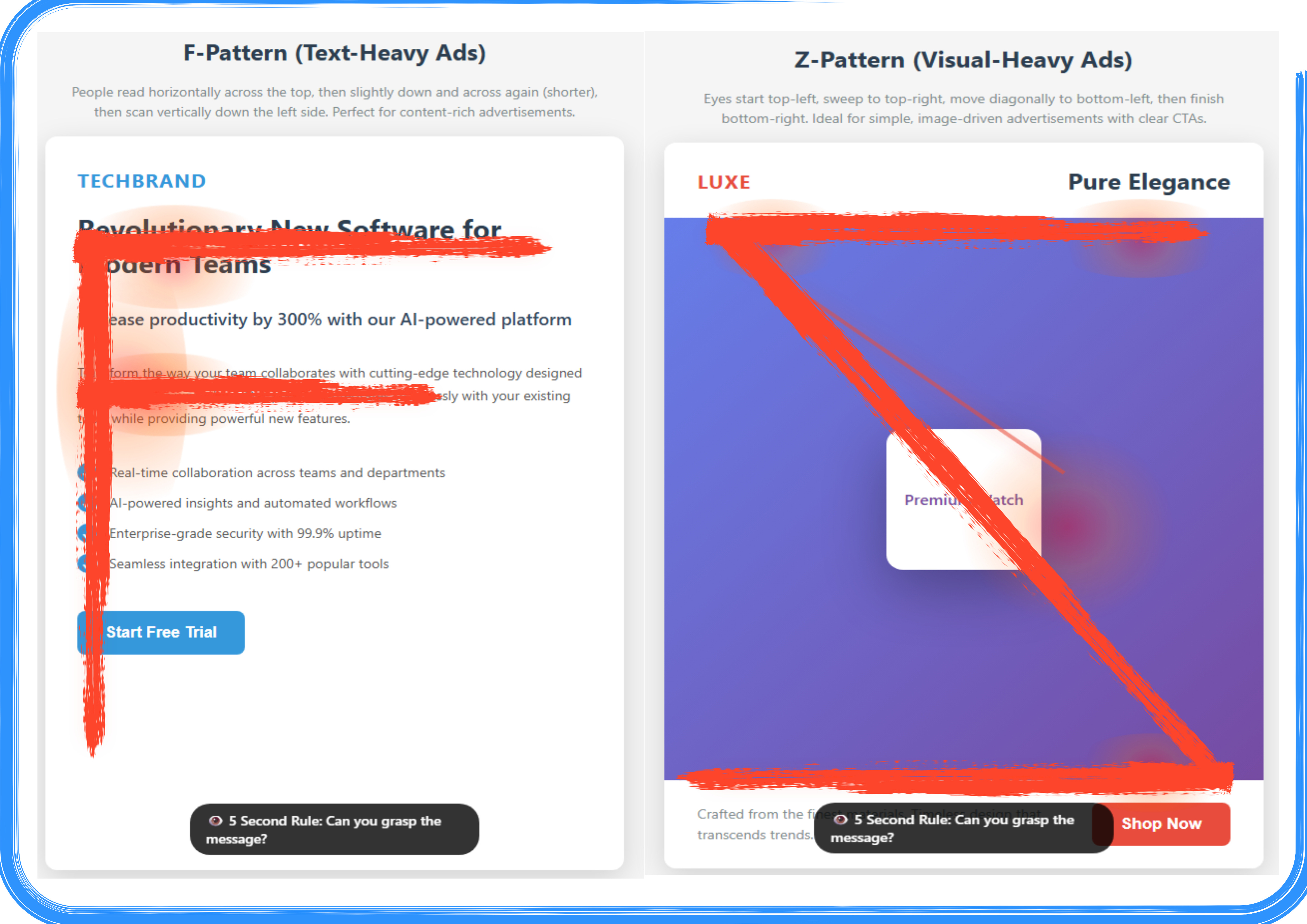
Comparison of eye-tracking patterns for text-heavy versus visual-heavy advertising designs, illustrated with red overlay paths indicating viewer gaze movement. The left panel demonstrates the F-Pattern reading behavior for text-heavy advertisements, showing a TechBrand software ad with the eye-tracking path (red overlay) starting at the top-left brand name, moving horizontally across the headline “Revolutionary New Software for Modern Teams,” dropping slightly down to scan horizontally across the subheadline about “300% productivity,” then scanning vertically down the left margin through the bulleted feature list, and terminating at the “Start Free Trial” call-to-action button, creating an F-shaped pattern optimal for content-rich advertisements where viewers seek detailed information. The right panel illustrates the Z-Pattern viewing behavior for visual-heavy advertisements, showing a LUXE brand luxury product ad with the eye-tracking path (red overlay) beginning at the top-left “LUXE” logo, sweeping horizontally across to “Pure Elegance” in the top-right corner, then moving diagonally downward across the purple gradient background to the centered “Premium Watch” product card, and finishing with a horizontal sweep along the bottom from the descriptive text to the red “Shop Now” button in the bottom-right, forming a Z-shaped pattern ideal for simple, image-driven advertisements with minimal text and clear visual hierarchy that guides viewers efficiently to the call-to-action.
The 3-Element Rule: Why Less Is More in Advertising
Cognitive psychology research consistently demonstrates that human working memory can comfortably hold about three to four chunks of information at once. When designers try to cram more than three main visual elements into an advertisement, they inadvertently create cognitive overload that reduces comprehension and recall. The 3-Element Rule isn’t about having only three total items in your design, but rather about having three primary focal points that carry your message. Think of these as the headline, the hero image, and the call-to-action, or the product, the benefit statement, and the brand logo. Everything else should be clearly subordinate to these main players.
The power of limitation reveals itself when you examine the world’s most memorable advertisements. Apple’s product launch ads typically feature just the device itself, a short tagline, and the Apple logo. Nike ads might show an athlete, an inspiring phrase, and the swoosh. These brands understand that every additional element you add to a design doesn’t just take up space, it divides attention. If viewers are looking at five or six different competing elements, each one receives only a fraction of the mental processing power. By limiting yourself to three primary elements, you ensure each one gets the attention it deserves and your overall message becomes stronger and more memorable.
Implementing the 3-Element Rule requires discipline during the design process. Start by listing everything you think needs to be in your ad, then ruthlessly prioritize until you’ve identified the three things that absolutely must be there. Often, what seems essential at first glance can actually be communicated through subtext, visual metaphor, or omitted entirely without weakening the message. If stakeholders insist on including additional elements, find ways to group them into visual units that read as a single element, or reduce their visual weight through size, color, and positioning so they clearly become supporting players rather than competing for primary attention.
The 3-Element Rule also creates breathing room in your designs. When you commit to three main focal points, you naturally create more white space around each element, which paradoxically makes each one more noticeable and the overall composition more sophisticated. Luxury brands have long understood this principle, which is why high-end fashion and automotive ads often look sparse compared to retail sale advertisements. The restraint communicates confidence and quality, while the visual clarity ensures the message lands with impact.
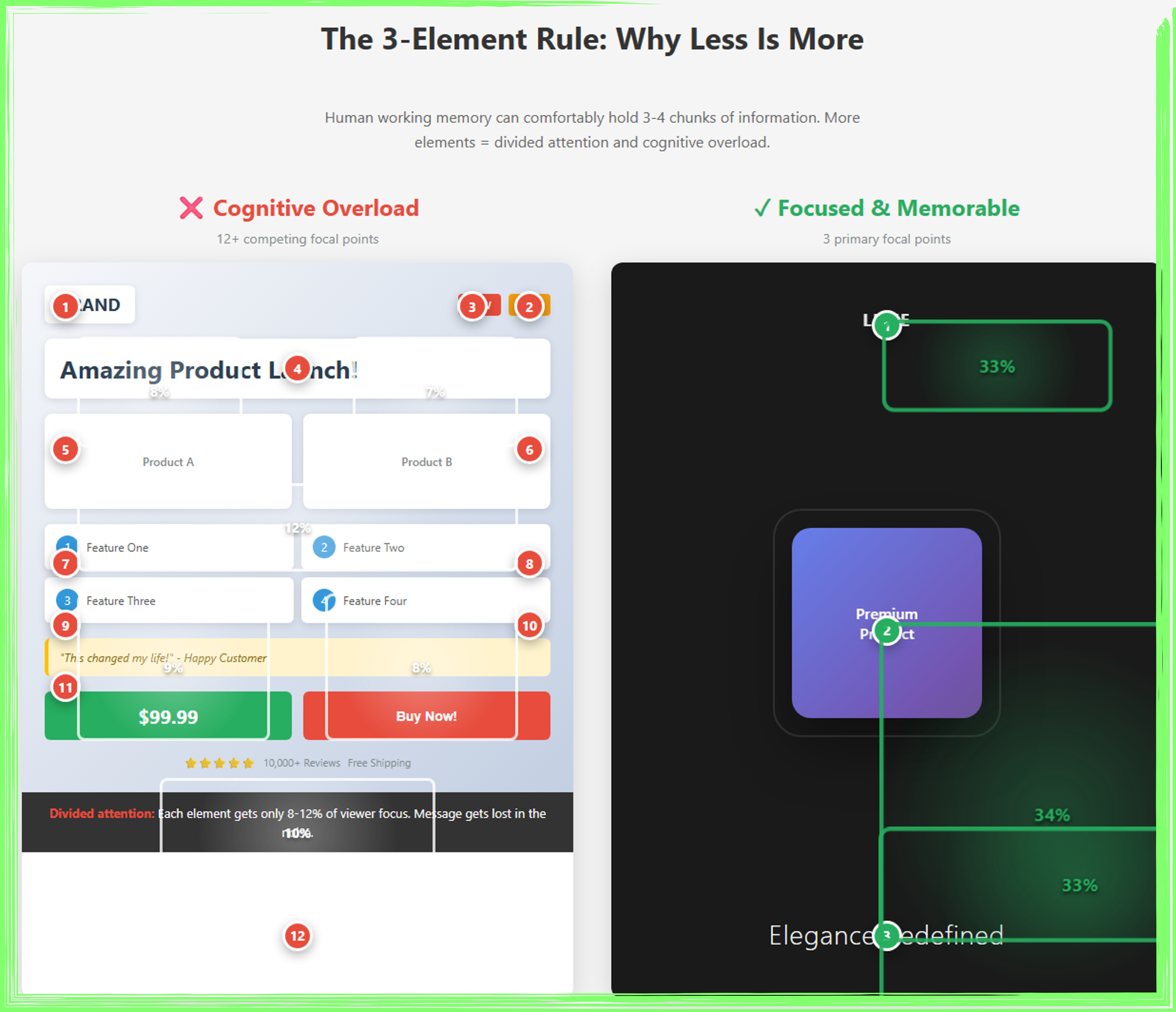
This infographic illustrates the 3-Element Rule in ad design by comparing cognitive overload versus focused visual hierarchy. The left panel demonstrates how advertisements with 12+ competing elements (numbered 1-12 in red) fragment viewer attention, resulting in each component receiving only 8-12% of focus—causing the core message to become lost in visual clutter. In contrast, the right panel showcases a streamlined design with just three primary focal points (numbered 1-3 in green): the logo, premium product, and tagline. This minimalist approach allocates 33% of viewer attention to each element, creating a clear visual hierarchy that enhances memorability and impact. The comparison reveals how human working memory’s limitation of holding 3-4 chunks of information directly translates to effective ad design—demonstrating that strategic restraint and generous white space produce more sophisticated, memorable, and persuasive advertisements than busy, element-heavy layouts.
Visual Weight and Controlling Viewer Attention
Visual weight refers to how much an element appears to “weigh” in a composition, which determines how much attention it attracts. Elements with greater visual weight pull the viewer’s eye more strongly, while lighter elements recede into the background. Understanding visual weight gives designers precise control over what viewers notice first, second, and third, allowing you to choreograph the viewing experience like a director guiding an audience’s attention across a scene. This isn’t manipulation in a negative sense, it’s communication strategy that respects the viewer’s cognitive resources by presenting information in order of importance.
Size is the most obvious contributor to visual weight. Larger elements naturally attract more attention than smaller ones, which is why headlines are bigger than body copy and why your call-to-action button should be prominently sized. However, size alone doesn’t determine weight. A small element in a bright, contrasting color can easily outweigh a larger element in a neutral tone. Similarly, a small area of high detail and texture will draw the eye more than a large area of flat color. This interplay of factors gives designers multiple tools for controlling attention without making everything important comically large.
Color and contrast dramatically affect visual weight. Warm colors like red, orange, and yellow advance toward the viewer and carry more weight than cool colors like blue and green, which recede. High-contrast elements, where there’s a strong difference between the element and its background, carry more weight than low-contrast elements. This is why call-to-action buttons typically use bright, contrasting colors, they need maximum visual weight to draw the eye and prompt action. Black and white imagery can actually carry more weight than full color in certain contexts because the high contrast makes it stand out against typical colorful surroundings.
Position and isolation also contribute to visual weight. Elements positioned in the optical center of a design (slightly above the mathematical center) naturally draw attention. Elements surrounded by white space gain visual weight because the isolation makes them stand out, much like a single person standing in an empty field is more noticeable than someone in a crowd. Designers can manipulate visual weight to create balance in their compositions, using a large, light-colored element on one side to balance a small, dark, highly-contrasting element on the other side. Mastering visual weight means you can guide viewers through your message in exactly the sequence you intend, ensuring they see your value proposition before your disclaimer, and your product before your footer information.
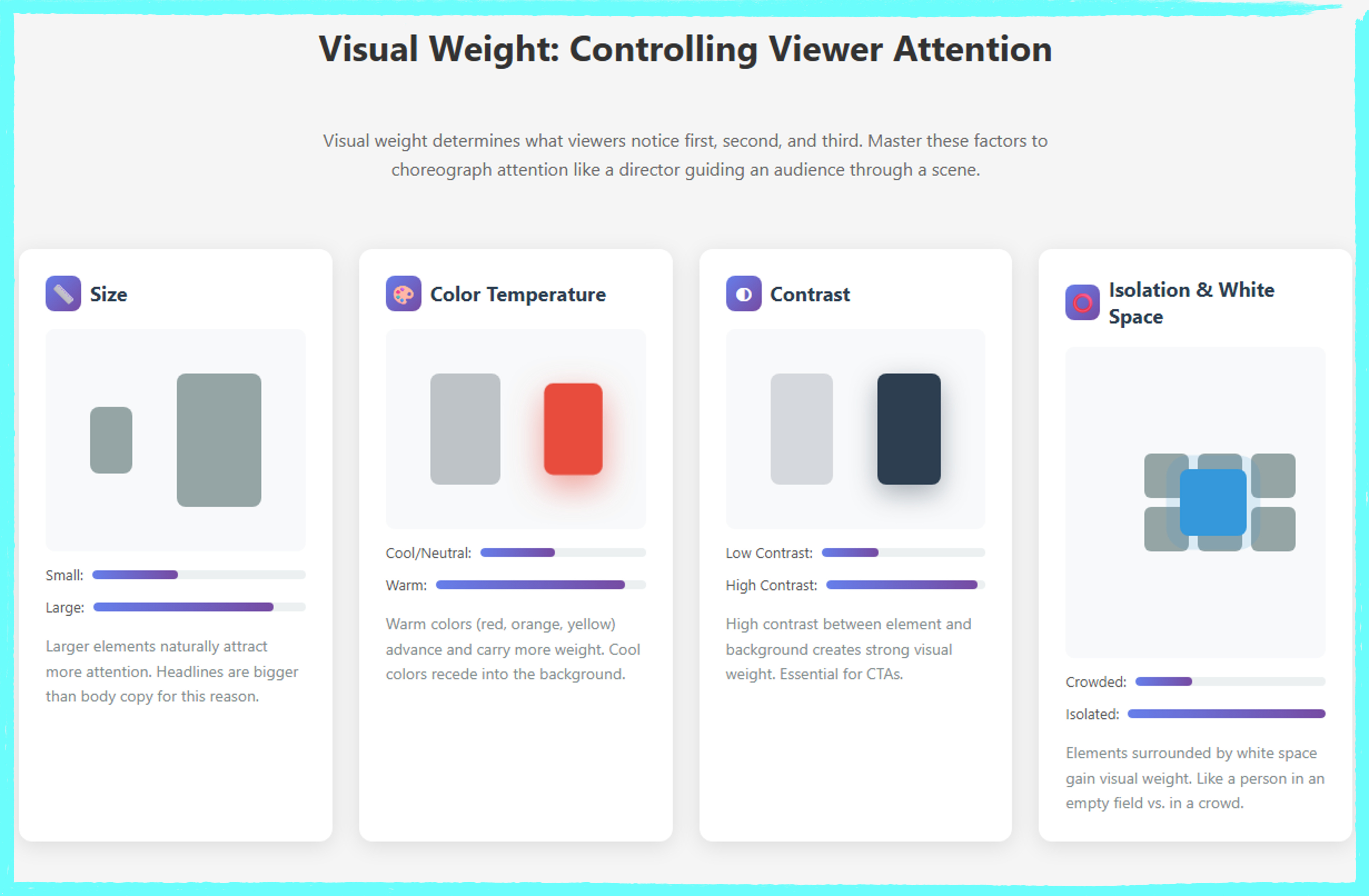
This infographic breaks down the four fundamental factors that determine visual weight in ad design and their practical application. The top section presents individual weight factors through visual demonstrations and measurement scales: Size (larger elements command up to 85% more attention than smaller ones), Color Temperature (warm colors like red advance and carry 90% weight versus neutral tones), Contrast (high contrast elements achieve 95% weight by standing out sharply from backgrounds), and Isolation & White Space (isolated elements surrounded by white space gain 100% weight compared to crowded elements at 30%). The bottom comparison synthesizes these principles, contrasting a poorly weighted ad with ambiguous hierarchy against a strategically designed version where calculated application of size, warm color, high contrast, and isolation creates numbered visual priorities (1-2-3) that choreograph viewer attention like a director guiding an audience through a scene.
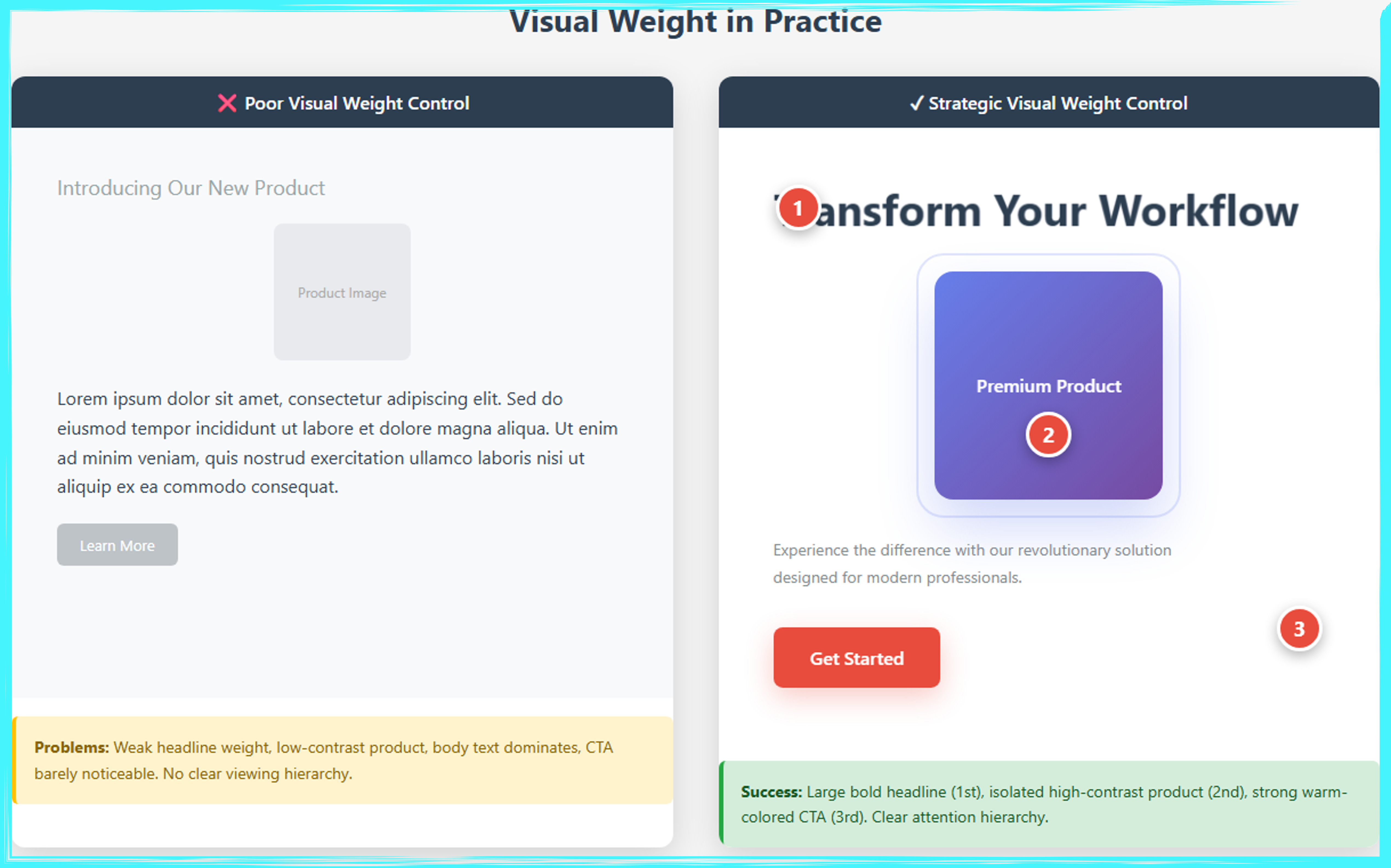
This side-by-side comparison demonstrates the critical impact of visual weight control on ad effectiveness. The left panel illustrates poor visual weight distribution, where a weak, low-contrast headline competes with dense body text, a faint product image, and an inconspicuous call-to-action button, resulting in no clear attention hierarchy and viewer confusion. The right panel showcases strategic visual weight control through three numbered focal points: a bold, large headline “Transform Your Workflow” (1st), a high-contrast, isolated premium product with generous white space (2nd), and a prominent warm-colored CTA button (3rd). This deliberate hierarchy guides viewers through the intended sequence using size differentiation, color contrast, spatial isolation, and restrained body copy, creating a clear path from awareness to action that significantly improves engagement and conversion rates.
White Space as a Design Element
White space, also called negative space, is not wasted space or empty space that needs filling. It’s an active design element that gives other elements room to breathe, creates visual relationships between elements, and paradoxically makes designs look more premium and trustworthy. Novice designers often fear white space, feeling compelled to fill every available pixel with content, imagery, or decorative elements. Professional designers understand that strategic emptiness is often more powerful than additional content, creating focus, clarity, and sophistication that busy designs can never achieve.
White space functions at two levels: micro and macro. Micro white space includes the small gaps between letters (kerning), the space between lines of text (leading), and the padding around buttons and elements. Getting micro white space right ensures readability and prevents designs from feeling cramped or claustrophobic. Macro white space refers to the larger empty areas in your composition, the margins around your ad, the space between major sections, and the breathing room around hero images or primary headlines. Macro white space creates the overall sense of spaciousness or density in a design and establishes the visual rhythm that guides viewers through your content.
Different industries and brands use white space strategically to communicate specific qualities. Luxury brands employ generous white space to communicate exclusivity, sophistication, and confidence. When Chanel or Rolex run advertisements with large swaths of emptiness surrounding a product image and minimal text, they’re leveraging white space to say “we’re so confident in our product’s value that we don’t need to explain or justify it.” Conversely, retail sale ads often minimize white space, packing in multiple products, prices, and promotional callouts to communicate abundance, value, and urgency. Neither approach is inherently better, the right amount of white space depends on your message and brand positioning.
Learning to use white space effectively requires a shift in thinking. Instead of asking “what else can we add here,” start asking “what can we remove without weakening the message.” Look at the empty areas in your composition not as voids waiting to be filled, but as shapes and forms in their own right. In Japanese aesthetics, the concept of “ma” refers to the intentional use of emptiness and space, recognizing that the space between objects is as important as the objects themselves. When you view white space through this lens, you begin to see it as an active participant in your design that shapes meaning, creates emphasis, and delivers a superior viewing experience. Your designs will instantly look more professional, your messages will become clearer, and viewers will spend more time engaging with your content because it’s visually comfortable rather than overwhelming.
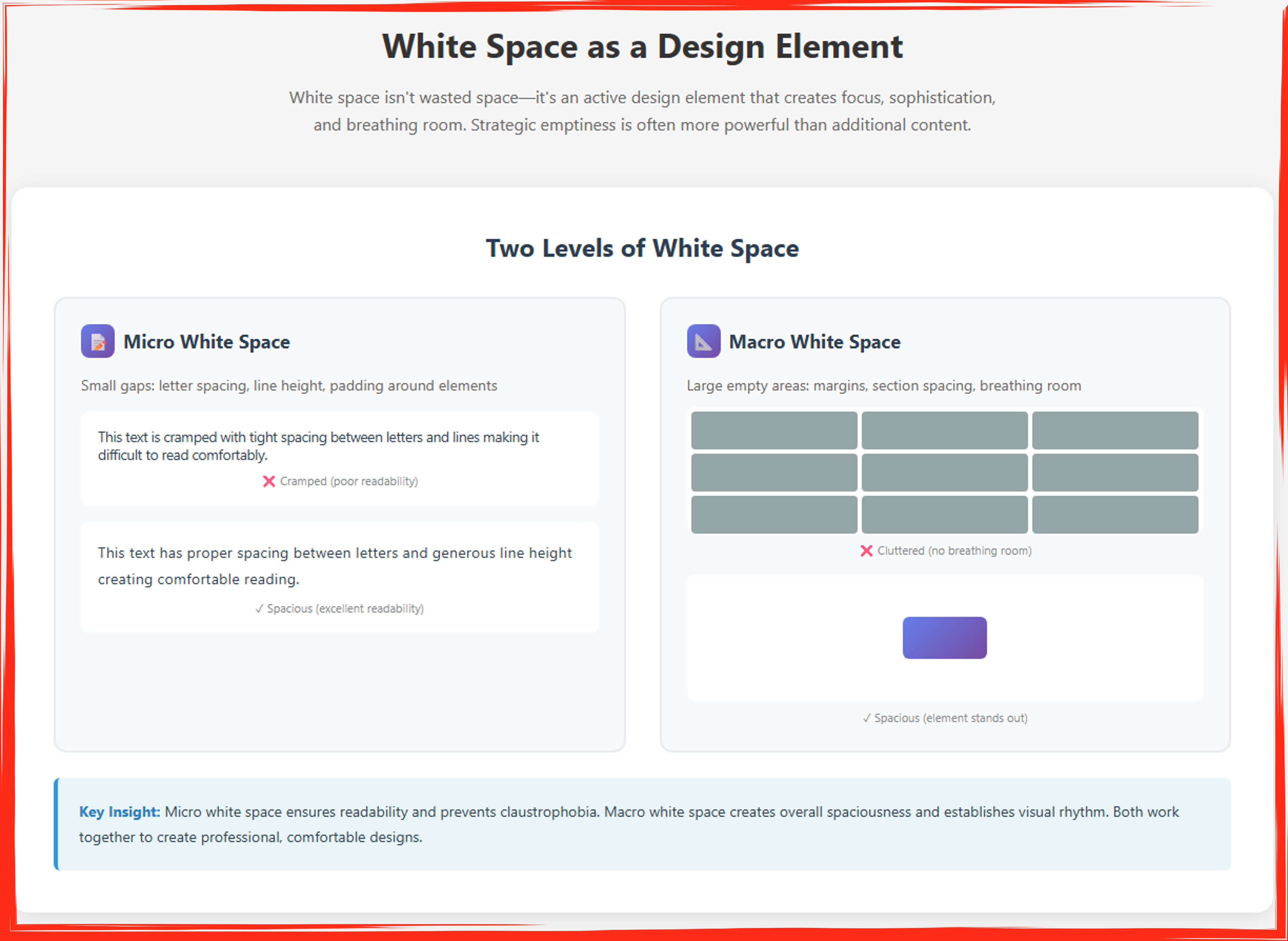
This infographic distinguishes between two essential types of white space in design and demonstrates their complementary roles in creating effective advertisements. The left panel explains micro white space—the small gaps controlling letter spacing, line height, and padding around elements—through a direct comparison showing cramped text with poor readability (marked with a red X) versus properly spaced text with generous line height that ensures comfortable reading (marked with a green checkmark). The right panel illustrates macro white space—the large empty areas including margins, section spacing, and breathing room—by contrasting a cluttered grid of nine tightly packed elements that create visual chaos (red X) against a single isolated element surrounded by ample white space that commands attention and creates sophistication (green checkmark). The bottom insight emphasizes that micro white space ensures readability and prevents claustrophobia at the detail level, while macro white space establishes overall spaciousness and visual rhythm at the compositional level, with both types working synergistically to produce professional, comfortable, and impactful designs that leverage strategic emptiness as a powerful design tool rather than wasted space.
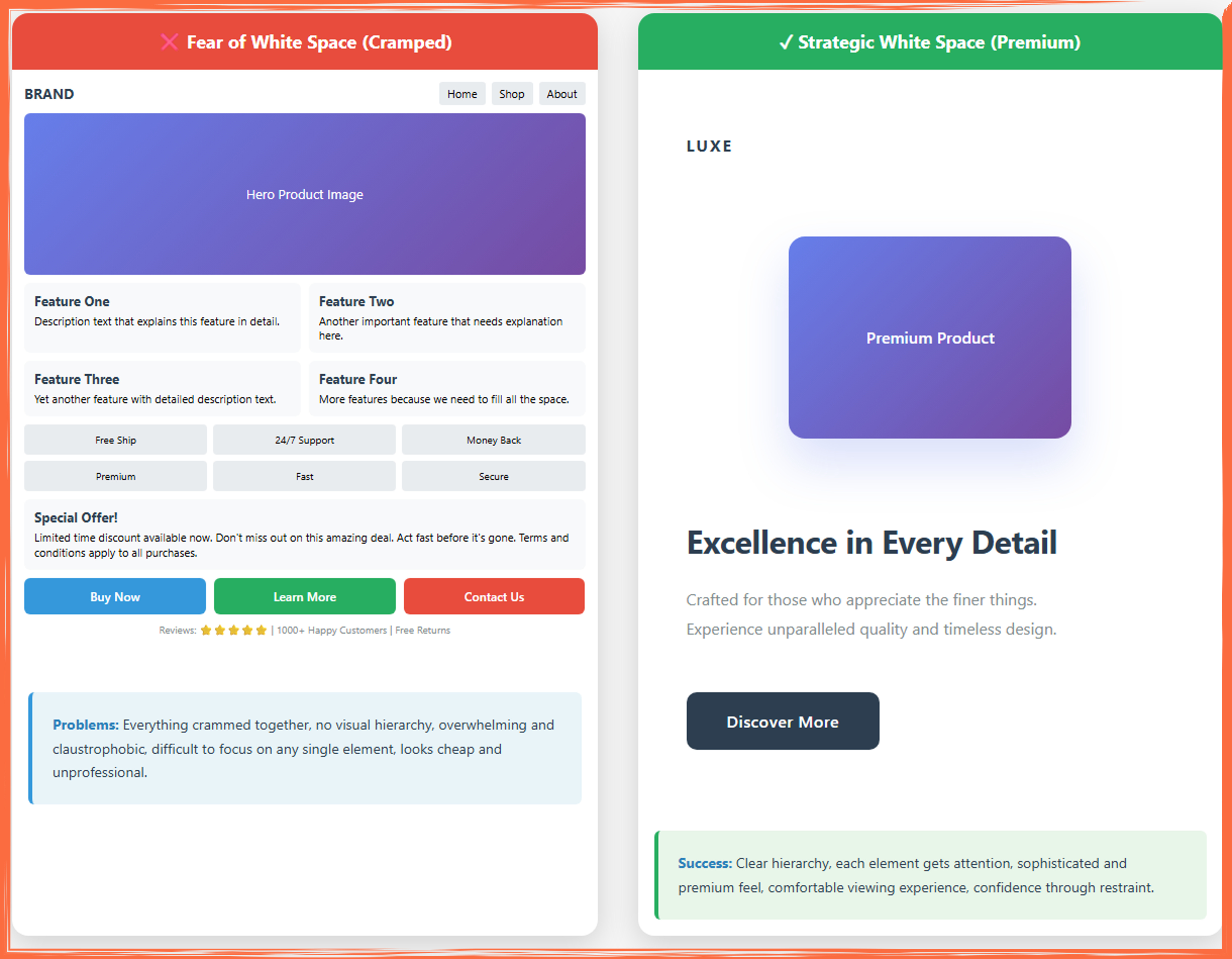
This side-by-side comparison illustrates the dramatic difference between cramped design and strategic use of white space in advertisement layouts. The left panel demonstrates “fear of white space,” where every available pixel is filled with content: a large hero image is immediately followed by four feature descriptions in a tight grid, six benefit badges crammed together, a promotional block, three competing call-to-action buttons, and social proof elements—all packed without breathing room, creating visual chaos, no clear hierarchy, and an overwhelming, claustrophobic experience that appears cheap and unprofessional. The right panel showcases strategic white space usage with the premium brand “LUXE,” featuring generous margins, a single centered product image with ample surrounding space, a bold headline “Excellence in Every Detail” with substantial padding, minimal supporting copy, and one prominent call-to-action button, demonstrating how restraint and intentional emptiness create sophistication, guide attention naturally, project premium quality, and provide a comfortable, confident viewing experience. The bottom annotations emphasize that cramped designs force users to work harder to process information and undermine credibility, while strategic white space establishes clear visual hierarchy, allows each element its moment of attention, and communicates brand confidence through compositional restraint.
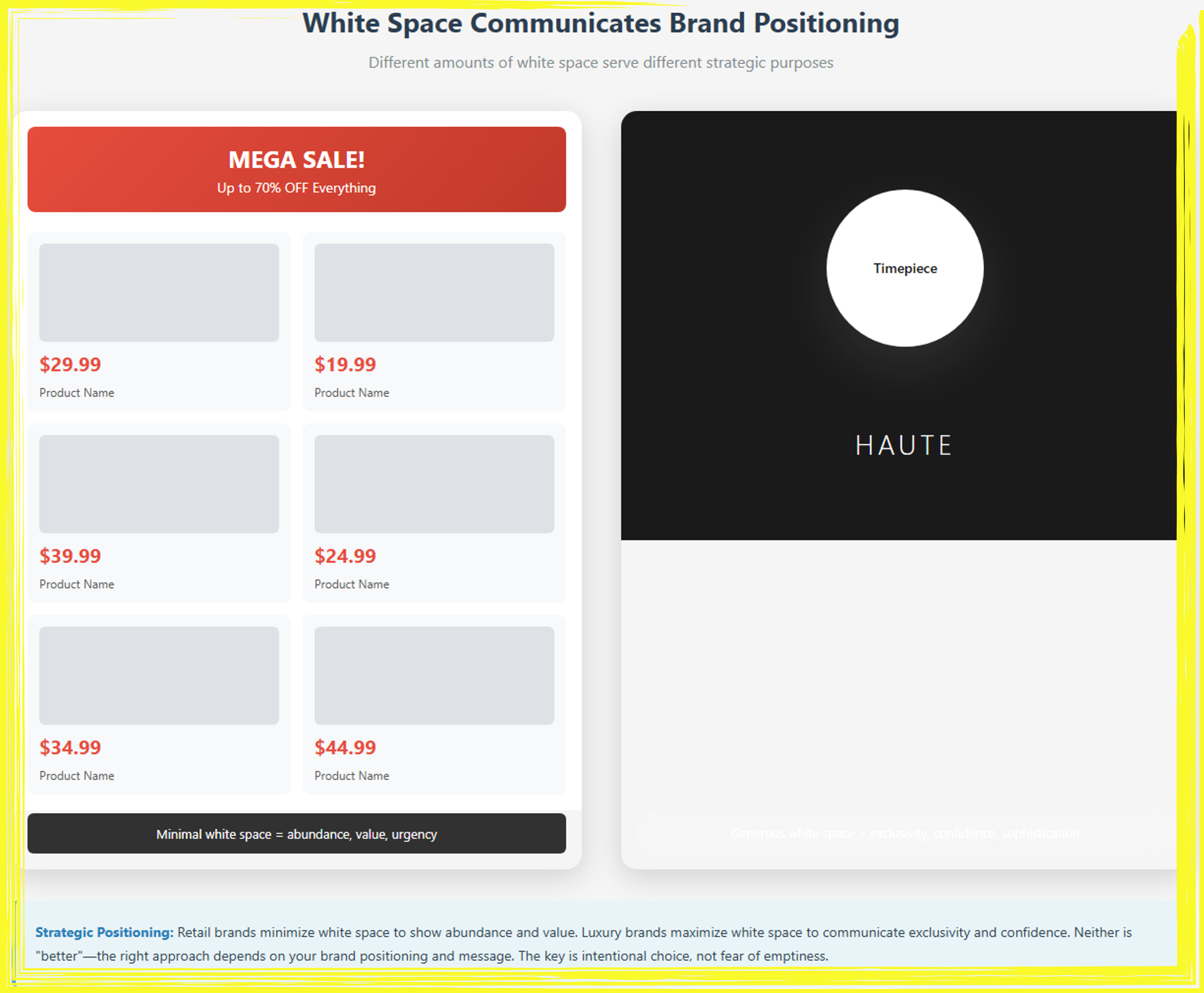
This comparison infographic demonstrates how varying amounts of white space communicate distinct brand positioning strategies and target different market segments. The left panel exemplifies a retail/value-oriented approach with minimal white space, featuring a prominent red “MEGA SALE!” banner, dense product grid displaying six items with prices ranging from $19.99 to $44.99, minimal margins between elements, and an emphasis on abundance and urgency—a design strategy that signals accessibility, value, and immediate action to price-conscious consumers seeking deals and variety. The right panel showcases a luxury positioning through maximal white space, presenting a stark black background with a single centered white circle containing “Timepiece,” the minimalist brand name “HAUTE” in elegant letterforms, and vast empty areas dominating approximately 85% of the composition—communicating exclusivity, confidence, premium quality, and refined taste to affluent consumers who associate restraint with sophistication. The bottom insight emphasizes that neither approach is inherently superior; retail brands intentionally minimize white space to convey abundance and competitive pricing, while luxury brands deliberately maximize it to project exclusivity and prestige, making the strategic choice of white space density a powerful tool for brand positioning that should align with target audience expectations, price points, and brand values rather than stemming from design uncertainty or fear of emptiness.
Part 2: Mathematical Ratios for Harmonious Design
The Golden Ratio (1.618:1)
The golden ratio, approximately 1.618 to 1, represents one of mathematics’ most fascinating phenomena, a proportion that appears throughout nature, art, and architecture across cultures and centuries. Also known as phi (φ) or the divine proportion, this ratio describes a relationship where the whole is to the larger part as the larger part is to the smaller part. While this sounds abstract, its visual manifestation is immediately recognizable and deeply pleasing to human perception. From the spiral of a nautilus shell to the proportions of the Parthenon, from the arrangement of flower petals to the compositions of Renaissance paintings, the golden ratio creates a sense of natural balance that resonates with viewers on an almost subconscious level.
The reason the golden ratio feels so naturally right stems from both evolutionary psychology and our daily experience of the natural world. Our brains have evolved to recognize patterns, and the golden ratio is one of the most prevalent patterns in organic forms. When we encounter this proportion in designed objects, it triggers a subtle recognition of natural order and harmony. This doesn’t mean viewers consciously think “ah, the golden ratio” when they see a well-proportioned ad, but rather that the composition feels balanced, professional, and aesthetically pleasing in a way they might struggle to articulate. This subliminal appeal makes the golden ratio a powerful tool for designers who want their work to feel polished and sophisticated.
Practical application of the golden ratio in ad design can take several forms. The simplest is using it to determine the proportions of your layout itself. If you’re designing a rectangular ad, making the width to height ratio 1.618:1 creates an inherently pleasing format. Within that format, you can divide the space using golden ratio proportions to determine where to place primary elements. For instance, positioning your hero image so it occupies approximately 61.8% of the width, with text and white space taking the remaining 38.2%, creates natural balance. You can also use the ratio to determine the relative sizes of elements, making your headline 1.618 times larger than your subheadline, which is in turn 1.618 times larger than your body copy.
The golden spiral, derived from the golden ratio, offers another powerful compositional tool. This logarithmic spiral grows by a factor of the golden ratio for every quarter turn it makes, creating a curved path that can guide viewer attention through your design. Many iconic photographs and advertisements position key elements along this spiral or at its center point, creating dynamic compositions that feel naturally balanced while avoiding static symmetry. Software tools can overlay golden spiral guides on your canvas, making it easy to position your product, model’s face, or call-to-action button at the spiral’s focal point. However, it’s crucial to remember that the golden ratio is a tool, not a requirement. Not every successful ad uses it, and forcing it into inappropriate contexts can create more problems than it solves. Use it when it naturally supports your composition, not as a rigid formula that constrains your creativity.
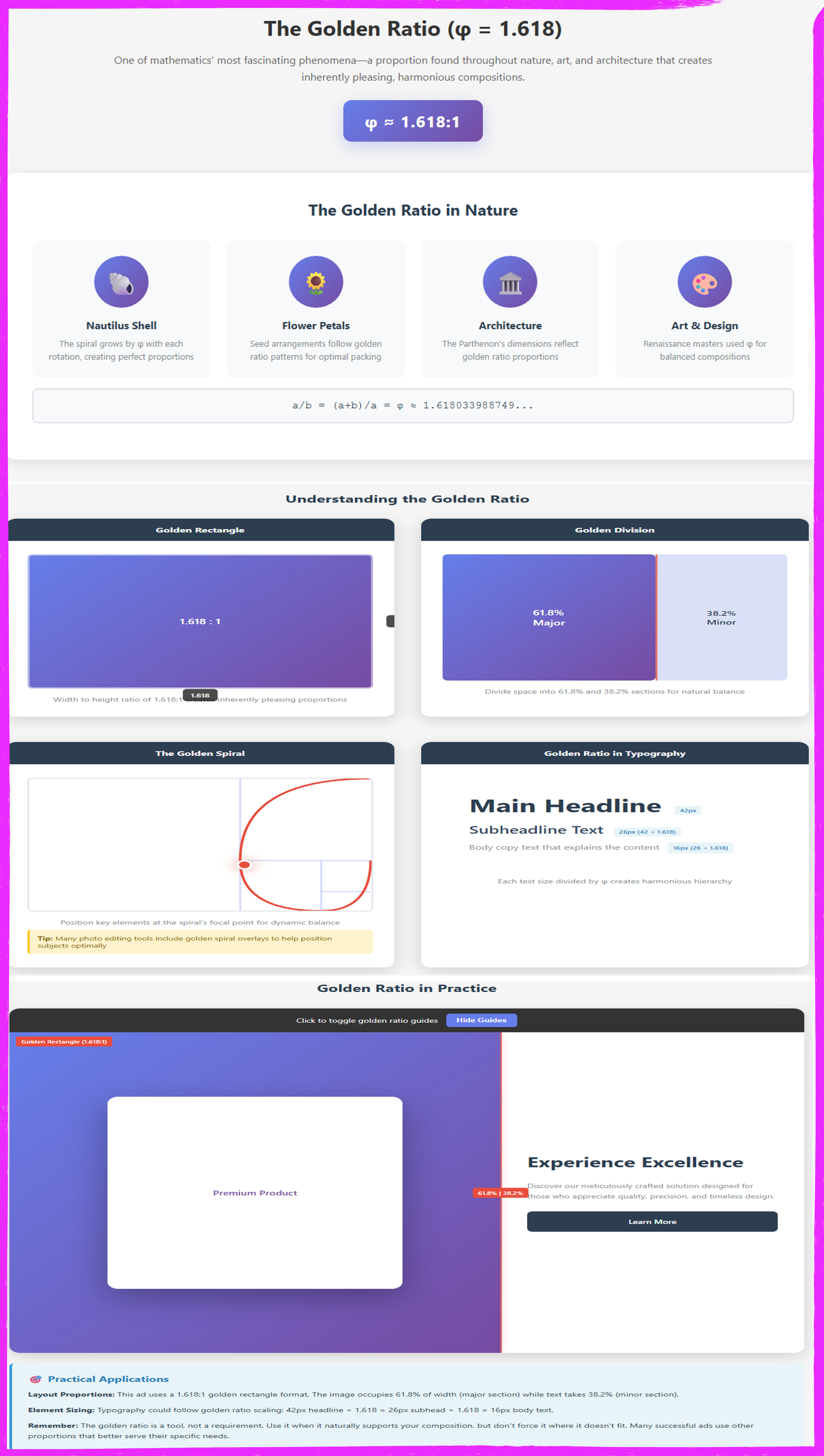
This comprehensive infographic educates designers on the golden ratio (φ = 1.618) and its practical application in advertisement design. The header introduces the divine proportion as a mathematically derived relationship found throughout nature, art, and architecture that creates inherently pleasing, harmonious compositions. The top section presents four real-world examples nautilus shell spirals that grow by φ with each rotation, flower petal arrangements following golden ratio patterns for optimal packing, the Parthenon’s architectural dimensions reflecting these proportions, and Renaissance masters’ use of φ for balanced compositions accompanied by the mathematical formula demonstrating the relationship. The middle section provides two fundamental visualizations: the Golden Rectangle showing width-to-height ratio of 1.618:1 with clear dimension labels, and the Golden Division demonstrating how to split space into 61.8% (major) and 38.2% (minor) sections for natural balance. Advanced concepts include the Golden Spiral with animated SVG drawing showing how positioning key elements at the spiral’s focal point creates dynamic balance, plus a practical Typography Scale demonstrating harmonious font sizing (42px headline ÷ 1.618 = 26px subhead ÷ 1.618 = 16px body copy). The bottom Golden Ratio in Practice section features an interactive full advertisement layout in 1.618:1 format with toggle-able guide overlays, showing a premium product occupying 61.8% of width (major section) and “Experience Excellence” text in the 38.2% section (minor section), with a practical applications note emphasizing that while the golden ratio naturally supports pleasing composition, designers shouldn’t force it where other proportions better serve their specific needs making φ a powerful compositional tool rather than a rigid requirement.
The Fibonacci Sequence
The Fibonacci sequence represents one of mathematics’ most elegant patterns: 0, 1, 1, 2, 3, 5, 8, 13, 21, 34, 55, 89, and so on, where each number is the sum of the two preceding numbers. What makes this sequence particularly relevant to designers is its intimate relationship with the golden ratio. As the Fibonacci sequence progresses, the ratio between consecutive numbers approaches 1.618, meaning that 8/5 equals 1.6, 13/8 equals 1.625, 21/13 equals 1.615, and so on. This mathematical connection means that using Fibonacci numbers for sizing and spacing creates the same harmonious proportions as the golden ratio, but with the advantage of working with whole numbers rather than decimals.
For typography, the Fibonacci sequence offers an elegant system for creating hierarchical relationships between different text elements. If you set your body copy at 13 points, your subheadings could be 21 points, and your main headline could be 34 points. These aren’t arbitrary jumps, they’re proportional relationships that create visual harmony while ensuring clear differentiation between hierarchy levels. This approach works across any scale, whether you’re designing a business card or a billboard. You might use 8, 13, 21 for smaller formats or 21, 34, 55 for larger ones. The key is maintaining the proportional relationships, which creates consistency and rhythm throughout your design.
The Fibonacci sequence also works beautifully for layout grids and spacing systems. You might divide your canvas into Fibonacci-based columns, such as 5 columns for secondary information and 8 columns for your primary content area, creating a natural 5:8 ratio that approaches the golden proportion. Margin and padding can follow Fibonacci numbers as well, using 8 pixels for tight spacing between related elements, 13 pixels for medium separation, 21 pixels for clear distinction between sections, and 34 pixels for major divisions. This creates a rhythmic consistency throughout your design where spacing never feels arbitrary, and relationships between elements feel intentional and professional.
One practical advantage of the Fibonacci approach over strict golden ratio calculations is simplicity in execution. Designers can memorize the sequence (at least the numbers commonly used in design: 3, 5, 8, 13, 21, 34, 55, 89) and apply them quickly without calculators or complex measurements. This makes the system particularly useful in fast-paced design environments or when creating design systems that other team members need to understand and apply consistently. However, like all mathematical guides, the Fibonacci sequence should inform your decisions rather than dictate them. If your brand uses a specific font size for accessibility reasons, or if your platform has technical constraints, adapt the system to fit reality rather than sacrificing usability for mathematical purity.
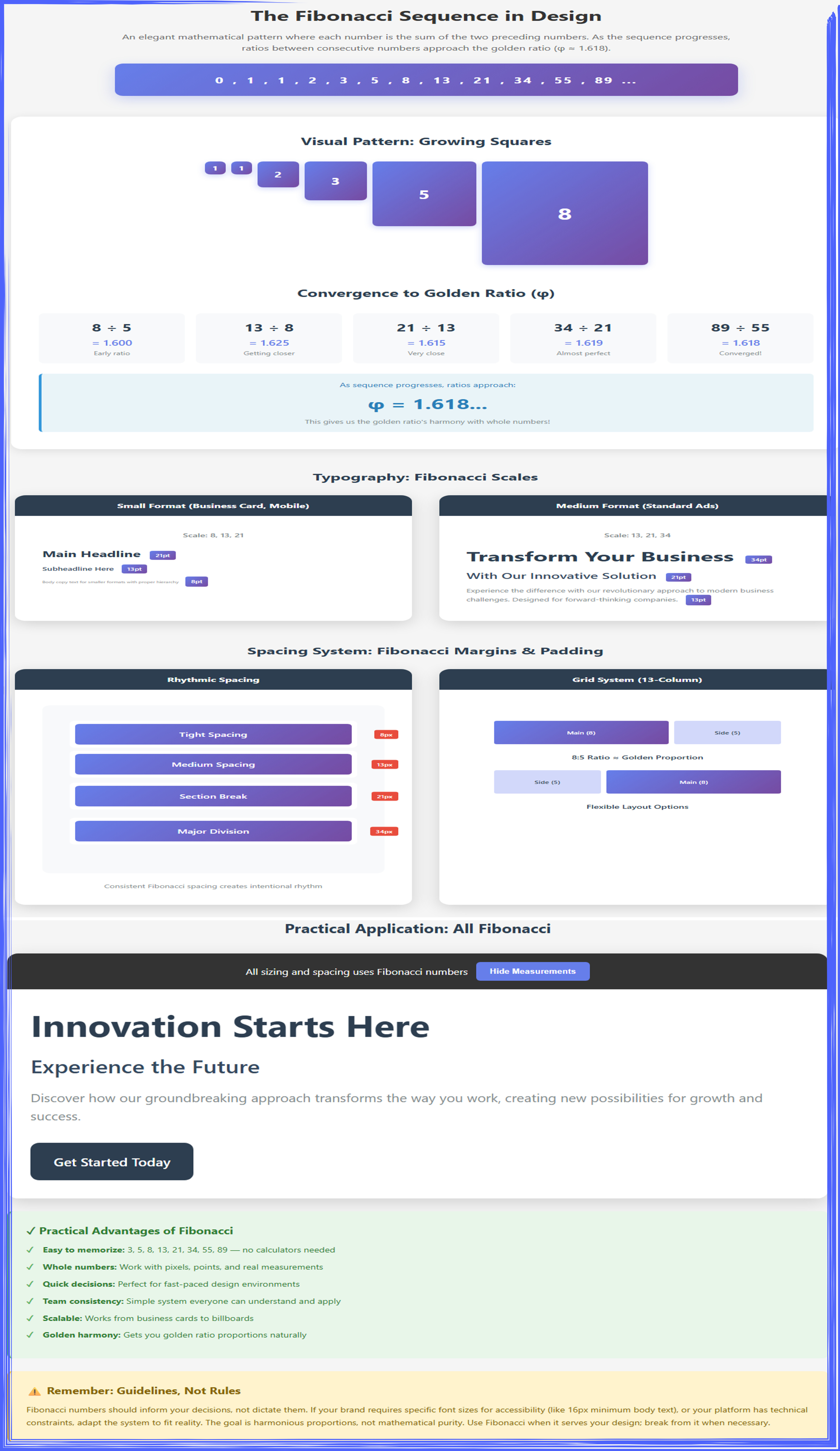
This interactive demonstration reveals how the Fibonacci sequence (0, 1, 1, 2, 3, 5, 8, 13, 21, 34, 55, 89...) provides designers with an elegant mathematical framework that combines the harmony of the golden ratio with the simplicity of whole numbers. As the sequence progresses, ratios between consecutive numbers converge toward φ (1.618): 8÷5 = 1.600, 13÷8 = 1.625, 21÷13 = 1.615, eventually reaching 89÷55 = 1.618. The visualization shows practical applications across typography (using scales like 13pt, 21pt, 34pt for body, subhead, and headline), spacing systems (8px for tight spacing, 13px medium, 21px section breaks, 34px major divisions), and grid layouts (8:5 column ratios approximating golden proportions). The key advantage is memorability and speed—designers can quickly apply 3, 5, 8, 13, 21, 34, 55, 89 without calculators, making it perfect for fast-paced environments and team consistency. However, these Fibonacci numbers should inform rather than dictate decisions; always adapt the system when accessibility requirements (like minimum 16px body text) or platform constraints demand it, prioritizing usability over mathematical purity.
Rule of Thirds
The rule of thirds represents the most widely used compositional guideline in visual arts, from photography to painting to advertising design. This principle divides any rectangular frame into nine equal parts using two equally spaced horizontal lines and two equally spaced vertical lines, creating a grid that resembles a tic-tac-toe board. The four points where these lines intersect become optimal positions for placing key elements, and the lines themselves serve as guides for aligning important features. This simple system has endured because it reliably creates balanced, dynamic compositions that avoid the static feeling of perfectly centered elements while remaining intuitive enough for beginners to apply successfully.
The psychological foundation of the rule of thirds relates to how our eyes process visual information and seek balance. Perfectly centered compositions can feel formal, static, or even monotonous because they lack visual tension. By positioning key elements slightly off-center at the intersection points of the thirds grid, you create a subtle asymmetry that makes the composition more dynamic and interesting while maintaining overall balance. Research into aesthetic preferences consistently shows that people find slightly asymmetrical compositions more engaging than perfectly symmetrical ones, probably because asymmetry creates visual questions that keep the brain engaged: “why is that positioned there?” “what balances that element?” This engagement translates into longer viewing times and better message retention.
In advertising applications, the rule of thirds helps solve common design challenges with elegant simplicity. Positioning a product at one of the four intersection points rather than dead center immediately makes your ad more visually interesting. Aligning your headline along the top horizontal third line creates a strong, stable position that commands attention without dominating the entire space. Placing your call-to-action button at the lower-right intersection point (which coincides with the terminal area of the Z-pattern) positions it exactly where viewers’ eyes naturally finish their scan. For image-based ads, positioning the horizon line along either the top or bottom third rather than the middle creates more dynamic compositions, whether you want to emphasize expansive sky or foreground detail.
The rule of thirds offers a simpler, more practical alternative to the golden ratio for many design situations. While the golden ratio requires precise measurements and calculations (dividing by 1.618), the rule of thirds just needs dividing by three, which any designer can do quickly. For fast-paced environments like social media content creation or responsive design that needs to work across multiple screen sizes, the thirds grid provides a reliable framework that’s easy to implement and adjust. Modern design software often includes rule of thirds overlay options, allowing you to align elements quickly without manual measurement. However, understanding both systems allows you to choose the right tool for each project. The golden ratio might be perfect for a luxury brand’s print campaign where every detail receives meticulous attention, while the rule of thirds might serve better for digital ads that need quick creation and responsive flexibility.
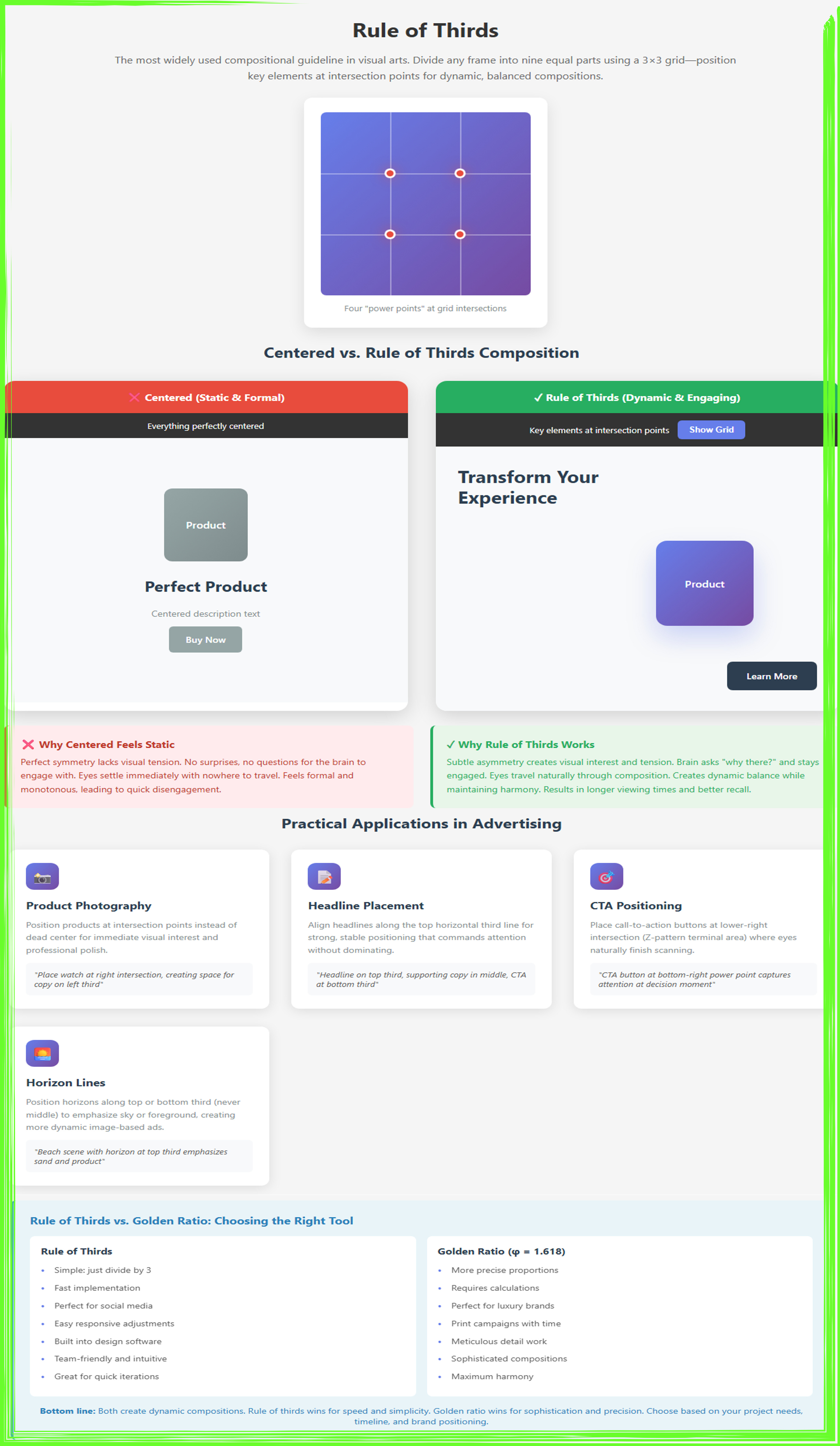
This interactive demonstration illustrates the rule of thirds compositional principle, which divides any frame into nine equal sections using a 3×3 grid. The header shows the basic grid structure with four pulsing red “power points” at line intersections where key elements should be positioned. The side-by-side comparison contrasts a static centered composition (left, using dull grays with all elements on the central axis) against a dynamic rule-of-thirds layout (right, with headline on the top third, product at the upper-right intersection, and CTA at the lower-right terminal point). Color-coded feedback boxes explain why centered compositions feel monotonous while off-center positioning creates engaging visual tension that increases viewing time. Four practical application cards demonstrate optimal positioning for product photography, headlines, CTAs, and horizon lines. The comparison table highlights when to use rule of thirds (simple, fast, ideal for social media and responsive design with built-in software support) versus golden ratio (precise, sophisticated, better for luxury brands and meticulous print campaigns). The interactive grid toggle reveals optimal placement strategies, showing how the rule of thirds provides an intuitive, quickly-implemented alternative to golden ratio calculations while still creating dynamic, balanced compositions that guide viewer attention through intentional asymmetry.
Root 2 Rectangle (√2 ratio - 1:1.414)
The root 2 rectangle, based on the mathematical ratio of 1 to the square root of 2 (approximately 1:1.414), represents one of design’s most practical yet underappreciated proportional systems. This ratio defines the A-series paper sizes used internationally (A4, A3, A2, etc.), which were specifically designed so that folding or cutting the paper in half maintains the same proportions. An A4 sheet is 210mm × 297mm, and when you fold it in half, you get A5 at 148mm × 210mm, the ratio remains constant. This mathematical property makes the root 2 rectangle exceptionally versatile for designs that need to scale across different formats or be printed at various sizes.
The aesthetic appeal of the root 2 rectangle lies in its balance between the golden ratio’s organic elegance and the perfect square’s stability. At 1:1.414, it’s slightly more elongated than a square but less stretched than golden ratio compositions. This makes it feel modern and clean while avoiding the potentially stuffy formality of perfect squares or the sometimes-exaggerated drama of golden ratio layouts. European designers particularly favor this proportion because of its connection to standard paper sizes, meaning designs created with root 2 proportions automatically fit perfectly into common print formats without requiring cropping or awkward scaling that can compromise the composition.
For advertising applications, the root 2 rectangle excels in situations requiring versatility across multiple formats. If you’re designing a campaign that needs to work as magazine ads, posters, flyers, and digital assets, starting with root 2 proportions provides a common framework that scales elegantly. Layout elements positioned according to this ratio maintain their relationships across different sizes, ensuring visual consistency throughout your campaign. This is particularly valuable for brand consistency, when consumers see your ad in a magazine, on a poster, and on their phone screen, the proportional relationships between your logo, headline, and imagery remain constant, reinforcing brand recognition.
Implementing the root 2 system in digital design requires slightly more conscious effort since screen dimensions don’t naturally follow these proportions. However, you can create root 2 containers within your digital layouts, using the ratio to determine the dimensions of key content areas, image crops, or card-based designs. For instance, if you’re designing a grid of product cards, making each card 300 pixels wide and approximately 424 pixels tall (300 × 1.414) creates that pleasing root 2 proportion. You can also use the ratio to determine the relationship between your hero section height and your content width, or between sidebar width and main content width. Like all mathematical systems, root 2 proportions work best when they serve your design goals rather than constraining them, but understanding this ratio adds another valuable tool to your proportional toolkit, particularly for projects with print components or international audiences accustomed to A-series formats.
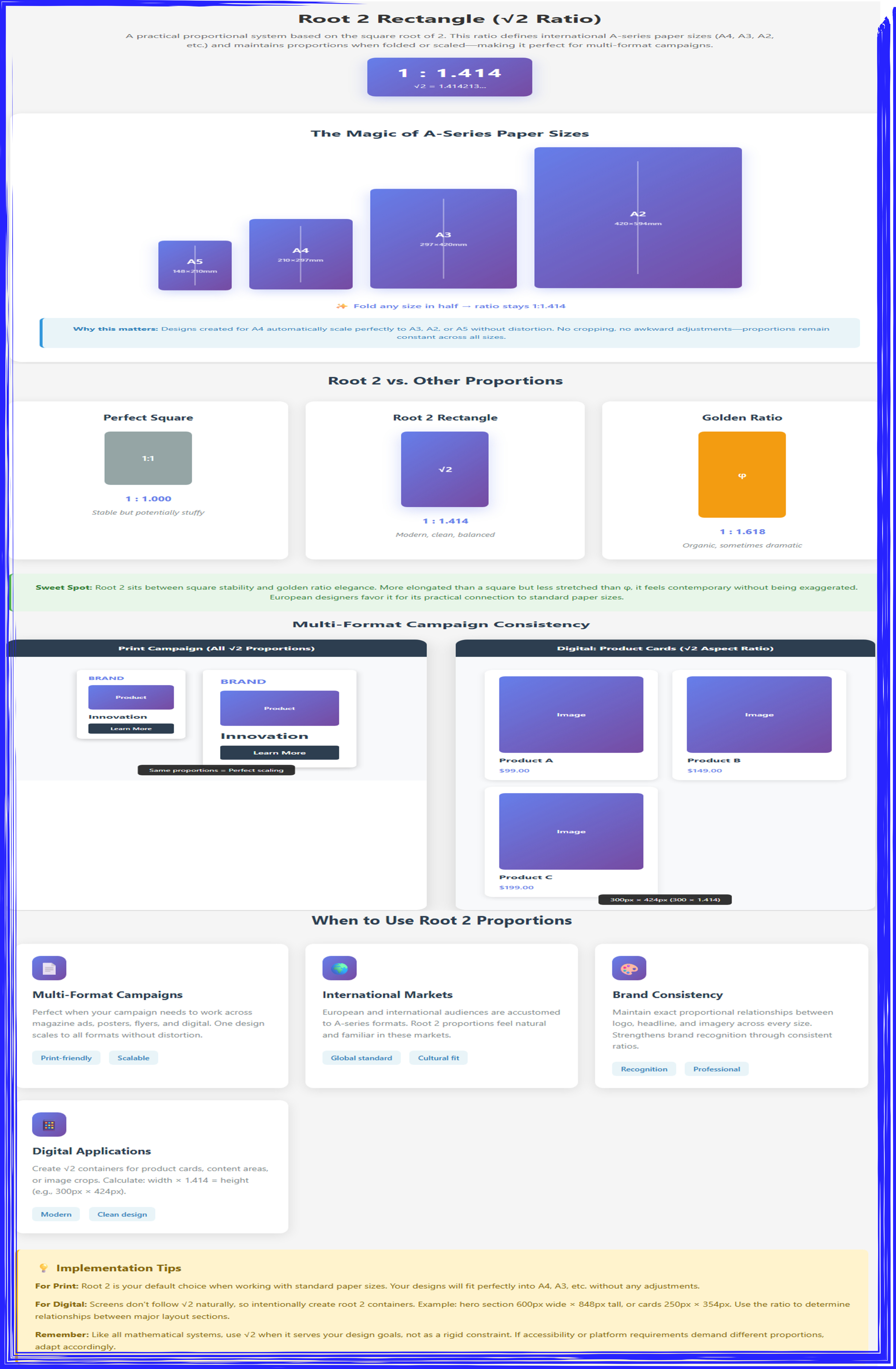
This demonstration illustrates the root 2 proportional system, defined by the ratio 1:1.414, which forms the basis of international A-series paper sizes. The animated paper demo shows A5 through A2 sheets with floating animations and vertical fold indicators, demonstrating the “magic” property where folding any size in half maintains the constant √2 ratio—ensuring designs scale perfectly across formats without distortion or cropping. The ratio comparison visualizes three proportional systems side-by-side: the perfect square (1:1, stable but potentially stuffy in gray), the root 2 rectangle (1:1.414, modern and balanced in purple gradient, positioned as the “sweet spot”), and the golden ratio (1:1.618, organic and dramatic in orange). Multi-format application demos show practical implementation through a print campaign (magazine ad and poster maintaining identical proportional relationships when scaled) and digital product cards (e-commerce grid using 300px × 424px cards calculated as width × 1.414). Four use case cards highlight optimal scenarios: multi-format campaigns (print-friendly and scalable), international markets (global A-series standard with cultural familiarity), brand consistency (maintaining exact proportional relationships across sizes for recognition), and digital applications (creating modern, clean √2 containers for content areas and cards). The implementation tips box provides practical guidance for both print (default choice for standard paper sizes) and digital (intentionally creating root 2 containers like 600px × 848px hero sections), while reminding designers to adapt the system when accessibility or platform requirements demand flexibility rather than treating it as a rigid constraint.
Part 3: Grid Systems & Spacing
The 8-Point Grid System
The 8-point grid system has become the de facto standard in modern interface design, and its principles apply equally well to advertising layouts. This system stipulates that all spacing and sizing should occur in multiples of eight pixels: 8, 16, 24, 32, 40, 48, and so on. While this might seem like an arbitrary constraint, the 8-point system offers profound practical benefits that solve many common design challenges. The number eight was chosen because it’s highly divisible (by 1, 2, 4, and 8), making it easy to create consistent subdivisions and scale designs across different screen densities and resolutions. Modern displays often use pixel density ratios of 2x or 4x, meaning that 8-point measurements scale perfectly without creating fractional pixels that can cause blurry rendering.
The psychological benefits of consistent spacing based on the 8-point grid are substantial. When humans view designs, our brains unconsciously seek patterns and consistency. Random spacing measurements like 7 pixels here, 19 pixels there, and 33 pixels somewhere else create subtle cognitive friction as our pattern-recognition systems fail to find order. Conversely, when all spacing follows a predictable rhythm of 8, 16, 24, 32 pixels, our brains recognize the pattern, and the design feels more organized and professional, even if viewers can’t articulate why. This consistency also speeds up the design process itself, as designers can make spacing decisions quickly without agonizing over whether an element needs 14 or 15 pixels of margin, it simply needs 16 (or 8, or 24).
Implementing an 8-point grid in advertising design starts with establishing your baseline spacing units. Your smallest spacing unit is 8 pixels, used for tight relationships like the gap between an icon and adjacent text, or between related form fields. 16 pixels creates medium separation, useful for spacing between unrelated elements in the same section. 24 or 32 pixels provides clear sectional breaks, signaling to viewers that they’re moving from one content block to another. 40, 48, or larger multiples create major divisions, such as the space between your hero section and your body content. By sticking to these increments, you ensure consistent visual rhythm throughout your design.
The 8-point system also provides a framework for element sizing, not just spacing. Buttons might be 32 or 40 pixels tall, input fields 48 pixels, and icon sizes 16, 24, or 32 pixels. When both the size of elements and the space between them follow the same proportional system, the entire design gains cohesion and feels intentionally crafted rather than arbitrarily assembled. Modern design tools like Figma, Sketch, and Adobe XD support 8-point grids natively, allowing you to snap elements to the grid and maintain consistency automatically. For responsive design, the 8-point system scales beautifully, as you can adjust spacing proportionally across breakpoints (using 16 pixels on mobile where you used 32 pixels on desktop, for example) while maintaining the rhythmic consistency that makes designs feel polished and professional.
This comprehensive infographic explains the 8-point grid system the modern standard for interface design and advertising layouts where all spacing and sizing uses multiples of 8 (8, 16, 24, 32, 40, 48, 56, 64...) to create consistent rhythm, scale perfectly across screen densities, and produce organized, professional designs. The top section outlines why 8 works mathematically through four advantages: highly divisible (8 ÷ 2 ÷ 2 ÷ 2 creates easy subdivisions), perfect scaling (aligns cleanly across 1x, 2x, and 3x pixel densities for retina displays), pattern recognition (brain detects consistent rhythms subconsciously), and speed and efficiency (no mental arithmetic required 8×3 simply becomes 24px). A visual divisibility diagram demonstrates how 8 ÷ 1 = 8 boxes, 8 ÷ 2 = 4 boxes, and 8 ÷ 4 = 2 boxes for flexible layout options. The middle comparison contrasts random spacing versus 8-point grid: the left “cognitive friction” panel shows five elements with arbitrary, inconsistent gaps (marked with red X’s) that create visual chaos and require constant deliberation, while the right “consistent rhythm” panel displays the same elements with uniform 8-point spacing (marked with green checks) producing predictable patterns, easier scanning, and professional polish. The 8-Point Spacing Scale section provides practical guidelines: tight spacing (8px) for closely related items like icon-text adjacency, medium separation (16-24px) for distinct but related elements, sectional breaks (24-32px) for major content divisions with labeled examples, and major divisions (40-64px) separating hero sections from body content with comprehensive labeling. The bottom Practical Application demonstrates a complete advertisement using 8-point grids throughout, with a toggle button to show/hide grid lines, displaying proper element spacing (8px), section breaks (24px), and page margins (32px) across both desktop and mobile views proving that mathematical precision creates designs that feel organized, professional, scalable, and effortlessly harmonious.
Safe Zones and Bleed Areas
Safe zones and bleed areas represent critical technical concepts that separate amateur designs from professional print-ready advertising. The safe zone is the area where you must keep all essential content, including text, logos, and call-to-action elements, to ensure they won’t be accidentally cropped during printing or display. The bleed area extends beyond the actual trim size of your ad, typically 3-5mm on all sides for print, providing a safety margin so that background colors or images can extend to the edge without risk of white gaps appearing if the cutting is slightly misaligned. Understanding and properly implementing these zones prevents costly reprints and ensures your designs look professional across all media.
The physical realities of printing necessitate these zones. Commercial printing involves large sheets with multiple pieces that get cut apart, and cutting machines, while precise, have tolerances measured in millimeters. If your background color or image stops exactly at the intended edge of your ad, even a tiny misalignment in cutting creates a thin white line where the paper shows through. By extending your background into the bleed area, you guarantee that even with slight cutting variance, your ad will still look intentional and complete. Similarly, if you position text or logos too close to the trim edge, cutting tolerances might clip them, making text harder to read or cutting off part of your logo. The safe zone prevents this by keeping critical elements safely away from dangerous edges.
For digital advertising, safe zone principles remain relevant despite the absence of physical cutting. Different platforms crop images differently depending on device and placement. A Facebook ad might display full-width on desktop but get cropped on mobile devices. Instagram posts appear square in feed but might display in portrait orientation in stories. Email clients render images with varying amounts of the original visible depending on display width and user settings. By keeping your essential content within a safe zone, typically 5-10% away from all edges, you ensure that regardless of how and where your ad displays, the message remains intact and legible. This is particularly crucial for text overlays on images, as partially cropped text can completely change meaning or become unreadable.
Implementing safe zones and bleeds requires planning during the design phase rather than as an afterthought. Start by setting up your document at the correct bleed size, which means your canvas will be larger than the final trim size. In your design software, create guides that show both the trim line (where the piece will be cut) and the safe zone (where important content must stay). Design your backgrounds, patterns, and edge-to-edge images to extend all the way into the bleed area, ensuring continuous coverage. Position all text, logos, buttons, and critical graphics comfortably within the safe zone. Most professional printers provide specific templates showing their required bleed and safe zone measurements, always work from these specifications rather than guessing. For digital work, create your ads at the platform’s specified dimensions, then mentally treat the outer 5-10% as a buffer zone where you avoid placing crucial elements. This disciplined approach ensures your carefully crafted designs survive the transition from screen to final output without unpleasant surprises.
This educational infographic compares safe zones and bleed areas across print and digital advertising design, illustrating essential technical principles that prevent costly production errors. The Print Design panel (left) demonstrates the three-zone system critical for professional print production: the bleed area (red shaded region) extends 3-5mm beyond the final dimensions to prevent white edges from appearing due to cutting variance during the trimming process, the trim line (black dashed border) marks where the printed piece will be physically cut, and the safe zone (green shaded area) indicates where all text, logos, and critical elements must be positioned to avoid accidental cropping with backgrounds intentionally extending to the bleed edge while important content stays within safe margins. The Digital Design panel (right) adapts these concepts for screen-based platforms: the full canvas (blue shaded area with orange dashed border) represents platform-specified dimensions, the variable crop zone (orange dashed boundary) shows where different devices, aspect ratios, and social media placements may crop the image differently across mobile, tablet, and desktop displays, and the safe zone (green shaded area, typically 5-10% from all edges) marks where critical elements should be positioned to ensure visibility across all contexts and avoid platform-specific cropping. The bottom Key Implementation Points section provides four color-coded principles: extend backgrounds into bleed areas (red), keep essential content within safe zones (green), account for platform-specific crops across devices (blue), and establish guides from printer/platform specifications at the project’s start rather than as an afterthought (orange). The yellow warning box emphasizes the professional tip to always request printer specifications and platform requirements before beginning design work, preventing expensive reprints or content loss from improper zone management making this technical knowledge essential for designers creating advertisements destined for both physical printing and digital distribution.
Platform-Specific Aspect Ratios
The fragmented digital landscape means that modern advertisers must design for dozens of different platforms, each with its own preferred image dimensions and aspect ratios. Instagram favors 1:1 squares and 4:5 portraits, Facebook works best with 1.91:1 horizontal formats, Stories demand 9:16 vertical compositions, LinkedIn prefers horizontal images, and display ad networks have their own specifications. Understanding these platform-specific requirements isn’t just about technical compliance, it’s about respecting how users consume content on each platform and ensuring your message displays optimally rather than awkwardly cropped or letterboxed with empty space.
The aspect ratio you choose fundamentally affects your composition and storytelling. A 1:1 square Instagram post creates an intimate, focused feeling, perfect for product photography or simple, centered compositions. The square format forces you to work with roughly equal vertical and horizontal space, which naturally leads to balanced, symmetrical designs or close-cropped imagery. Conversely, a 1.91:1 Facebook horizontal format gives you wide cinematic space, ideal for landscape imagery, group shots, or designs where you want elements arranged left-to-right across the frame. The 9:16 vertical format of Instagram and Facebook Stories creates tall, immersive compositions that fill mobile screens completely, perfect for step-by-step tutorials, before-and-after sequences arranged vertically, or designs that guide eyes from top to bottom.
Designing effectively for multiple platforms requires strategic thinking rather than simply resizing the same composition. The most professional approach involves creating a primary design at your hero platform’s ideal dimensions, then thoughtfully adapting rather than merely cropping for other platforms. This might mean repositioning key elements, adjusting text sizes for readability, or even reconsidering the composition entirely. For instance, if you design a landscape Facebook ad with text positioned on the left and a product image on the right, simply cropping to Instagram’s square format might cut off the text entirely. Instead, you’d want to create a square version where text moves above or below the product, maintaining readability while adapting to the new format.
Systematic workflow processes help manage multi-platform design efficiently. Start by identifying all the platforms and placements where your ad will run, and list the ideal dimensions for each. Design your primary version for your most important platform, keeping in mind how it might adapt to others. Use layers or artboards in your design software to create versions for each platform, maintaining consistent branding elements (colors, fonts, logo treatment) while adjusting composition for each format. Many designers create “safe zones within safe zones,” positioning the most critical elements in an area that will remain visible across all formats, while allowing less critical elements to extend into areas that might be cropped in some versions. Smart asset organization, clear naming conventions, and template systems prevent chaos when managing multiple versions. Remember that while creating multiple versions requires more work upfront, it ensures your message displays optimally everywhere, which dramatically improves campaign performance compared to forcing a single composition across incompatible formats.
This comprehensive infographic educates designers on platform-specific aspect ratios and strategic adaptation workflows for cross-platform advertising campaigns. The Common Platform Formats section displays seven major social media specifications with color-coded rectangles showing actual proportions: Instagram Feed (1:1 square, 1080×1080), Instagram Post (4:5 portrait, 1080×1350), Facebook Feed (1.91:1 horizontal, 1200×628), Stories (9:16 vertical, 1080×1920), LinkedIn Post (1.91:1 horizontal, 1200×627), YouTube (16:9 widescreen, 1280×720), and Pinterest Pin (2:3 portrait, 1000×1500), with each labeled by orientation, dimensions, and use case. The How Aspect Ratio Affects Composition section illustrates three fundamental layout approaches: square format (1:1) favors centered focus and balanced design, horizontal format (1.91:1) enables left-right layout and cinematic storytelling, while vertical format (9:16) follows top-to-bottom flow optimized for mobile-first immersion. The Strategic Adaptation Workflow provides a four-step process using numbered blue circles: (1) identify all platforms and document ideal dimensions, (2) design a hero version for the key platform considering how it will adapt to others, (3) adapt rather than simply crop by repositioning elements for each format and adjusting text sizes for readability, and (4) maintain brand consistency by keeping colors, fonts, and logo treatment consistent while adapting composition to preserve identity. The Adaptation: Wrong vs Right comparison contrasts lazy execution against thoughtful redesign: the wrong approach (marked with red X) shows simple cropping that cuts off critical product imagery when converting from horizontal to square format, while the right approach (marked with green checkmark) demonstrates thoughtful repositioning where the product remains fully visible and text is adjusted for the new dimensions. The Professional Insight box emphasizes the “safe zones within safe zones” strategy—keeping the most critical elements in an area visible across ALL formats while allowing less critical elements to extend into format-specific zones, acknowledging that multiple versions require more work but ensure optimal display everywhere, preventing the common mistake of designing for one platform and discovering critical content gets cropped on others.
Part 4: Color Theory for Advertising
Color Psychology and Emotional Triggers
Color operates as one of advertising’s most powerful psychological tools, capable of evoking emotions, triggering memories, and influencing decisions before viewers consciously process your message. This power stems from both biological wiring and cultural conditioning. Humans evolved to respond to color signals in nature, where red fruits against green foliage indicated food sources, blue sky and water suggested resources and safety, while yellow and black patterns warned of dangerous insects. These evolutionary associations persist in modern psychology, with red still triggering arousal and urgency, blue evoking calm and trust, and yellow capturing attention while suggesting caution or optimism depending on context.
Different colors trigger distinctly different psychological responses that smart advertisers leverage strategically. Red increases heart rate and creates feelings of excitement, urgency, passion, and energy, which explains its dominance in clearance sales, sports brands, and food advertising where appetite stimulation matters. Blue generates feelings of trust, stability, professionalism, and calm, making it the color of choice for banks, insurance companies, healthcare providers, and technology companies seeking to communicate reliability. Green connects to nature, growth, health, and sustainability, perfect for organic products, environmental causes, and wellness brands. Yellow radiates optimism, youth, and attention-grabbing brightness, though too much can become overwhelming or suggest caution. Purple communicates luxury, creativity, and spirituality, often appearing in beauty products and premium services.
Cultural context significantly modifies color meanings, requiring research when advertising across different regions. White signifies purity and cleanliness in Western cultures, making it popular for healthcare and wedding-related advertising, but represents mourning and death in many Asian cultures. Red means luck and prosperity in China but can signal danger or debt in Western contexts. Purple suggests royalty and luxury in Western markets but can have negative or mourning-related connotations elsewhere. Understanding these cultural variations prevents embarrassing miscommunications and allows you to leverage positive associations while avoiding negative ones. Global brands often adapt color schemes for different markets, showing the same product in region-appropriate colors or adjusting background treatments while maintaining overall brand recognition.
Applying color psychology effectively requires matching color choices to your specific advertising goals and audience expectations. If you’re promoting a limited-time sale and want to create urgency, red and orange backgrounds with high-contrast elements push viewers toward action. If you’re building trust for a new financial service, blues and grays communicate stability and professionalism. If you’re advertising organic food products, earth tones and greens activate associations with nature and health. However, avoid being so predictable that your ads become generic. Sometimes strategically unexpected color choices create memorability, a tech company using warm, friendly oranges instead of predictable blues, or a luxury brand using bold reds instead of expected blacks and golds. The key is intentionality, understanding what response each color typically generates, then consciously deciding whether to leverage or subvert those expectations based on your strategic goals.
This comprehensive infographic educates advertisers on color psychology principles and strategic color selection for maximum campaign effectiveness. The Core Color Responses section (left) catalogs seven fundamental colors with their psychological triggers and recommended applications: Red (excitement, urgency, passion, energy—increases heart rate and appetite, best for sales, food, and sports), Blue (trust, stability, professionalism, calm—creates feelings of security and reliability, best for finance, tech, and healthcare), Green (nature, growth, health, sustainability—evokes environmental and wellness connections, best for organic, eco, and wellness brands), Yellow (optimism, youth, attention, caution—highly visible but can overwhelm in excess, best for youth brands and warnings), Purple (luxury, creativity, spirituality, royalty—communicates premium quality and imagination, best for beauty, luxury, and creative industries), Orange (enthusiasm, friendliness, confidence, warmth—combines red’s energy with yellow’s happiness, best for CTAs, fun brands, and food), and Black/Gray (sophistication, power, elegance, neutrality—timeless and professional, adds contrast, best for luxury, tech, and professional services). The Cultural Context Matters section (right) warns that color meanings shift dramatically across cultures, providing critical examples: White means purity and cleanliness in Western contexts but represents mourning, death, and funerals in Asian cultures; Red signifies luck, prosperity, and celebration in China but danger, debt, and warning in Western contexts; Purple conveys royalty, luxury, and creativity in the West but mourning and sadness in some regions; Yellow represents happiness, caution, and optimism in the West but is considered sacred and imperial in some regions; Green globally signals nature, growth, and environmental values but indicates infidelity or jealousy in some regions. The Strategic Application: Match Color to Goal section provides four scenario-based recommendations: for Urgency/Action campaigns (limited-time sales, CTAs, clearances), use red, orange, and high contrast to create excitement and drive action; for Trust/Stability messaging (financial services, healthcare, B2B), use blue, gray, and clean whites to build confidence and reliability; for Health/Nature positioning (organic products, wellness, eco-friendly), use green, earth tones, and natural palettes to activate environmental associations; for Luxury/Premium branding (high-end products, beauty, exclusivity), use purple, black, gold, and deep colors to communicate sophistication and value. The bottom Golden Rule of Color Strategy emphasizes intentionality over convention: understand what response each color typically generates, then consciously decide whether to leverage or subvert those expectations—predictable color choices ensure clarity but risk being generic, while strategic unexpected choices create memorability, such as a tech company using warm oranges instead of corporate blues, or a luxury brand using bold reds instead of expected blacks and golds. The final guidance recommends testing color variations with target audiences to validate psychological impact before full campaign launch, ensuring colors resonate appropriately across different cultural contexts and demographic segments.
The 60-30-10 Color Rule
The 60-30-10 color rule provides a foolproof formula for creating balanced, professional color schemes that avoid both monotony and chaos. This interior design principle, which translates perfectly to advertising, stipulates that 60% of your design should use a dominant color, 30% should use a secondary supporting color, and 10% should use an accent color for highlights and calls-to-action. This proportion creates visual harmony by establishing clear hierarchy among colors while ensuring enough variety to maintain interest. The formula works because it mirrors how humans naturally process visual information, seeking both pattern recognition (the dominant 60%) and points of interest (the accent 10%) within an organized framework.
The 60% dominant color typically serves as your background or foundational element, establishing the overall mood and connecting to your brand identity. For many ads, this might be white or a light neutral that creates clean, professional space while ensuring text readability. For brands with strong color identities, the dominant color might be their signature hue used as a background wash or in large graphic elements. The key is that this color should support rather than compete with your message, it creates the stage rather than demanding to be the star. This dominant color establishes immediate brand recognition and sets the emotional tone for the entire piece, whether that’s calm and trustworthy (blues), energetic and bold (reds), or natural and organic (greens).
The 30% secondary color provides visual interest and helps organize information without overwhelming the composition. This color often appears in secondary text, supporting graphics, borders, sections, or medium-sized visual elements. It should complement your dominant color while providing enough contrast to create clear visual separation. If your dominant color is a cool blue, your secondary might be a warm gray or a lighter tint of the blue. If you’re using white as your dominant color, your secondary might be your brand’s primary color used for headers, blocks, or shapes. This secondary color creates rhythm and structure, helping viewers parse different sections and understand the relationship between elements without introducing so much variety that the design feels chaotic or unfocused.
The 10% accent color delivers the punch, drawing attention to your most important interactive elements like call-to-action buttons, special offers, or key statistics. This accent should contrast strongly with both your dominant and secondary colors, creating unmistakable focal points that guide viewer actions. Many designers choose complementary colors (opposite on the color wheel) for maximum contrast. If your dominant palette uses blues and grays, your accent might be orange or yellow. If you’re working with greens, a red or pink accent creates drama. The restraint of limiting this bold accent to just 10% of your design ensures it remains special and attention-grabbing rather than becoming overwhelming noise. Every time viewers see that accent color, they should immediately understand “this is important, pay attention here.”
Implementing the 60-30-10 rule requires measuring approximate visual weight rather than exact pixel counts. You don’t need to calculate that precisely 60% of pixels are blue, but rather that blue dominates the overall visual impression. Use your design software’s layer opacity or color fill tools to block out major areas and assess whether the proportions feel balanced. If your accent color seems to be everywhere, reduce it and strengthen your focus. If your design feels flat and monotonous, you might need to increase your secondary color’s presence or make your accent more bold. Like all design rules, 60-30-10 serves as a guideline rather than a rigid law. Some designs might work better at 70-20-10 or 50-30-20, but the principle of establishing clear color hierarchy through proportional allocation remains universally valuable for creating cohesive, professional advertising that guides viewers effectively.
This infographic presents the 60-30-10 color rule a foolproof formula for creating balanced, professional color schemes in advertising design. The Formula Visualized section (top left) displays the proportional relationship through scaled rectangles: a large blue block representing 60% dominant color, a medium blue block showing 30% secondary color, and a small coral block indicating 10% accent color, making the hierarchy immediately clear through size differentiation. The Role of Each Color section (top right) explains the strategic function of each proportion: the 60% Dominant color (blue circle) serves as the foundation that sets overall mood and establishes brand identity, typically appearing as backgrounds or largest visual elements, creating the stage without demanding to be the star; the 30% Secondary color (lighter blue circle) provides visual interest and organizes information, appearing in headers, sections, borders, and supporting graphics, complementing the dominant color while creating clear separation and structure; the 10% Accent color (coral circle) delivers the punch by drawing attention to CTAs, offers, and key statistics, contrasting strongly with other colors while maintaining restraint to preserve its attention-grabbing power and special status. The Application Examples section demonstrates four real-world implementations: Tech Company Ad uses 60% light blue background (trust, innovation), 30% medium blue section (structured information), and 10% red accent CTA button (urgency); Organic Product Ad employs 60% light green background (natural, eco-friendly), 30% medium green section (health focus), and 10% yellow accent CTA (optimism, action); Luxury Fashion Ad leverages 60% black background (sophistication, elegance), 30% charcoal section (premium quality), and 10% gold accent CTA (luxury, exclusivity); Healthcare Service Ad utilizes 60% white background (cleanliness, trust), 30% light blue section (calm, professionalism), and 10% teal accent CTA (wellness, action). The Implementation Tips box (bottom) provides practical guidance with four key points: measure visual weight rather than exact pixels by assessing if proportions feel balanced rather than calculating precisely; use complementary colors (opposite on the color wheel) for the 10% accent to create maximum contrast and impact; if design feels flat, increase secondary color presence, or if accent seems everywhere, reduce it to strengthen focus; and emphasizes that it’s a guideline, not a law some designs work at 70-20-10 or 50-30-20, but the principle of establishing clear visual hierarchy through proportional color distribution remains key to preventing chaotic, unprofessional color schemes where every element competes equally for attention.
Contrast for Readability and Attention
Contrast represents the difference in visual properties that makes an element distinguishable from its surroundings, and it’s perhaps the single most important factor determining whether your ad gets read or ignored. Insufficient contrast makes text difficult or impossible to read, forcing viewers to strain or simply move on to easier content. Excessive or improperly used contrast creates visual chaos where everything screams for attention and nothing receives it. Mastering contrast means understanding how to use differences in color, value, size, shape, and texture to create clear hierarchies that guide viewers effortlessly through your message while ensuring every element remains accessible and legible.
Color contrast, the most obvious form, relies on the difference between hue and value (lightness/darkness). Light text on dark backgrounds or dark text on light backgrounds creates the fundamental contrast needed for legibility. However, not all color combinations work equally well. Yellow text on white backgrounds fails despite being different hues because they have similar values, they’re both light. Similarly, dark blue text on black backgrounds struggles because both values are dark. The Web Content Accessibility Guidelines (WCAG) specify minimum contrast ratios: 4.5:1 for normal text and 3:1 for large text (18pt or larger). Tools like contrast checkers help verify your color combinations meet these standards, ensuring your ads remain readable for viewers with visual impairments or viewing in challenging conditions like bright sunlight on mobile screens.
Beyond simple legibility, strategic contrast creates visual hierarchy and guides attention. Your headline should have stronger contrast against the background than your body copy, making it more prominent and ensuring viewers see your main message first. Call-to-action buttons need maximum contrast to stand out as interactive elements distinct from passive content. This might mean using a bright accent color against a neutral background, or ensuring buttons have clear borders and shadows that separate them from surrounding elements. Similarly, hero images should contrast with text overlays, sometimes requiring semi-transparent gradient overlays that darken or lighten portions of images to ensure text remains readable regardless of the underlying imagery.
Size, weight, and spatial contrast work alongside color contrast to create comprehensive visual hierarchies. A large, bold headline creates contrast with smaller, regular-weight body text not through color but through scale and weight. Tight letter spacing in headlines contrasts with generous line spacing in body copy. Dense sections of content contrast with generous white space. These non-color contrasts prove especially important for accessible design, as they ensure hierarchy remains clear even for viewers with color blindness. The most effective ads layer multiple types of contrast: size, weight, color, and spatial contrast all working together to create unmistakable hierarchies. Test your designs by converting them to grayscale if the hierarchy still works without color, you’ve built solid contrast structure. If elements become indistinguishable in grayscale, you’re relying too heavily on color alone and need to strengthen other contrast types to ensure accessibility and clarity across all viewing conditions.

This comprehensive infographic educates designers on using contrast strategically to create clear visual hierarchies, guide viewer attention, and ensure accessibility in advertising. The Color Contrast: Good vs Bad section (top left) provides six practical examples with contrast ratios and WCAG compliance: good examples include black on white (21:1 ratio, AAA compliant), white on blue (8.6:1 ratio, AAA compliant), and dark on light gray (14.8:1 ratio, AAA compliant), marked with green checkmarks; poor examples include yellow on white (1.4:1 ratio, fails WCAG), blue on black (2.4:1 ratio, fails WCAG), and gray on gray (1.8:1 ratio, fails WCAG), marked with red X’s to demonstrate unreadable combinations that exclude users with visual impairments or viewing in challenging conditions. The WCAG Contrast Standards box (top right) specifies minimum contrast ratios of 4.5:1 for normal text under 18pt and 3:1 for large text 18pt+ or bold 14pt+, explaining these standards ensure readability for viewers with visual impairments, maintain legibility in challenging conditions like bright sunlight or mobile screens, meet accessibility requirements and legal standards, and improve overall user experience and message comprehension. The Strategic Contrast Creates Visual Hierarchy demonstration (middle left) shows an advertisement with labeled contrast levels: “Summer Sale Event” headline (strongest/maximum contrast), “Up to 50% Off Select Items” subheading (high contrast), descriptive body copy (medium contrast), product image area with overlay (medium contrast), and red “Shop Now” CTA button (maximum contrast), illustrating how varying contrast levels guide the eye through content in intentional sequence from most to least important elements. The Multiple Types of Contrast section (middle right) identifies four contrast categories that should be layered for maximum effect and accessibility: Color Contrast (blue box with circle icon) created through differences in hue and value between light and dark; Size Contrast (orange box with “A” icon) achieved through large headlines versus small body text; Weight Contrast (green box with “Bd” icon) produced by bold or regular versus light font weights; and Spatial Contrast (red box with square icon) generated through dense content versus generous white space. The Grayscale Test section (bottom) provides a critical validation method: convert your design to grayscale if hierarchy remains clear in grayscale with all color removed, you’ve built solid contrast through value differences rather than relying solely on color; the side-by-side comparison shows a “Special Offer” ad that maintains clear hierarchy in both color version (blue background) and grayscale test (gray tones), proving the design works for colorblind users and in low-color environments. The bottom reminder emphasizes the balance: insufficient contrast makes ads unreadable and excludes audiences, while excessive contrast creates visual chaos master the balance by layering multiple contrast types including color, size, weight, and spatial relationships that work together for all viewers in all conditions, ensuring no user is left behind due to preventable accessibility failures.
Creating Effective Color Palettes
Building an effective color palette for advertising requires balancing aesthetic appeal with practical functionality, brand consistency with creative freshness, and personal preference with psychological impact. A well-crafted palette becomes a powerful asset that ensures brand recognition while providing enough flexibility to create diverse campaigns without starting from scratch each time. Professional designers typically develop palettes containing a primary brand color, 2-3 secondary colors for variety and different moods, several neutral colors for backgrounds and text, and designated accent colors for calls-to-action and highlights.
The foundation of any advertising color palette starts with your brand colors, which should already be established through your logo and brand guidelines. These colors carry equity and recognition that you’ve built over time, so they must feature prominently in your advertising palette. However, brand colors alone rarely provide enough variety for diverse campaign needs. Extend your palette by selecting complementary colors that harmonize with your brand colors while providing additional options. Use color theory principles: analogous colors (adjacent on the color wheel) create harmonious, cohesive palettes that feel calm and unified. Complementary colors (opposite on the color wheel) create vibrant, high-energy combinations with maximum contrast. Triadic colors (evenly spaced around the wheel) offer balanced variety with plenty of creative options.
Practical palette development requires thinking about specific use cases. Your palette needs colors that work for backgrounds, both light and dark options to ensure text readability in different contexts. It needs colors for text, typically including true black or very dark gray, medium gray for secondary text, and light gray for deemphasized content. It needs interactive element colors for buttons, links, and hover states that stand out clearly from passive content. It needs semantic colors for success states (often green), warnings (often yellow or orange), and errors (often red), even if these aren’t your preferred brand colors, because users expect these conventional signals. Organize your palette with clear naming conventions and usage guidelines so team members understand which colors serve which purposes.
Testing your palette across different contexts ensures it works in practice, not just in theory. Create mockups of ads in different formats and platforms. Does your palette work on both white and colored backgrounds? Do your accent colors maintain sufficient contrast with your brand colors? Can you create visually distinct campaigns within your palette without feeling repetitive? Does the palette work in both light mode and dark mode contexts? Test accessibility using contrast checkers to verify text remains legible in all combinations. Consider how your colors appear on different devices and screens, as colors can shift significantly between the designer’s calibrated monitor and viewers’ smartphones. Document your palette thoroughly with hex codes, RGB values, CMYK values for print, and usage guidelines, creating a resource that maintains consistency across designers, campaigns, and years. A well-designed palette becomes a long-term asset that simplifies decision-making, speeds up production, and strengthens brand consistency across all touchpoints.
Comprehensive framework for developing versatile, brand-consistent color palettes for advertising campaigns. The top panel illustrates the four essential palette components: primary brand color (single identity color), secondary colors (2-3 colors for variety and mood), neutrals (multiple shades for backgrounds and text), and accents (high-contrast colors for calls-to-action). The second row demonstrates three color theory approaches for palette extension—analogous (adjacent colors creating harmonious cohesion), complementary (opposite colors producing vibrant contrast), and triadic (evenly-spaced colors offering balanced variety)—each with visual color demonstrations and recommended applications. The middle section presents four practical use case categories showing specific color requirements for backgrounds (light/neutral/dark options), text hierarchy (primary/secondary/deemphasized), interactive elements (buttons, hover states, links), and semantic states (success/warning/error indicators). The testing panel provides a dual-column checklist covering essential validation requirements across multiple formats and devices alongside documentation standards including color values (HEX, RGB, CMYK), naming conventions, and usage guidelines. The bottom panel displays a complete professional documentation example for a fictional “TechCorp” brand, showing fully specified colors with their technical values, descriptive names, usage guidelines, a complete neutral scale, and application examples demonstrating the palette in both bold and professional advertising contexts.
Part 5: Typography That Converts
Font Selection & Pairing
Typography serves as one of advertising’s most underestimated power tools, capable of completely transforming how messages are received and whether they’re read at all. The fonts you choose communicate personality, establish hierarchy, and affect readability in ways that either support or undermine your message. A financial services ad in a whimsical script font immediately loses credibility, while a children’s toy ad in formal serif typography feels stiff and unapproachable. Font selection must balance aesthetic appeal with functional readability, brand personality with accessibility, and creative expression with professional polish. Getting typography right often means the difference between ads that get read and ads that get ignored.
Serif fonts, featuring small decorative strokes or “feet” at the ends of letters, carry associations with tradition, authority, reliability, and formality. Classic serifs like Times New Roman, Garamond, or Baskerville appear in newspapers, legal documents, and academic publications, lending advertising a sense of established credibility. Luxury brands often use refined serifs to communicate heritage and quality. However, serif fonts can feel dated or stuffy if not chosen carefully, and they sometimes reduce readability at small sizes or on low-resolution screens. Modern designers often use serifs selectively for headlines while choosing sans-serifs for body copy, gaining the authoritative feel of serifs without sacrificing readability.
Sans-serif fonts, lacking the decorative strokes of serifs, project modernity, clarity, simplicity, and approachability. Helvetica, Arial, Futura, and their many descendants dominate contemporary advertising because they read clearly at any size, work well on screens, and communicate a clean, forward-thinking aesthetic. Tech companies overwhelmingly prefer sans-serifs for their association with innovation and simplicity. However, sans-serifs can sometimes feel cold or impersonal, and overuse of common fonts like Arial makes ads blend into generic corporate communication. Distinctive sans-serifs like Brandon Grotesque, Proxima Nova, or custom typefaces help brands stand out while maintaining clarity and contemporary feel.
Font pairing, combining multiple typefaces in a single design, creates visual interest and hierarchy while requiring careful attention to ensure harmony rather than conflict. The classic pairing combines a serif headline font with a sans-serif body font, leveraging the visual interest and personality of serifs for short, impactful headlines while using the superior readability of sans-serifs for longer text. Alternatively, pairing two weights or styles of the same font family (thin and bold, regular and italic) creates hierarchy through variation while maintaining consistency. When pairing different font families, look for contrast in personality while maintaining similar proportions and x-heights (the height of lowercase letters). Avoid pairing fonts that are too similar, as they create confusion about whether variation was intentional. Avoid pairing fonts that clash in personality, like combining a playful script with a serious corporate sans-serif. Most professional designs limit themselves to 2-3 font families maximum, creating hierarchy through size, weight, and color rather than introducing additional typefaces.

Comprehensive guide to strategic font selection and pairing for advertising effectiveness. The top panels compare serif and sans-serif font categories side-by-side, displaying structural differences with annotated letterforms, personality associations, common examples, ideal use cases, and cautionary notes about potential drawbacks (serifs appearing dated on screens; sans-serifs feeling impersonal). The middle section demonstrates three effective pairing strategies through live typographic examples: the classic serif headline with sans-serif body copy combination, same-family weight variations creating hierarchy, and contrasting distinct personalities while maintaining similar proportions. The pairing rules panel provides a dual-column reference of five essential “do” practices (create clear contrast, match x-heights, limit font families) highlighted in green and five critical “don’t” mistakes (pairing similar fonts, mixing clashing personalities, sacrificing readability) marked in red. The bottom comparison panels present three advertisement mockups illustrating poor pairing (two similar serifs without hierarchy) versus two successful approaches (serif-sans combination and weight-based hierarchy), with explanatory captions clarifying why each pairing succeeds or fails.
Size & Hierarchy
Typographic hierarchy uses size, weight, and other visual properties to establish clear relationships between different text elements, ensuring viewers understand what’s most important and in what order to read content. Without clear hierarchy, ads become walls of same-sized text where nothing stands out and everything competes equally for attention, virtually guaranteeing that nothing gets read. Effective hierarchy makes critical information impossible to miss while supporting elements remain available but secondary. The challenge lies in creating sufficient differentiation to make hierarchy unmistakable without creating such extreme variations that the design feels chaotic or unprofessional.
The Size Contrast Ratio principle stipulates that your headline should be at least 2-3 times larger than your body text, creating immediate visual differentiation that ensures the headline gets noticed first. If your body copy is 14 points, your subheadline might be 21 points, and your main headline could be 34-42 points, using Fibonacci-based scaling to create proportional relationships. This dramatic size difference communicates importance without words, viewers understand implicitly that larger text matters more. However, size alone doesn’t create hierarchy effectively. A 72-point headline in a light typeface might carry less visual weight than 48-point text in a heavy bold weight. Combine size with weight, color, and positioning for comprehensive hierarchy that works across different contexts.
Font weight, from thin to heavy variations within a typeface family, provides a powerful hierarchy tool that works independently or alongside size variations. Your headline might use bold or black weights (700-900 in CSS terms) to command attention, while subheadlines use medium weight (500-600) for prominence without overwhelming, and body copy uses regular or book weight (400) for comfortable extended reading. This weight differentiation creates clear hierarchy even when size constraints limit variation. Small-format ads like social media posts or mobile banners particularly benefit from weight-based hierarchy, where you might not have room for dramatically different sizes but can still achieve clear differentiation through bold headlines and regular body text.
Call-to-action text requires special hierarchical consideration because it serves a unique purpose: prompting immediate action. CTA text needs to be prominent enough to be noticed and clearly interactive, but not so overwhelming that it dominates the entire ad at the expense of your value proposition. Typically, CTA button text sits between body copy and headline size, large enough to be clearly readable and actionable but subordinate to your main message. The button’s visual treatment, color, shape, and positioning carries as much hierarchical weight as text size. A medium-sized text in a bright, contrasting button with clear hover states and generous padding can achieve perfect hierarchy: noticeable enough to prompt action, integrated enough not to feel like a disconnected element shouting at viewers to click without understanding why they should.

Strategic use of typographic size and weight to establish clear visual hierarchies in advertising. The top comparison panels contrast poor hierarchy (all 16pt text with no differentiation) against effective hierarchy (42pt headline, 24pt subheadline, 14pt body copy), demonstrating how size variation creates natural eye flow and clear entry points. The size contrast ratio section illustrates the 2-3× scaling principle with annotated measurements showing proportional relationships between headline, subheadline, and body text, alongside Fibonacci-based scaling examples (72-48-32-21-14pt) that create harmonious visual relationships. The font weight panel demonstrates how weight variations (900 black, 600 semibold, 400 regular) create hierarchy independently of size differences, with a visual weight scale showing the progression from black to regular weights. The call-to-action positioning section presents three comparative examples showing CTA buttons that are too small (gets lost), properly sized (achieves balance), and too large (overwhelms the message), accompanied by a five-point design checklist covering optimal size ranges (16-20pt), contrast requirements, padding considerations, appropriate weight selections, and strategic positioning for maximum effectiveness.
Spacing & Readability
Typography spacing, encompassing letter spacing (kerning/tracking), line spacing (leading), and word spacing, fundamentally determines whether text gets read or abandoned. Proper spacing creates comfortable reading rhythms that allow viewers to process information effortlessly, while poor spacing forces readers to work harder, leading to eye strain, confusion, and eventual disengagement. Professional designers understand that spacing is not empty void waiting to be eliminated, but rather an active participant in communication that can make identical text either pleasant or painful to read. Mastering spacing requires understanding both technical specifications and aesthetic judgment about what feels comfortable and appropriate for each context.
The Line Length Rule addresses one of readability’s most critical factors: how many characters appear in each line of text. Research consistently shows that optimal line length for comfortable reading ranges from 50-75 characters per line, which roughly translates to 8-12 words. Lines shorter than this feel choppy, forcing readers’ eyes to jump frequently between lines and breaking reading flow. Lines longer than this become difficult to track, as readers struggle to find the start of the next line after reaching the end of a long one, especially in body text at typical sizes. For advertising copy, err toward the shorter end of this range (50-60 characters) since viewers typically scan rather than read carefully, and shorter lines accommodate scanning behavior better than longer ones.
Leading, the vertical space between lines of text, requires different approaches for different text types. Body copy needs generous leading of 130-150% of the font size to prevent lines from feeling cramped and to accommodate descenders (letters like g, y, p that drop below the baseline) without colliding with the line above. If your body copy is 14 points, your line height should be approximately 18-21 points. This space gives eyes comfortable room to track along lines without accidentally jumping to the wrong line. Headlines, however, can use tighter leading of 100-120% because readers process them as single units rather than tracking across multiple lines, and tighter leading creates visual cohesion that makes multi-line headlines feel like unified statements rather than disconnected phrases.
Kerning and tracking, while often confused, serve different purposes in creating optimal spacing. Kerning adjusts the space between specific letter pairs to create visual evenness. Certain letter combinations like “AV,” “To,” or “We” naturally create awkward gaps due to their shapes, and kerning brings them closer together for improved appearance. Most professional fonts include built-in kerning pairs that automatically adjust these combinations, but designers often fine-tune kerning manually in headlines where every detail matters. Tracking adjusts spacing across entire words or blocks of text uniformly. Headlines often benefit from slightly tightened tracking (-20 to -50 units in design software) which creates visual cohesion and impact, while all-caps text typically needs increased tracking (+50 to +100 units) because capital letters’ uniform height creates the illusion of crowding when spaced normally. Body text generally works best with default or slightly loosened tracking (0 to +20 units), prioritizing comfortable readability over stylistic considerations. The key is making spacing adjustments serve readability and brand personality rather than simply following default settings or arbitrary rules.
Comprehensive guide to typographic spacing principles for optimal advertising readability. The top panel demonstrates the line length rule through three comparative examples: text under 50 characters per line (choppy, frequent eye jumps), optimal 50-75 characters (comfortable reading rhythm), and over 75 characters (difficult to track), illustrating how line length fundamentally affects reading comfort. The middle section compares leading (line height) requirements for different text types, showing body copy examples at 114% leading (cramped) versus 150% leading (comfortable) and headline examples at 150% leading (disconnected) versus 107% leading (cohesive), with an accompanying formula box providing calculations for both text types (body: 1.3-1.5× font size; headlines: 1.0-1.2× font size). The bottom panel distinguishes between kerning and tracking, demonstrating kerning adjustments for problematic letter pairs (AV, To, We) and tracking applications for headlines (tightened -20 to -50 units) versus all-caps text (loosened +50 to +100 units), with a comprehensive guidelines box detailing optimal tracking ranges for headlines, all-caps text, body copy, and small text to serve readability and brand personality rather than arbitrary defaults.
Part 6: Composition Techniques
Dynamic Arrangements
Dynamic compositions create energy, movement, and visual interest that captures attention and guides viewers through content in intentional sequences. Unlike static, grid-based layouts that feel stable and formal, dynamic arrangements use diagonal lines, asymmetrical balance, and unexpected positioning to create tension and excitement that keeps viewers engaged. This doesn’t mean chaotic or random placement, rather, it means strategic use of visual forces that create the sensation of movement and energy while maintaining underlying structure and purpose. Dynamic compositions work particularly well for brands targeting younger demographics, promoting active products or experiences, or differentiating themselves in categories dominated by conventional layouts.
The Visual Triangle arranges three key elements at the points of a triangle rather than in linear rows or centered stacks. This creates natural visual movement as viewers’ eyes travel from point to point, engaging with all three elements rather than fixating on a single centered focal point. The triangle might be equilateral for balanced harmony, or it might be deliberately asymmetrical with one element positioned far from the other two, creating tension and visual interest. For a product ad, you might position your headline at the top, your product image at bottom-right, and your call-to-action at bottom-left, with visual cues like lines, color, or whitespace creating implied connections between the three points. This arrangement feels more dynamic than traditional centered compositions while ensuring all three critical elements receive attention.
The Golden Triangle, a compositional technique adapted from photography, divides your canvas diagonally from one corner to its opposite, then draws perpendicular lines from the remaining corners to meet that diagonal. This creates four triangular zones that can guide element placement for dynamic balance. By positioning key elements along these diagonal lines or at their intersections, you create compositions that feel energetic and modern while maintaining mathematical harmony. This technique works particularly well for full-page magazine ads or large-format posters where you have substantial space to work with and want to create sophisticated arrangements that reward sustained viewing.
Diagonal Dominance leverages the fact that diagonal lines create more visual energy than horizontal or vertical lines. Horizontal lines feel stable and calm, vertical lines feel strong and formal, but diagonal lines suggest movement, tension, and dynamism. Tilting elements slightly off vertical creates instant energy, whether it’s angling product shots, rotating text blocks, or using diagonal background shapes. However, use diagonals purposefully rather than randomly. Align multiple elements to the same diagonal angle to create cohesion, or use opposing diagonals to create controlled tension. Too many competing diagonal angles creates chaos, while a single strong diagonal direction creates dynamic flow that guides viewers through your composition. This technique appears frequently in sports advertising, automotive ads, and any category where communicating energy and movement supports the brand message.

Strategic compositional techniques for creating energy, movement, and visual interest in advertising design. The top comparison panels contrast static composition (centered, grid-based, formal) with dynamic composition (diagonal, asymmetrical, energetic), demonstrating how rotated elements and unconventional positioning create visual excitement. The middle-left panel illustrates the Visual Triangle technique, positioning three key elements (headline at top, product at bottom-right, CTA at bottom-left) at triangle vertices with dotted connecting lines showing natural eye movement patterns that engage viewers with all components. The middle-right panel demonstrates the Golden Triangle method, using diagonal division lines to create four dynamic zones with elements positioned along diagonal intersections for sophisticated mathematical harmony combined with visual energy. The bottom section explores Diagonal Dominance through three line orientation comparisons—horizontal lines (stable, peaceful), vertical lines (powerful, structured), and diagonal lines (active, exciting)—followed by a practical sports brand advertisement example where headline text and product imagery align to a single diagonal angle to create cohesive energy. The principles box summarizes four essential guidelines: maintaining purposeful rather than chaotic arrangements, preserving underlying structural frameworks, aligning multiple elements to common angles for cohesion, and matching dynamic techniques to appropriate brand personalities (youth, sports, energy) rather than formal contexts (finance, legal).
Balance & Symmetry
Balance in composition refers to the distribution of visual weight across a design, creating stability and aesthetic harmony that feels natural and intentional rather than lopsided or chaotic. Perfect symmetry, where elements mirror exactly across a central axis, creates formal, stable compositions that communicate tradition, authority, and reliability. Asymmetrical balance, where different elements on each side carry equivalent visual weight without mirroring each other, creates more dynamic, contemporary compositions that feel energetic and engaging. Understanding both approaches allows designers to choose the appropriate balance type for each project’s goals and brand personality.
Symmetrical compositions work through exact or near-exact mirroring across a central vertical or horizontal axis. A centered headline above a centered product image above a centered call-to-action creates perfect vertical symmetry. This approach feels authoritative and formal, communicating that this message should be taken seriously and that the brand is established and reliable. Luxury brands frequently use symmetrical layouts because symmetry suggests careful craftsmanship and attention to detail. Government agencies, financial institutions, and established corporations also favor symmetry for its associations with stability and trust. However, perfect symmetry can feel static or boring if not executed with exceptional quality in every detail, which is why brands using symmetrical approaches typically invest heavily in premium photography, refined typography, and generous white space.
Asymmetrical balance creates equilibrium without mirroring, using different elements of different sizes and weights positioned strategically to balance each other. A large image on the left might be balanced by smaller text blocks and a bold call-to-action button on the right. A massive headline at the top-right might balance with a product image at bottom-left. The key is understanding visual weight: larger elements carry more weight, as do elements in darker colors, warm colors, high-detail areas, or items with strong contrast against their backgrounds. By carefully calculating these weights, designers can create compositions where each side feels appropriately weighted even though the elements differ completely.
Radial balance arranges elements around a central point, like spokes on a wheel or petals on a flower, creating compositions that feel unified and complete while avoiding the formality of vertical/horizontal symmetry. Radial compositions work particularly well for designs centered on a product or logo, with supporting elements arranged in a circle or scattered evenly around the center. This approach feels organic and dynamic while maintaining strong structure. Circular flow, related to radial balance, arranges elements so viewers’ eyes travel in a circular path through the design, perhaps starting at a headline, moving to an image, flowing to body copy, and arriving at a call-to-action before the circle leads back to the headline. This creates engaging compositions where viewers naturally see all elements without feeling like they’re being force-marched through a predetermined sequence. The key to all balance approaches is intention: consciously deciding which type of balance serves your specific message and audience, then executing that balance thoroughly rather than accidentally creating compositions that feel unbalanced due to lack of attention rather than strategic choice.
Visual demonstration of compositional balance techniques using pure geometric forms and spatial arrangements. The symmetrical balance section (blue) illustrates perfect mirroring through two examples: matching circular and rectangular shapes positioned equidistant from a central vertical axis (top), and a centered vertical layout where headline bar, image rectangle, and button align along the symmetry line (bottom), representing formal, authoritative compositions. The asymmetrical balance section (yellow/orange) demonstrates equilibrium without mirroring through large elements on one side balanced by multiple smaller elements on the opposite side (top), and diagonal balance with heavy shapes in the top-right corner counterweighted by elements in the bottom-left (bottom), creating dynamic yet stable arrangements. The radial balance section (green) shows two circular organization patterns: a spoke-wheel arrangement with rectangular and circular elements radiating outward from a central circle in cardinal and diagonal directions (left), and a multi-ring composition with concentric layers of shapes orbiting a central element (right), representing unified, complete designs. The visual weight section (red/pink) illustrates three weight principles through comparative demonstrations: size (one large circle balancing three small circles), color value (dark rectangle balancing lighter rectangles), and complexity (detailed multi-element shape balancing simple plain rectangle), showing how different visual properties contribute to perceived weight in achieving compositional balance.
Leading Lines & Directional Cues
Leading lines are visual elements within a composition that guide viewers’ eyes along specific paths toward important focal points. These lines might be literal (actual drawn or photographic lines) or implied (created by alignment of elements, eye gaze direction, or negative space). Effective use of leading lines transforms passive viewing into guided experiences where designers choreograph exactly how viewers move through content and where attention lands. This technique, borrowed from photography and painting, proves particularly powerful in advertising where the ultimate goal is directing attention toward specific actions or messages.
Literal leading lines in advertising might include roads, fences, railings, or architectural elements in photography that create diagonal or converging lines pointing toward your product. A photo of a pathway leading to a hotel entrance naturally guides eyes toward that destination. Product packaging arranged in rows creates lines that lead to a featured item. Even graphic elements like arrows, underlines, or decorative rules serve as leading lines directing attention deliberately. When shooting or selecting photography for ads, look for compositions where natural lines lead toward important elements rather than away from them. In designed graphics, create intentional lines through color blocks, shapes, or patterns that guide viewers from headline to image to call-to-action in your preferred sequence.
Implied leading lines use alignment, directional cues, and psychological principles to guide attention without obvious visual elements. The most powerful implied leading line in advertising is eye gaze direction. When human figures in ads look toward specific elements, viewers instinctively follow that gaze. A model looking toward your product image naturally directs viewer attention there. A satisfied customer gazing toward your testimonial text creates a visual connection between the person and their statement. Conversely, when figures look directly at viewers (direct gaze), it creates engagement and connection but doesn’t guide attention elsewhere in the composition. Strategic use of gaze direction allows you to leverage human psychology’s deep-seated tendency to follow others’ attention.
Directional shapes and gestures create additional implied leading lines. Pointing fingers or hands gesture toward important elements. Arrow-like shapes in backgrounds or graphics indicate direction. Even the orientation of products can serve as directional cues: a car facing right suggests forward movement and progress, while one facing left feels like it’s going backward. These associations are subtle but real, affecting how viewers perceive your message. Multiple aligned elements create implied lines even when not connected: three product images vertically aligned create a vertical line that guides eyes down the page. Text aligned along one edge creates an implied boundary line. Use these alignments deliberately to create visual pathways through your composition. The most sophisticated leading line usage combines multiple types: a photograph with literal lines leading to your product, the model’s gaze directed toward your headline, and aligned text elements creating implied lines toward your call-to-action. This multi-layered approach guides attention so effectively that viewers experience it as natural and intuitive rather than manipulative or forced.
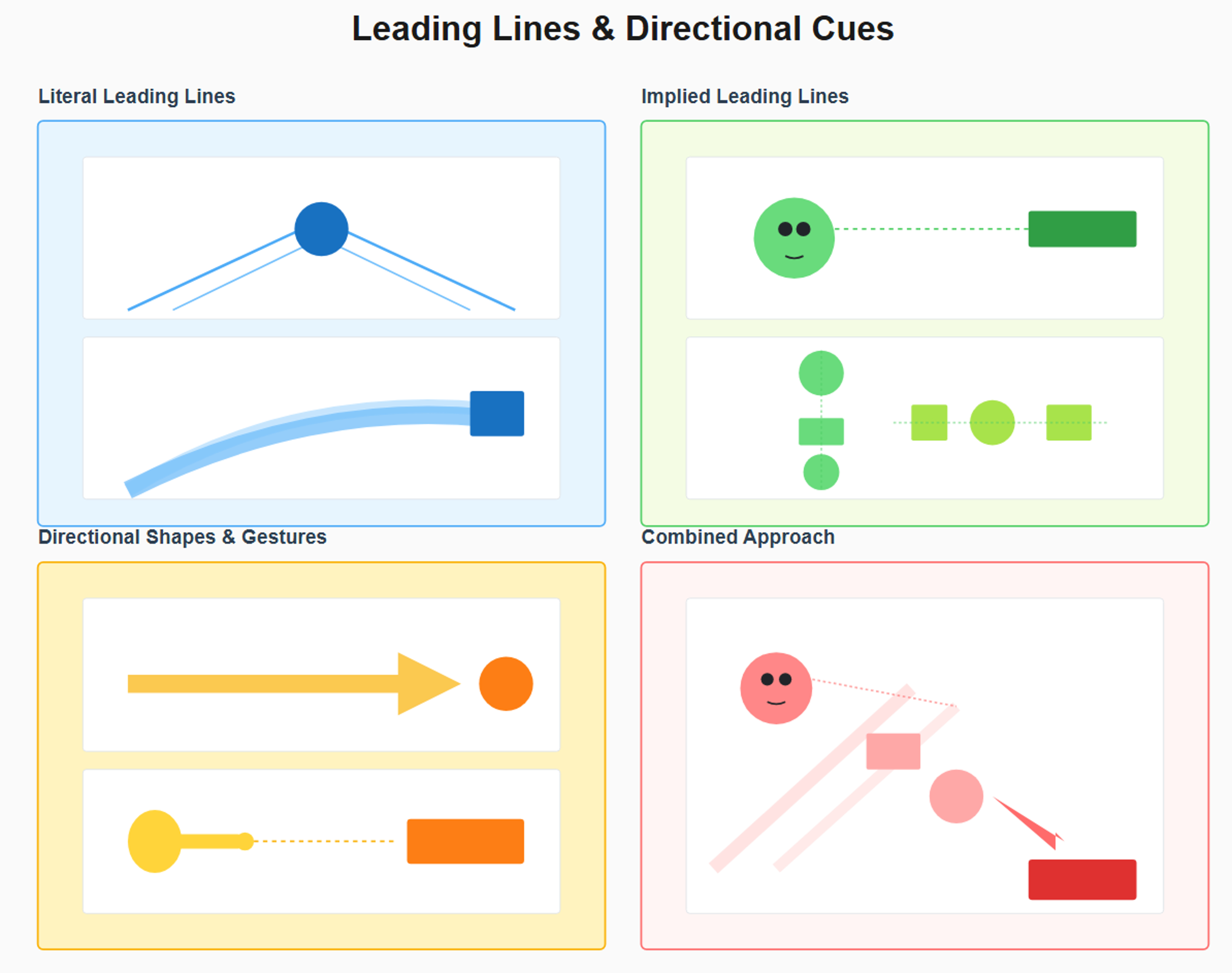
Visual demonstration of compositional techniques for guiding viewer attention through deliberate directional elements. The literal leading lines section (blue) illustrates explicit visual pathways through two examples: converging perspective lines from bottom corners meeting at a central circular focal point (top), and a curved path element leading from lower left to an upper right rectangular destination (bottom), representing roads, architectural elements, or arranged objects that create obvious directional flow. The implied leading lines section (green) demonstrates psychological attention guidance through a face with directional eye gaze indicated by a dashed line pointing toward a target rectangle (top), and vertically and horizontally aligned geometric elements creating implicit linear pathways shown by subtle dashed guide lines (bottom), illustrating how alignment and gaze direction guide attention without explicit connectors. The directional shapes and gestures section (yellow/orange) shows intentional directional indicators through a large arrow shape pointing toward a circular target (top), and a simplified hand gesture with extended finger directing attention along a dashed line toward a rectangular element (bottom), representing pointing, arrows, and shape orientation as directional tools. The combined approach section (red/pink) synthesizes multiple techniques in a single composition featuring background diagonal lines, a face with gaze direction indicated by dashed line, vertically aligned shapes, a small directional arrow, and a final rectangular call-to-action target, demonstrating how layering literal lines, eye gaze, element alignment, and gestural cues creates sophisticated, multi-level attention choreography that guides viewers naturally through content toward desired focal points.
Part 7: Image-to-Text Ratios
The balance between visual imagery and written text fundamentally shapes how advertisements are perceived and processed. The 70/30 Rule suggests that optimal ad compositions devote approximately 70% of space to visual content (images, graphics, shapes, white space) and only 30% or less to text. This ratio reflects how human attention and processing actually work: we process images exponentially faster than text, extracting meaning from visuals in milliseconds while text requires conscious reading effort. In contexts where attention is scarce and fleeting, particularly in digital advertising, scroll-based feeds, and outdoor formats, prioritizing visual communication ensures your message registers before viewers move on.
The psychological foundation for favoring visuals over text stems from how our brains evolved. Visual processing developed over millions of years as a survival mechanism for quickly identifying food, threats, and opportunities in the environment. Reading text is a relatively recent skill, only thousands of years old, and requires conscious cognitive effort. When faced with image-heavy ads, our brains engage automatic processing systems that extract meaning almost instantly. We recognize faces, assess emotions, identify products, and understand basic narratives from images before consciously deciding to engage. Text-heavy ads, conversely, require viewers to make an active decision to invest attention in reading, a much higher barrier that many simply won’t clear.
Visual-dominant design doesn’t mean eliminating necessary text, but rather being ruthlessly efficient with the text you include. Your headline should convey the core message in as few words as possible, ideally 5-8 words that can be grasped in a single glance. Body copy should be minimal, perhaps 15-30 words that provide essential information without requiring sustained reading effort. Every word should earn its place by providing value that visuals alone can’t communicate. This approach forces clarity: when you only have room for 20 words, you can’t waste any on vague corporate speak or unnecessary qualifiers. The discipline of working within tight text constraints typically produces stronger, clearer messages than when unlimited text space allows for verbal meandering.
However, the 70/30 rule isn’t universal, and certain advertising contexts benefit from reversing or modifying this ratio. Editorial-style advertising, designed to look like magazine articles or educational content, deliberately uses more text to build credibility, tell detailed stories, and engage readers who want substantial information before making decisions. Long-form copy works for complex products requiring explanation, high-consideration purchases, or B2B audiences seeking detailed information. When breaking the 70/30 rule, do so intentionally for strategic reasons, not because you couldn’t decide which information to cut. Even text-heavy ads benefit from typographic hierarchy, generous spacing, and strategic use of images to break up copy. The principle underlying the 70/30 rule visual communication processes faster and more easily than text remains true even when you choose to emphasize text for specific strategic purposes.
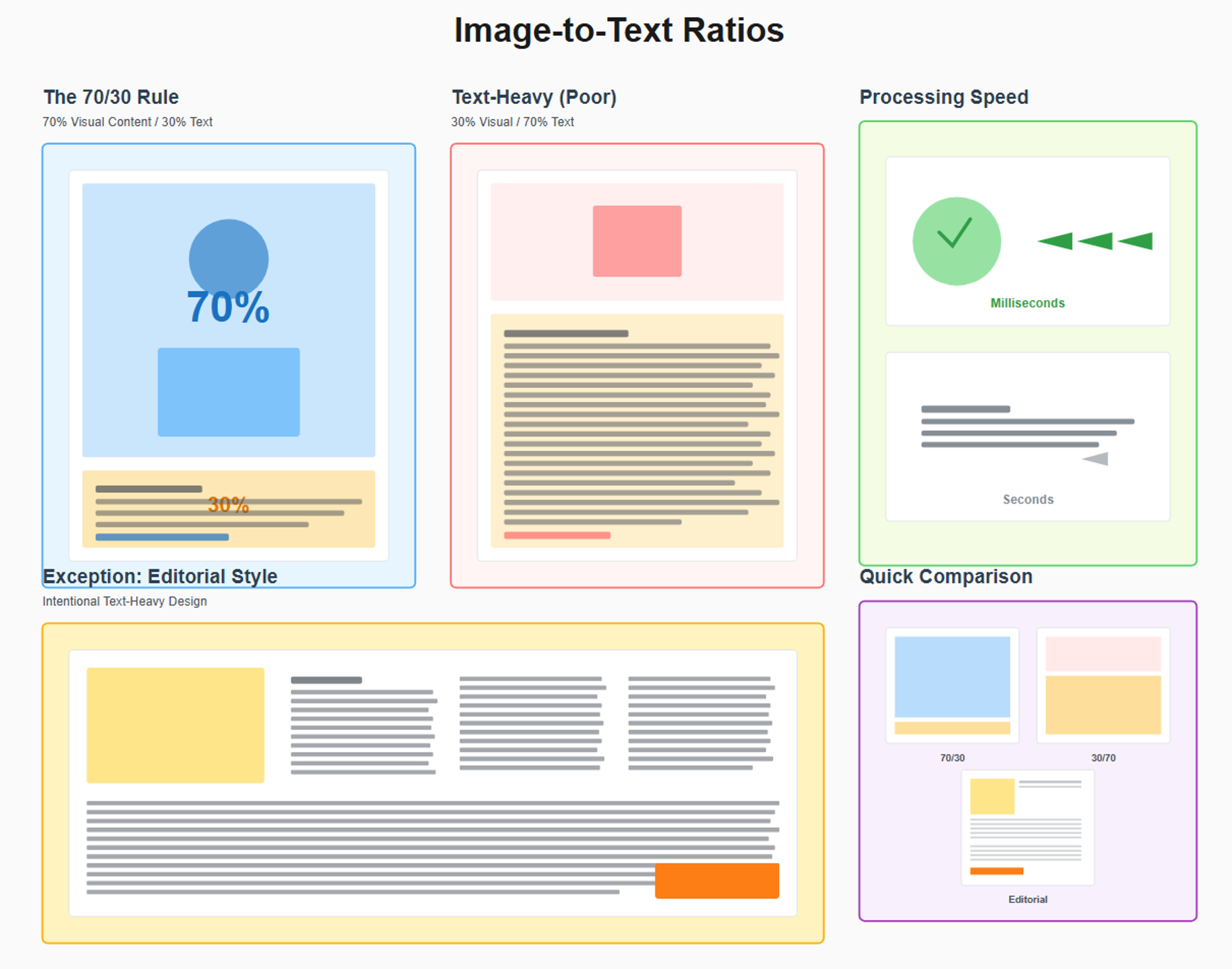
Visual demonstration of optimal image-to-text balance principles in advertising composition. The 70/30 rule section (blue/orange) illustrates the recommended ratio with a layout showing 70% allocated to visual content (represented by blue shaded area containing circle and rectangle shapes) and 30% to text content (orange shaded area with horizontal lines representing text blocks and a call-to-action). The text-heavy poor example (red/orange) demonstrates the inverse problematic ratio of 30% visual content (small red rectangle at top) and 70% text (extensive orange area filled with numerous horizontal lines), showing overwhelming text density that requires excessive reading effort. The processing speed section (green/gray) contrasts cognitive processing rates through two panels: image processing depicted with a checkmark icon and three speed arrows labeled “Milliseconds” indicating rapid visual comprehension, versus text processing shown with text lines and a single slow arrow labeled “Seconds” representing slower conscious reading effort. The editorial style exception section (yellow/orange) presents an intentional text-heavy approach featuring a small featured image in the upper left with three columns of text lines followed by full-width text blocks and a call-to-action button, representing magazine-style advertising where detailed information serves strategic purposes. The quick comparison panel (purple) synthesizes all approaches through three miniature layouts displaying the optimal 70/30 split, the poor 30/70 reversal, and the editorial exception format, providing side-by-side visual reference for understanding appropriate context-dependent ratio selections.
Part 8: Putting It All Together
The Design Process
Successful advertising design follows a systematic process that ensures every decision serves your strategic goals rather than just personal aesthetic preference. Beginning with clarity about objectives and working through structured steps prevents the common trap of creating visually appealing ads that fail to achieve business results. This process integrates all the principles we’ve covered, applying them in sequence to build compositions that are simultaneously beautiful, functional, and effective. While experienced designers internalize many steps and work more intuitively, even veterans benefit from occasionally slowing down and methodically working through the process, especially for high-stakes campaigns.
The first critical step is defining your goal and key message using the 5-Second Rule as your benchmark. Before touching design software, write down in one sentence what viewers should understand or do after seeing your ad. This becomes your north star that guides every subsequent decision. Is the goal to generate immediate sales, build brand awareness, educate about a new product, or drive event registrations? Is your core message “50% off this weekend,” “introducing our revolutionary new feature,” “we’re the trusted choice for families,” or “register before September 1st?” Test potential messages by timing yourself speaking them aloud. If you can’t communicate the essence in five seconds, simplify until you can. This forces clarity and prevents designing beautiful ads that leave viewers confused about what you’re actually communicating.
Once your goal is crystal clear, choose your grid system and compositional framework. Will you use the golden ratio for sophisticated, timeless layout? The rule of thirds for dynamic, photography-focused design? An 8-point grid for pixel-perfect precision? Or perhaps the root 2 rectangle for elegant print proportions? This decision depends on your format, medium, and brand personality. Luxury brands might favor golden ratio layouts, while tech startups might prefer 8-point grids. Set up your design file with appropriate guides showing your chosen grid, safe zones, bleed areas (if applicable), and platform-specific dimensions. This structural foundation prevents compositional decisions from becoming arbitrary and ensures professional polish.
Apply color theory by establishing your palette using the 60-30-10 rule. Choose your dominant, secondary, and accent colors based on brand guidelines and the emotional response you want to create. Set up color swatches in your design software so you can quickly apply consistent colors throughout the piece. Establish typography hierarchy using Fibonacci-based sizing or clear 2-3x contrast ratios between headline and body text. Choose your font pairing carefully, ensuring legibility while expressing appropriate personality. Create visual flow by considering whether F-pattern, Z-pattern, or circular arrangements best suit your content. Position elements according to your chosen grid system, using leading lines and directional cues to guide attention toward your call-to-action. Throughout this process, continuously reference your core message from step one, ensuring every design decision supports rather than distracts from that central communication goal.
The final step is validation against your principles and rules. Does your message read clearly in five seconds? Have you limited yourself to three main visual elements? Does your color contrast meet accessibility standards? Is your typography hierarchy immediately obvious? Does your composition maintain proper balance? Are safe zones respected? Test your design with fresh eyes, ideally by showing it to someone unfamiliar with the project and seeing if they grasp the message immediately. Be ruthless about making revisions based on this feedback. The best designers iterate multiple times, each round bringing the work closer to that ideal combination of aesthetic appeal and functional effectiveness.
Common Mistakes
Understanding common design mistakes helps you avoid them in your own work and diagnose problems in underperforming ads. The most pervasive error is overcrowding, violating the 3-Element Rule by trying to pack too much information or too many competing visuals into limited space. This mistake typically stems from stakeholder pressure to include “just one more thing” until the ad becomes a cluttered mess where nothing stands out. Overcrowded designs fail because they create cognitive overload, viewers don’t know where to look first, can’t identify the main message, and typically just move on to simpler content. The solution is ruthless prioritization: identify the absolute essential message and supporting elements, then have the courage to cut everything else, even when it feels painful.
Poor contrast represents another critical failure that makes ads unreadable and inaccessible. This might manifest as light text on light backgrounds, insufficient color contrast that fails accessibility standards, or weak typographic hierarchy where headline and body text have similar sizes. Designers sometimes sacrifice contrast for aesthetic considerations, choosing muted, “sophisticated” color schemes that look beautiful but render text illegible, especially on mobile devices or in challenging viewing conditions. The solution is always prioritizing function over pure aesthetics: test your designs with contrast checkers, view them on multiple devices in different lighting, and convert to grayscale to verify hierarchy remains clear without color. If elements become indistinguishable, strengthen contrast through size, weight, color, or spatial separation.
Inconsistent spacing reveals itself when margins, padding, and gaps between elements follow no discernible system, creating visual chaos even when individual elements are well-designed. One section might have 15 pixels between elements, another 22 pixels, another 31 pixels, with no rhyme or reason. This inconsistency signals amateur work and makes designs feel haphazard even when viewers can’t articulate what’s wrong. The solution is adopting a grid system like the 8-point grid and religiously adhering to it. Use spacing values of 8, 16, 24, 32, 48 pixels throughout your design. This creates rhythmic consistency that makes everything feel intentionally crafted. Modern design tools offer smart guides and grid snapping to make this easier, use these features rather than eyeballing positions.
Platform mismatches occur when designers create ads without considering where they’ll actually appear, resulting in awkwardly cropped images, text cut off at edges, or compositions that don’t fit platform requirements. A horizontal Facebook ad cropped to Instagram’s square format might lose crucial text or product imagery. A desktop-optimized design might render tiny and unreadable on mobile. Safe zones get ignored, resulting in important elements too close to edges where platform interfaces or cutting tolerances might affect them. The solution is designing for specific platforms from the start, using correct aspect ratios, respecting safe zones, and creating platform-specific variations when one size truly doesn’t fit all. Test your ads on actual devices and platforms before launching to catch problems while fixes are still possible.
Before/After Case Studies
Example 1: Applying Golden Ratio to a Cluttered Ad
The original ad for a fitness studio attempted to communicate multiple messages simultaneously: class schedule information, promotional pricing, trainer credentials, facility amenities, and membership options all competed for attention in a cramped layout. Text covered 60% of the space in various sizes with no clear hierarchy. Stock photography of the gym occupied the remaining 40% but got lost among competing elements. The color palette used seven different colors with no systematic application. The overall effect was overwhelming and confusing, with no clear action for viewers to take.
The redesigned version applied golden ratio proportions to create harmonious balance and clear hierarchy. The layout divided into golden ratio sections: approximately 62% dedicated to a striking hero image of a trainer in action, 38% to simplified text content. Within the text section, further golden ratio divisions organized headline (largest proportion), supporting benefit statements (medium proportion), and call-to-action (smallest but highest contrast). The color palette reduced to three colors following the 60-30-10 rule: neutral white/gray dominant, brand blue secondary, vibrant orange accent for the CTA. Typography hierarchy used Fibonacci sizing (34pt headline, 21pt subhead, 13pt body), creating clear visual differentiation.
The transformation was dramatic. The message instantly became clear: “Transform Your Body in 30 Days” with a single compelling benefit statement and obvious call-to-action. Supporting information moved to smaller text or was eliminated entirely, trusting that interested viewers would seek details after the ad captured attention. The generous white space around elements made everything more legible and gave the design room to breathe. The visual hierarchy guided viewers naturally from the powerful image to the headline to the benefit to the action, following the golden spiral’s natural flow. Testing showed viewers could grasp the core message in under three seconds, compared to confusion and abandonment with the original version.
Example 2: Using Rule of Thirds for Product Photography
The original jewelry ad centered a product shot of a necklace against a plain white background, with the brand name centered above and pricing information centered below. While clean and uncluttered, the composition felt static and uninspiring, failing to convey the luxury and desirability the brand wanted to communicate. The centered positioning created no visual tension or interest, and viewers’ eyes had nowhere to travel, they saw the necklace and immediately moved on without engagement.
The redesigned version used the rule of thirds to create a dynamic, engaging composition. The necklace was repositioned to the right intersection point of the thirds grid, creating asymmetrical balance that immediately felt more sophisticated. The left side of the frame featured generous negative space with subtle texture, allowing the product to breathe while creating a sense of luxury through restraint. A model’s hand, positioned along the left vertical third line, reached toward the necklace, creating implied motion and human connection while serving as a leading line directing attention to the product. The brand name moved to the upper left intersection point, while the call-to-action positioned at the lower right created diagonal visual flow across the frame.
This transformation created multiple improvements. The asymmetrical composition felt more modern and premium, appropriate for the luxury positioning. The implied narrative, a hand reaching for the necklace, created emotional engagement and desire rather than just showing product specifications. The rule of thirds positioning created natural visual interest that encouraged longer viewing times. The diagonal flow from brand to product to action guided viewers through an intentional sequence. Most importantly, the repositioning transformed a forgettable product shot into a memorable image that communicated luxury, desirability, and sophistication through composition alone.
Example 3: Fixing Typography with Fibonacci Sequence
The original software company ad used four different type sizes with no clear proportional relationship: 28pt headline, 19pt subheadline, 14pt body copy, and 16pt call-to-action text. The arbitrary sizing created visual confusion about what was most important. Additionally, all text used the same weight, further muddying hierarchy. Line spacing varied inconsistently from 1.2x to 1.8x the font size. Letter spacing felt cramped in headlines but too loose in body copy. The overall effect was amateur despite competent design in other respects.
The redesigned version implemented a strict Fibonacci-based typographic system that transformed clarity and hierarchy. The headline increased to 34pt, subheadline to 21pt, body copy to 13pt, and small print to 8pt, each size a Fibonacci number creating harmonious proportional relationships. The headline additionally used a bold weight (700), subheadline medium (500), and body regular (400), creating hierarchy through both size and weight. Line spacing standardized to 1.4x font size throughout, with headlines slightly tighter at 1.2x. Letter spacing tightened by -30 units in headlines for impact while body copy received +10 units for comfortable readability.
The transformation created immediate visual clarity. Viewers could instantly distinguish headline from supporting content, with the proportional relationships feeling natural and intentional rather than arbitrary. The multi-layered hierarchy (size + weight + spacing) ensured clarity even when viewing quickly or from distance. The mathematical consistency created a sense of polish and professionalism that elevated the entire design. Most significantly, comprehension and recall improved in testing, as viewers could quickly identify and remember the key message rather than struggling to parse visually flat text blocks.
Example 4: Implementing 60-30-10 Color Rule
The original restaurant ad used five colors without systematic application: red brand color, orange for some highlights, yellow for other highlights, green for some text, and blue for the logo. Different sections used different color combinations with no consistency. The resulting design felt chaotic and carnival-like, undermining the restaurant’s upscale positioning. Text legibility suffered with colored text on colored backgrounds that lacked sufficient contrast. The overall impression was confusion about brand identity and positioning.
The redesigned version implemented the 60-30-10 rule with discipline and clarity. The dominant 60% used elegant gray tones and white space, creating sophisticated neutral backgrounds that positioned the restaurant as upscale. The secondary 30% employed the brand’s deep burgundy red for headers, borders, and key graphic elements, establishing brand identity without overwhelming. The accent 10% used a complementary gold for call-to-action buttons and special highlights, creating focal points that directed action. All other colors were eliminated, with food photography providing natural color variety within the systematic palette.
The transformation was remarkable. The design immediately felt more cohesive and premium, appropriate for the restaurant’s positioning. The neutral dominant color created breathing room and sophistication, while the burgundy secondary provided consistent brand reinforcement. The gold accents created unmistakable focal points for reservations and featured dishes. Text legibility improved dramatically with high-contrast pairings. Most importantly, the systematic color approach made the brand feel more established and trustworthy. Testing showed increased perception of quality and higher click-through rates on reservation CTAs, demonstrating that color discipline translated directly to business results.
The Designer’s Checklist
Before finalizing any advertisement, run through this comprehensive checklist to catch issues and ensure professional quality. This systematic review prevents common mistakes and confirms that all principles work together effectively.
Core Message & Clarity
Can viewers grasp the main message in 5 seconds or less?
Is there a single, clear call-to-action?
Does every element support the core message?
Would someone unfamiliar with the project understand it immediately?
Visual Hierarchy & Composition
Are there no more than 3 main visual elements?
Is the visual hierarchy immediately obvious?
Does the most important element have the greatest visual weight?
Do leading lines guide attention toward key elements?
Layout & Grid Systems
Is a proper grid system applied (golden ratio/rule of thirds/8-point)?
Are all elements aligned to the grid?
Does the composition feel balanced (symmetrically or asymmetrically)?
Is there adequate white space around key elements?
Color
Does the design follow the 60-30-10 color rule?
Are all color choices intentional and supporting the message?
Does color contrast meet accessibility standards (4.5:1 for text)?
Are colors appropriate for the target culture and audience?
Typography
Is there clear typography hierarchy (headline 2-3x body text size)?
Are no more than 2-3 typefaces used?
Is line length appropriate (50-75 characters for body text)?
Is line spacing comfortable (120-150% of font size)?
Is kerning/tracking adjusted appropriately for headlines?
Are all fonts legible at their intended sizes?
Visual Flow
Does the layout follow appropriate scan patterns (F/Z-pattern)?
Do elements guide viewers through content in logical sequence?
Does eye gaze or directional cues point toward important elements?
Does composition create natural movement toward the CTA?
Technical Requirements
Are safe zones respected (content 5-10% from edges)?
Is bleed area included for print (typically 3-5mm)?
Is the aspect ratio correct for the intended platform?
Will the design work across different devices and screen sizes?
Are image resolutions appropriate for the output medium?
Image-to-Text Ratio
Does the design follow the 70/30 image-to-text guideline (unless intentionally editorial)?
Is text minimal and impactful rather than verbose?
Do images support and enhance the message?
Accessibility
Can the hierarchy be understood without color (grayscale test)?
Are alt text descriptions planned for images (digital)?
Is text large enough to be readable for all ages?
Do interactive elements have sufficient size (minimum 44x44 pixels for touch targets)?
Brand Consistency
Do colors match brand guidelines?
Are brand fonts used appropriately?
Is logo placement and sizing consistent with brand standards?
Does the overall design feel consistent with other brand materials?
Final Quality Check
Are all images high resolution without pixelation or blur?
Is all text spelled correctly and grammatically sound?
Are all links and CTAs functional (digital) or correct (print)?
Has the design been tested on actual devices/formats?
Have fresh eyes reviewed it for issues you might have missed?
Part 9: When to Break the Rules
Understanding design rules thoroughly is precisely what gives you permission to break them effectively. Rules exist to codify principles that reliably create successful outcomes, but they’re not immutable laws of physics. Once you comprehend why each rule works, what psychological or practical purpose it serves, and what outcomes it typically produces, you gain the judgment needed to recognize situations where breaking rules might actually serve your goals better than following them. The difference between amateur rule-breaking and professional rule-breaking is intention: amateurs break rules accidentally or ignorantly, while professionals break rules strategically with full awareness of the risks and potential rewards.
Brand personality often justifies breaking conventional rules to express distinctive character that sets you apart from competitors. A playful children’s brand might deliberately violate color theory by using chaotic, vibrant color combinations that would horrify traditional designers but perfectly capture the joyful energy of childhood. A punk rock venue might embrace cluttered, aggressive typography that breaks every readability rule because that chaos communicates authentic rebellious spirit. A disruptive startup might use asymmetry so extreme it creates discomfort, signaling their rejection of establishment norms. These rule violations work because they’re authentic expressions of brand identity rather than mistakes or laziness. The key is ensuring every rule you break serves your brand personality consciously and consistently.
Creative disruption for attention-grabbing represents another valid reason to break rules, particularly in saturated markets where conventional approaches blend into background noise. If every competitor in your category uses similar color palettes, typography, and layouts, following the same rules means looking like everyone else. Strategic rule-breaking creates pattern interruption that captures attention precisely because it violates expectations. A pharmaceutical company might break the predictable blue/white color scheme with bold oranges and teals. A law firm might abandon traditional serif typography for modern sans-serifs. A food brand might create deliberately minimal ads in a category dominated by abundant imagery. These disruptions work when they’re calibrated carefully: different enough to stand out, but not so bizarre that they lose credibility or confuse the message.
A/B testing provides the scientific method for validating rule-breaking before fully committing. When you have an idea that breaks conventional wisdom, create two versions: one following the rules, one breaking them in your proposed way. Run both versions simultaneously to comparable audiences and measure actual performance differences. Does your unconventional color scheme actually improve click-through rates, or does it just feel creative without delivering results? Does your rule-of-thirds violation create better engagement, or do traditional centered compositions perform better for your specific audience? Testing removes guesswork and personal bias, letting actual user behavior determine which approach works. Many successful innovations began as tests of unconventional ideas that proved more effective than traditional approaches.
Examples of successful rule-breaking abound once you start looking for them. Apple’s famous “Think Different” campaign used black-and-white photography in an era of colorful advertising, breaking color convention to communicate sophistication and timelessness. Volkswagen’s classic “Think Small” campaign broke every rule about making products look large and impressive, instead embracing honest minimalism that felt refreshingly authentic. Nike often violates safe zone rules by dramatically cropping athletes’ faces or bodies, creating bold visual impact that would make traditional designers nervous but perfectly captures athletic dynamism. These campaigns succeed not despite breaking rules but because the rule-breaking serves strategic purpose: standing out in crowded markets, expressing distinctive brand personalities, and creating memorable experiences that conventional approaches couldn’t achieve.
The key to effective rule-breaking is knowledge combined with intention. Learn the rules thoroughly, understand why they exist, and achieve competency in applying them conventionally. Only then can you make informed decisions about which rules to break, when, and how. Break rules that constrain your specific message or brand personality, not rules that serve fundamental functions like readability or accessibility. Break rules consciously with clear strategic reasoning, not accidentally or because you didn’t know better. Test your rule-breaking against conventional approaches to validate effectiveness rather than assuming creativity equals success. Most importantly, remember that breaking one or two rules creates impact and differentiation, but breaking all rules simultaneously creates chaos. Even the most unconventional designs maintain structure in some dimensions while pushing boundaries in others.
Conclusion
The principles, ratios, and rules compiled in this guide represent decades of accumulated design wisdom, psychological research, and practical advertising experience. From the mathematical elegance of the golden ratio and Fibonacci sequence to the psychological power of color theory and typographic hierarchy, from compositional techniques like the rule of thirds to practical systems like 8-point grids, these tools provide a comprehensive framework for creating advertising that doesn’t just look good but actually works. The difference between decorative design and effective advertising lies in understanding these principles deeply enough to apply them strategically rather than superficially.
The most powerful insight is recognizing that these rules work together, not in isolation. The golden ratio creates pleasing proportions, but those proportions need the right colors (60-30-10), proper typography (Fibonacci sizing with clear hierarchy), appropriate spacing (8-point grid), and strategic composition (leading lines and visual flow) to create complete advertisements that guide viewers through messages and toward actions. No single principle guarantees success, but the systematic application of multiple complementary principles creates synergies where the whole becomes dramatically more effective than the sum of parts. The checklist in Part 8 helps ensure you’re leveraging these synergies rather than randomly applying isolated concepts.
Testing and iteration remain essential because design is ultimately about communication with real human beings whose responses can surprise even experienced professionals. What seems obvious in the design studio might confuse actual viewers. Color combinations that test perfectly might perform poorly with specific demographics. Layouts that violate rules might outperform conventional approaches. The only way to know for certain is testing your designs with real audiences, measuring actual results, and refining based on feedback. Great designers maintain humility about their intuitions while building confidence through systematic testing and learning from every campaign.
Developing design intuition takes time and practice, requiring you to move beyond mechanical rule application toward genuine understanding of why principles work and when to apply them. Study advertising across media and categories, analyzing what makes effective campaigns work. Practice applying these principles to your own projects, experiencing firsthand how golden ratio layouts feel different from rule-of-thirds compositions, or how 60-30-10 color schemes create different impressions than random color choices. Build a reference library of exceptional advertisements and regularly analyze why they succeed. Over time, these conscious processes become intuitive: you’ll sense appropriate type sizes without calculating Fibonacci numbers, judge color balance without consciously invoking the 60-30-10 rule, and create dynamic compositions without overlay guides, because the principles become internalized through repeated practice.
The ultimate goal isn’t rigid adherence to rules but rather achieving that rare combination of aesthetic beauty and functional effectiveness that defines exceptional advertising. Ads that make viewers stop scrolling and pay attention. Ads that communicate messages instantly and memorably. Ads that inspire emotions and prompt actions. Ads that strengthen brands while driving measurable business results. The principles in this guide provide the foundation for achieving these outcomes consistently rather than accidentally. Whether you’re creating social media ads, magazine spreads, outdoor billboards, or digital banners, these timeless fundamentals of visual communication remain relevant and valuable.
Bonus: Quick Reference Guide
Mathematical Ratios
Golden Ratio: 1:1.618 (use for layouts, sizing, positioning)
Fibonacci Sequence: 3, 5, 8, 13, 21, 34, 55, 89 (use for typography sizing, spacing)
Rule of Thirds: Divide into 3×3 grid, position elements at intersections
Root 2 Rectangle: 1:1.414 (use for print-compatible proportions)
Color Guidelines
60-30-10 Rule: 60% dominant, 30% secondary, 10% accent
Contrast Minimum: 4.5:1 for normal text, 3:1 for large text
Color Psychology: Red (urgency), Blue (trust), Green (nature), Yellow (attention), Purple (luxury)
Typography Standards
Size Contrast: Headlines 2-3× larger than body text
Line Length: 50-75 characters (8-12 words) per line
Leading: Body text 130-150%, headlines 100-120% of font size
Tracking: Headlines -20 to -50, body text 0 to +20
Spacing Systems
8-Point Grid: Use multiples of 8px (8, 16, 24, 32, 48)
Safe Zones: Keep content 5-10% from edges
Bleed: Extend backgrounds 3-5mm beyond trim for print
Composition Rules
5-Second Rule: Core message must be clear in 5 seconds
3-Element Rule: Limit to 3 main visual focal points
70/30 Ratio: 70% visual content, 30% text (generally)
Scan Patterns: F-pattern (text), Z-pattern (visual), Circular flow
Platform Dimensions
Instagram Feed: 1:1 (square) or 4:5 (portrait)
Facebook: 1.91:1 (horizontal)
Stories: 9:16 (vertical)
LinkedIn: 1.91:1 (horizontal)
Design Process Steps
Define goal and 5-second message
Choose grid system (golden ratio/thirds/8-point)
Apply 60-30-10 color rule
Establish typography hierarchy (Fibonacci or 2-3× contrast)
Create visual flow (F/Z-pattern, leading lines)
Test against checklist
Iterate based on feedback
Remember: Rules are tools for achieving better results, not restrictions on creativity. Master them, understand why they work, then apply them thoughtfully to create advertising that truly connects with audiences and drives results.