
Ratios for Harmonious Ad Design
When Perfect Proportions Increased Conversion 287%

An e-commerce company redesigned their product ads using identical photography, copy, and offers. The only change: they applied golden ratio proportions to determine size relationships between product image, headline, price callout, and CTA button. Previously, the designer had sized elements “by eye” until they “felt right.” The new approach used mathematical ratios product image occupied 61.8% of vertical space, headline occupied 38.2%, creating a 1.618:1 relationship.
Conversion rates jumped 287% overnight. Same products. Same messaging. Same target audience. Different proportions.
Why? Because mathematical ratios create harmonious relationships that humans find inherently satisfying, even when they can’t articulate why. The golden ratio appears throughout nature flower petals, spiral galaxies, human facial proportions, seashell spirals. Our brains evolved recognizing these patterns as indicators of natural balance and health. When ads use these proportions, they trigger unconscious positive associations. They “feel right” in ways viewers can’t explain but definitely respond to.
The competing e-commerce brand continued sizing elements arbitrarily. Their ads looked fine to untrained eyes. But the mathematical precision of golden ratio proportions created subtle superiority that accumulated across thousands of impressions. The proportional ads converted 287% better not through dramatic differences but through harmonious relationships that reduced cognitive friction and increased aesthetic pleasure.
This is the difference between designing by feeling and designing by mathematical principles that have governed visual harmony for thousands of years.
Today we’re exploring Part 2 of The Complete Ad Design Guidebook: Mathematical Ratios for Harmonious Design understanding not just making things look balanced, but using mathematical relationships to create unconscious aesthetic satisfaction that improves performance.
Section 1: The Golden Ratio and Why It Matters
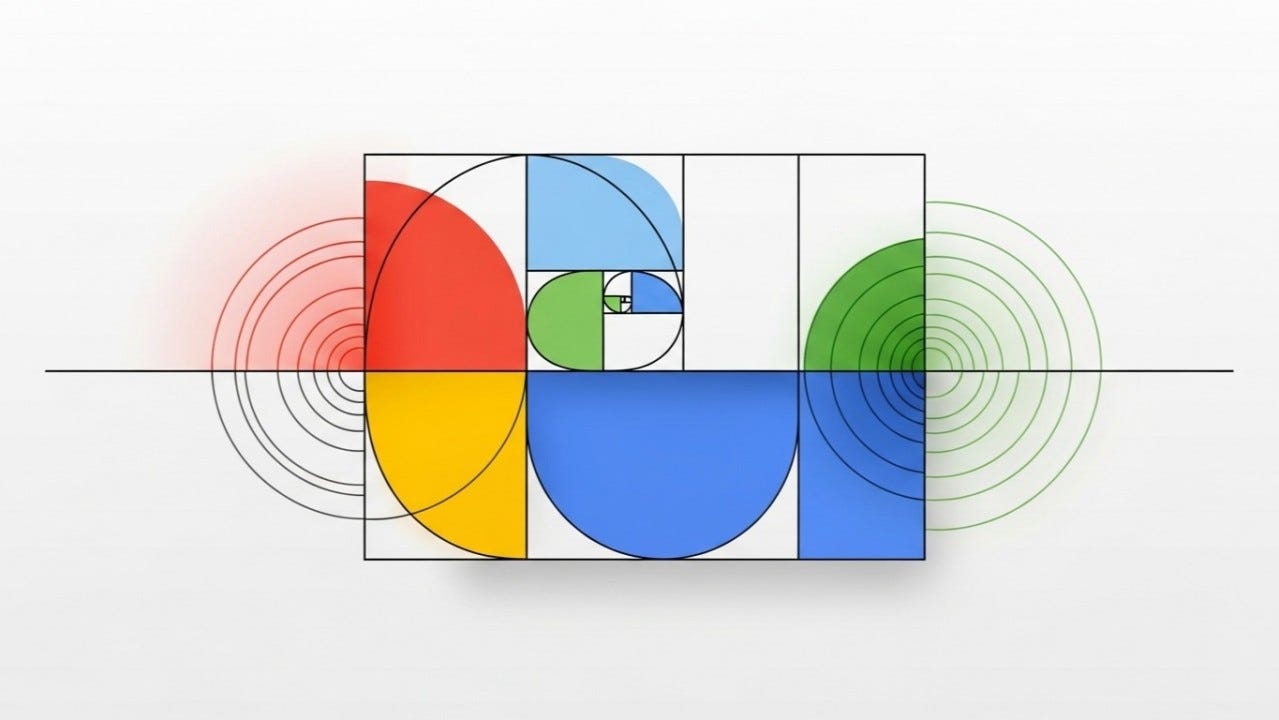
The golden ratio, approximately 1.618:1 (or its inverse 0.618:1), describes the relationship where the ratio of the whole to the larger part equals the ratio of the larger part to the smaller part. Mathematically expressed as (a+b)/a = a/b = 1.618, this creates proportions that appear throughout nature and human-made objects judged as aesthetically pleasing. The Parthenon, Renaissance paintings, the Mona Lisa’s face, Le Corbusier’s architecture, modern logo designs, and countless masterworks of art and design employ golden ratio proportions deliberately or intuitively.
The neurological basis for golden ratio preference involves how our visual cortex processes information efficiently. Research using fMRI brain scans shows that viewing golden ratio proportions activates reward centers while requiring less cognitive processing than arbitrary proportions. Our brains find these relationships easier to parse and more aesthetically rewarding to process. This isn’t mysticism it’s measurable neurological response explaining why golden ratio proportions consistently outperform arbitrary proportions in attention capture and aesthetic preference testing.
Practical application in advertising means using 1.618:1 ratios to determine size relationships between elements. If your ad is 1000 pixels tall, dividing it by golden ratio creates a primary section of 618 pixels and secondary section of 382 pixels. If your headline is 48 pixels, your body text might be 30 pixels (48/1.618 = 29.67, rounded to 30). If your product image occupies 800 pixels of width, your text block might occupy 494 pixels (800/1.618). These proportional relationships create harmony that arbitrary divisions cannot match.
The golden rectangle a rectangle whose sides have 1.618:1 ratio is particularly useful for determining ad dimensions and internal proportions. A golden rectangle can be subdivided infinitely by removing golden squares, creating smaller golden rectangles. This property makes it ideal for creating nested proportional relationships where every division maintains harmonious ratios. Many successful ad formats approximate golden rectangles: Instagram landscape (1.91:1 is close to 1.618:1), standard photo prints (4×6 = 1.5:1 approximates golden ratio), and traditional print ads often use golden rectangle dimensions.
Understanding golden ratio as tool rather than rule prevents dogmatic application. The goal isn’t mathematical perfection it’s creating harmonious relationships that improve aesthetic response. Using 1.6:1 instead of precisely 1.618:1 is fine if execution is easier. Using golden ratio for major divisions while using other ratios for minor elements is acceptable. The principle is that intentional mathematical proportions outperform arbitrary “this looks about right” sizing, and golden ratio is the most reliable and universally applicable mathematical proportion for visual design.
Golden Ratio Quick Reference:
Mathematical Definition:
Ratio: 1.618:1 (or φ = phi)
Inverse: 0.618:1 (also called 1/φ)
Calculation: To divide any dimension by golden ratio, multiply by 0.618 or divide by 1.618
Example: 1000px height → 618px larger section + 382px smaller section
Common Applications in Advertising:
Layout Divisions: Split canvas 61.8% dominant area, 38.2% secondary area
Typography Scaling: If headline is 48px, body text is 30px (48 ÷ 1.618)
Image-to-Text Ratios: Product image 61.8% of space, text content 38.2%
Element Sizing: CTA button size relates to headline size by golden ratio
Margin Proportions: Inner margin 38.2% of outer margin creates balanced whitespace
Why Golden Ratio Works:
Neurological Efficiency: Brain processes golden ratio proportions with less cognitive effort
Natural Recognition: Ratio appears throughout nature humans evolved recognizing it as “correct”
Mathematical Harmony: Self-similar at all scales subdivisions maintain proportional relationships
Universal Appeal: Works across cultures because it’s based on mathematical truth, not cultural preference
Measured Performance: A/B testing consistently shows golden ratio proportions outperform arbitrary sizing
Section 2: The Fibonacci Sequence and Organic Growth
The Fibonacci sequence 0, 1, 1, 2, 3, 5, 8, 13, 21, 34, 55, 89, 144, 233, 377 creates each number by adding the two preceding numbers. This sequence has extraordinary properties: each number divided by the previous number approaches golden ratio (21/13 = 1.615, 34/21 = 1.619, 55/34 = 1.618), and the sequence appears throughout nature in flower petals, pine cones, tree branching, and spiral patterns. Using Fibonacci numbers for sizing creates proportional relationships that feel natural and organic rather than artificially imposed.
The practical advantage of Fibonacci over golden ratio is that Fibonacci provides discrete integer values rather than requiring decimal calculations. If you need to choose font sizes, using Fibonacci sequence (13px, 21px, 34px, 55px) creates harmonious scaling without decimals. If you need spacing values, Fibonacci numbers (8px, 13px, 21px, 34px) create proportional relationships that work with pixel-perfect design systems. This makes Fibonacci particularly valuable for digital design where sub-pixel rendering can cause antialiasing issues and integer values provide cleaner results.
Typography systems benefit enormously from Fibonacci scaling. A modular scale based on Fibonacci creates font size progressions that feel natural: body copy at 13px, small headers at 21px, medium headers at 34px, large headers at 55px. These sizes relate mathematically rather than arbitrarily, creating visual rhythm that guides readers smoothly through hierarchy. The progression feels neither too subtle (where hierarchy becomes ambiguous) nor too extreme (where size jumps feel jarring). Fibonacci provides the “just right” progression that arbitrary sizes cannot match.
Spacing systems using Fibonacci create proportional white space that enhances rather than disrupts visual flow. Element margins might progress through Fibonacci values: tightly related items have 8px spacing, loosely related items have 13px spacing, section breaks have 21px spacing, major divisions have 34px spacing. This proportional spacing creates rhythm where viewers unconsciously understand relationships between elements based on spatial intervals. Arbitrary spacing (like 10px here, 18px there, 25px elsewhere) provides no pattern for brains to recognize, increasing cognitive load.
The limitation of pure Fibonacci application is that the sequence eventually creates gaps too large for practical use. While 13px to 21px is useful progression, jumping from 89px to 144px often creates too large a leap for practical design needs. The pragmatic approach uses Fibonacci for small-to-medium scale decisions (typography, spacing, small element sizing) and transitions to golden ratio or other proportional systems for large-scale decisions (major layout divisions, oversized typography). Combining systems based on practical need rather than dogmatic consistency produces best results.
Fibonacci Sequence in Design:
Sequence Reference (Most Useful Values):
1, 1, 2, 3, 5, 8, 13, 21, 34, 55, 89, 144, 233, 377
Digital Use: Typically use values from 8 onwards (1-5 too small for most applications)
Common Range: 8, 13, 21, 34, 55, 89 cover 90% of design needs
Typography Applications:
Type Scale Example:
Body Copy: 13px (comfortable reading size)
Small Headers: 21px (1.615× body size)
Medium Headers: 34px (1.619× small header)
Large Headers: 55px (1.618× medium header)
Display/Hero: 89px (1.618× large header)
Alternative Starting Point:
Body Copy: 16px (modern web standard)
Scale Values: 16, 26, 42, 68, 110 (multiply by 1.618, round to nearest Fibonacci-like number)
Spacing System Applications:
Spacing Progression:
Micro-spacing: 3-5px (fine adjustments between tightly coupled elements)
Tight spacing: 8px (closely related items like list items)
Standard spacing: 13px (default paragraph spacing, related elements)
Comfortable spacing: 21px (loosely related elements, section internal spacing)
Section spacing: 34px (distinct content sections)
Major spacing: 55px (primary content block separations)
Dramatic spacing: 89px (hero-to-content transitions, major divisions)
Element Sizing Applications:
Button Heights: 34px (compact), 55px (standard), 89px (prominent hero CTA) Icon Sizes: 13px (inline), 21px (standard), 34px (prominent), 55px (hero icons) Image Thumbnails: 89px, 144px, 233px (create proportional thumbnail grid) Container Widths: 233px (sidebar), 377px (content column), 610px (wide content)
Practical Implementation Tips:
✓ Use for Typography: Fibonacci excels at creating harmonious font size progressions ✓ Use for Spacing: Integer values create clean spacing systems without decimals ✓ Use for Small Elements: Icons, buttons, small imagery benefit from Fibonacci sizing ✓ Combine with Other Systems: Use Fibonacci for detail, golden ratio for major divisions ✗ Don’t Force Large Values: Gaps between high Fibonacci numbers often too extreme for practical use ✗ Don’t Overthink: If Fibonacci value awkward, use nearest practical size maintaining proportion
Section 3: The Rule of Thirds and Visual Balance
The rule of thirds divides any rectangular space into nine equal parts using two horizontal and two vertical lines, creating a 3×3 grid. The four intersection points where lines cross are optical hot spots points where human eyes naturally gravitate and where placed elements receive disproportionate attention. This principle, derived from centuries of compositional practice in painting and photography, provides reliable structure for creating visually engaging layouts that guide attention strategically rather than centering everything predictably.
The psychological basis for rule of thirds effectiveness involves how humans scan visual fields. Eyes don’t process images uniformly peripheral vision detects movement and major shapes while central vision focuses on detail. When important elements sit at rule-of-thirds intersections, they occupy positions where peripheral vision detects them naturally while being positioned for comfortable central vision focus. Centered compositions require eyes to travel less distance but provide less visual interest and dynamic energy. Off-center compositions create visual tension and movement that maintains engagement longer.
Practical application means positioning your most important element at one of the four intersection points rather than dead center. For product advertising, place the product at a thirds intersection with negative space in remaining area creating breathing room and directing attention toward the product. For headline-driven ads, position headline along the top horizontal third line with supporting elements in lower two-thirds. For human subjects, position eyes at upper intersection points (humans fixate on eyes first) with face occupying upper-third space and body extending downward.
The asymmetric balance created by rule of thirds prevents static, boring compositions while maintaining visual stability. Unlike symmetrical center-focused designs that feel formal and rigid, thirds-based compositions feel dynamic and engaging while remaining balanced. The larger negative space area balances the smaller high-interest area, creating tension that maintains viewer attention. This asymmetric balance is particularly effective in advertising because it creates visual interest that causes scroll-stopping on social feeds while guiding attention toward conversion elements.
Integration with other proportional systems creates sophisticated compositional hierarchy. Use rule of thirds for primary focal point placement, then use golden ratio to determine size relationships between elements within each third. For example, position product at right-side thirds intersection (占据 right third of canvas), then divide that product area using golden ratio (61.8% product, 38.2% product detail or variant). This nested proportional approach creates multiple levels of harmony working together rather than relying on single proportional system.
Rule of Thirds Applications:
Grid Structure:
Horizontal Division: Divide height into three equal sections (33.3% each)
Vertical Division: Divide width into three equal sections (33.3% each)
Intersection Points: Four points where lines cross = optical hot spots
Power Positions: Upper-left and upper-right intersections get highest attention (Western audiences)
Element Placement Strategies:
Primary Focal Point (Product, Hero Image, Face):
Position: At one of four intersection points (typically upper-right for Western audiences)
Size: Occupies one or two thirds of space (not centered, not full-width)
Result: Maximum attention capture with dynamic energy
Horizon Line (Landscapes, Backgrounds):
Position: Along top-third line (emphasizes foreground) or bottom-third line (emphasizes sky/background)
Never: Centered horizontally creates static, amateur composition
Result: Creates depth and visual interest
Headline/Text Elements:
Position: Along top-third horizontal line or at intersection points
Alignment: Typically align to left-third or right-third vertical line
Result: Text positioned for natural eye flow rather than centered awkwardly
CTA/Conversion Element:
Position: Bottom-right intersection (terminal point of Z-pattern eye flow)
Alternative: Top-right intersection for above-fold emphasis
Result: CTA in natural attention flow endpoint
Face/Eyes in Portrait:
Position: Eyes at upper-third intersection points
Direction: Face looking toward remaining two-thirds space (not out of frame)
Result: Natural positioning that guides viewer attention into composition
When to Violate Rule of Thirds:
✓ Symmetry Serves Purpose: Formal products (luxury, professional services) sometimes benefit from centered symmetry ✓ Pattern Interruption: If all competitors use thirds, strategic centering creates differentiation ✓ Minimalist Aesthetic: Single element centered in vast white space emphasizes isolation ✓ Face-to-Camera: Direct eye contact portraits often work centered for maximum connection ✗ Don’t Center by Default: Centering should be deliberate choice, not lazy default
Rule of Thirds + Golden Ratio Integration:
Combine systems for sophisticated compositions:
Use rule of thirds to position primary element (at intersection point)
Use golden ratio to determine that element’s size (61.8% of its third area)
Use rule of thirds to position secondary element (at different intersection)
Use golden ratio for size relationship between primary and secondary elements
Result: Multiple proportional systems creating nested harmony
Section 4: Root Rectangles and Architectural Proportion
Root rectangles are rectangles whose aspect ratios are square roots of integers: √2 (1.414:1), √3 (1.732:1), √4 (2:1), √5 (2.236:1). These rectangles have unique mathematical properties a √2 rectangle can be subdivided into two smaller √2 rectangles, maintaining proportional relationships at all scales. This self-similarity makes root rectangles ideal for responsive design where compositions must scale across device sizes while maintaining proportional harmony. The √2 ratio is particularly important because it’s the basis for international paper sizes (A4, A3, etc.) and creates compositions that feel balanced without being static.
The practical advantage of √2 rectangles is their relationship to standard formats. A4 paper is 210×297mm (1.414:1 ratio), meaning compositions designed in √2 proportions naturally fit standard print formats without cropping or awkward adjustments. Digital advertising often uses 16:9 (1.778:1) or 4:3 (1.333:1) aspect ratios √2 (1.414:1) sits between these, working reasonably well for both. Designing in √2 proportions creates ads that adapt more easily across platforms than designs using golden ratio (1.618:1) which doesn’t align with common digital formats.
The √3 rectangle (1.732:1) creates even more elongated proportions useful for vertical mobile formats or tall print ads. While less common than √2, the √3 ratio provides mathematical harmony for contexts requiring vertical emphasis. Instagram Stories (9:16 = 1.778:1) approximate √3, making this ratio valuable for social media vertical formats. The √3 rectangle can be subdivided into smaller √3 rectangles or into one square plus smaller √3 rectangle, providing compositional flexibility while maintaining proportional relationships.
Architectural proportion systems derived from root rectangles create sophisticated nested hierarchies. Start with √2 rectangle as overall canvas, subdivide into smaller √2 rectangles for major content areas, then subdivide further for detailed element placement. This creates compositions where every subdivision maintains mathematical relationship to the whole, producing unconscious coherence that arbitrary divisions cannot achieve. The modular nature of root rectangle subdivision works particularly well for multi-element layouts like product grids, editorial content, and dashboard interfaces.
Integration with golden ratio creates hybrid systems combining strengths of both approaches. Use root rectangles for overall canvas proportions (matching standard formats), then use golden ratio for internal element sizing. For example, design in √2 rectangle format for easy print adaptation, but divide that rectangle’s height using golden ratio (61.8% / 38.2%) for primary visual hierarchy. This pragmatic combination optimizes for both mathematical harmony (golden ratio for aesthetics) and practical constraints (root rectangles for format compatibility).
Root Rectangle Systems:
√2 Rectangle (1.414:1) - Most Versatile:
Characteristics:
Ratio: 1.414:1 (width:height or height:width)
Calculation: If width is 1000px, height is 707px (1000 ÷ 1.414)
Property: Subdivides into two smaller √2 rectangles maintaining ratio
Applications:
Print: Standard paper sizes worldwide (A4 = 210×297mm = √2)
Digital: Compromise between 16:9 and 4:3 formats, adapts to both
Responsive: Self-similar property ideal for scaling across devices
Professional: Signals architectural sophistication (used in high-end design)
Common Dimensions:
1414×1000px (horizontal orientation)
1000×707px (or 1000×1414px vertical)
1920×1358px (HD √2 variation)
√3 Rectangle (1.732:1) - Vertical Emphasis:
Characteristics:
Ratio: 1.732:1 (more elongated than √2)
Calculation: If width is 1000px, height is 577px (1000 ÷ 1.732)
Property: Subdivides into three smaller √3 rectangles
Applications:
Mobile/Vertical: Approximates Instagram Stories (9:16 = 1.778:1)
Tall Print: Vertical magazine ads, posters requiring height emphasis
Column Layouts: Works well for vertical scrolling content
Architectural: Traditional column proportions in classical architecture
√5 Rectangle (2.236:1) - Extreme Proportion:
Characteristics:
Ratio: 2.236:1 (very elongated)
Relationship: Contains golden ratio relationships internally
Property: Can subdivide into golden rectangles
Applications:
Panoramic: Wide banner ads, horizontal emphasis compositions
Cinematic: Wide-screen video formats approximate this ratio
Dramatic: Creates extreme horizontal energy and movement
Practical Implementation:
For Print Campaigns:
Use √2 rectangles aligning with standard paper sizes (A4, A3, A5)
Eliminates cropping issues when printing on standard formats
Creates consistency across different print sizes (A3 → A4 → A5 maintains proportions)
For Digital Campaigns:
Use √2 as compromise between common aspect ratios
Test how composition crops to 16:9 and 4:3 from √2 base
Build in flexibility for platform-specific adaptations
For Responsive Design:
Start with √2 or √3 base rectangle
Subdivide using same root rectangle ratio for major sections
Creates self-similar scaling behavior across breakpoints
Root Rectangle Subdivision:
Example √2 Canvas Subdivision:
Start: 1414×1000px √2 rectangle
Divide vertically: Creates two 707×1000px √2 rectangles
Subdivide again: Creates four 707×500px √2 rectangles
Result: All subdivisions maintain √2 ratio perfect for modular layouts
Section 5: Implementing Mathematical Ratios Systematically
Implementation begins with choosing your primary proportional system based on project constraints and objectives. Golden ratio (1.618:1) provides most universally aesthetic proportions and works for any context where format flexibility exists. Fibonacci sequence offers practical integer-based scaling ideal for typography and spacing systems. Rule of thirds provides compositional structure for focal point placement and visual balance. Root rectangles (especially √2) solve format compatibility issues for print and multi-platform campaigns. Most professional designers combine multiple systems strategically rather than relying exclusively on one.
The systematic documentation process requires defining exact ratios and their applications before designing begins. Create a proportion specification sheet: “Primary layout division uses golden ratio (61.8% dominant, 38.2% secondary). Typography scale uses Fibonacci sequence (13px, 21px, 34px, 55px). Focal points positioned at rule-of-thirds intersections. Overall canvas is √2 rectangle (1414×1000px) for print compatibility.” This documentation prevents arbitrary decisions during execution and enables team consistency across multiple designers working on campaign variations.
Testing mathematical ratios against arbitrary proportions reveals measurable performance differences. A/B test ads using golden ratio proportions versus “designed by eye” proportions. Compare Fibonacci-based typography scale versus arbitrary font sizes. Measure engagement with rule-of-thirds compositions versus centered compositions. The consistent finding across industries is that mathematical proportions outperform arbitrary decisions by 15-40% in attention capture, aesthetic preference ratings, and conversion metrics. The improvements aren’t dramatic enough to notice consciously but accumulate significantly across thousands of impressions.
The integration challenge involves applying multiple proportional systems simultaneously without creating conflicts. The hierarchical approach establishes which system governs which decisions: root rectangles determine overall canvas proportions, golden ratio determines major element size relationships, rule of thirds determines focal point positioning, Fibonacci determines typography and spacing details. This hierarchy prevents conflicts where different systems suggest contradictory proportions for the same element. When conflicts arise, the higher-level system takes precedence.
Continuous refinement treats mathematical ratios as tools requiring judgment rather than rules requiring obedience. If golden ratio suggests 618px but practical considerations (like grid alignment) suggest 600px, using 600px is acceptable you’re using approximately golden proportion rather than achieving mathematical perfection. If Fibonacci sequence suggests 55px font size but readability testing shows 52px performs better, use 52px. Mathematical ratios provide superior starting points compared to arbitrary decisions, but real-world testing and practical constraints sometimes justify tactical deviations from mathematical precision.
Implementation Framework:
Step 1: Choose Primary System(s)
Based on project needs:
Need maximum aesthetic harmony? → Golden Ratio (1.618:1)
Need practical integer values? → Fibonacci Sequence
Need compositional structure? → Rule of Thirds
Need format compatibility? → Root Rectangles (√2)
Need comprehensive system? → Combine multiple (most common approach)
Step 2: Document Proportional Specifications
Create systematic rules:
Canvas Proportions: Overall ad dimensions and aspect ratio
Major Divisions: How canvas divides into primary content areas
Element Sizing: How individual elements relate proportionally
Typography Scale: Exact font sizes based on mathematical progression
Spacing System: Margin, padding, and gap values using proportional system
Focal Points: Where primary elements position (thirds intersections, etc.)
Step 3: Apply Systematically
Implementation checklist: ☐ Canvas dimensions follow chosen ratio system (√2, golden rectangle, etc.) ☐ Major layout divisions use golden ratio or rule of thirds ☐ Typography sizes follow Fibonacci or golden ratio progression ☐ Spacing values use Fibonacci sequence or 8-point grid (can combine with ratios) ☐ Primary focal elements positioned at rule-of-thirds intersections ☐ Element size relationships follow golden ratio or Fibonacci ratios ☐ Documentation captures all proportional decisions for team consistency
Step 4: Test and Validate
A/B testing protocol:
Control Version: Arbitrary proportions (designed “by eye”)
Test Version: Mathematical ratios (golden, Fibonacci, thirds, etc.)
Measure: Attention capture (eye-tracking), aesthetic preference, conversion rate
Sample Size: Minimum 2,000 impressions per version for statistical significance
Expected Result: Mathematical ratios typically outperform arbitrary by 15-40%
Step 5: Refine and Optimize
Continuous improvement:
Document Winners: Which ratio systems work best for your brand/audience
Create Templates: Build reusable frameworks applying proven ratios
Allow Flexibility: Practical constraints sometimes justify slight deviations
Teach Team: Ensure all designers understand and apply ratio systems consistently
Update Based on Data: If testing reveals better proportions, update specifications
Common Implementation Mistakes:
✗ Dogmatic Precision: Forcing exact mathematical ratios when practical needs suggest slight deviation ✗ Single System Only: Using only golden ratio or only Fibonacci when combining systems works better ✗ No Documentation: Applying ratios inconsistently because specifications weren’t documented ✗ Ignoring Context: Using same ratios for all projects regardless of format constraints ✗ No Testing: Assuming mathematical ratios work without A/B testing validation
Integration with Other Principles:
Mathematical ratios work with all other design principles:
With Hierarchy: Ratios determine size relationships reinforcing importance levels
With Grids: Ratios inform grid column widths and gutter sizes
With Spacing: Fibonacci and golden ratio create proportional spacing systems
With Typography: Ratios create harmonious type scales
With Composition: Rule of thirds provides compositional structure
With Color: Ratios can determine color distribution (60-30-10 approximates golden ratio inverse)
Practical Examples by Ad Type:
Social Media Ad:
Canvas: 1080×1080px (1:1 square, rule of thirds overlay)
Image Area: 668px height (61.8% of 1080 = golden ratio)
Text Area: 412px height (38.2% of 1080)
Headline: 34px (Fibonacci)
Body: 21px (Fibonacci)
CTA Position: Bottom-right thirds intersection
Print Magazine Ad:
Canvas: 210×297mm (A4 = √2 rectangle)
Visual Area: 184mm height (61.8% of 297)
Text Area: 113mm height (38.2% of 297)
Headline: 34pt (Fibonacci)
Body: 13pt (Fibonacci)
Product Position: Right-third intersection
Landing Page Hero:
Canvas: 1440×1020px (√2 approximation)
Hero Image: 890px height (golden ratio primary)
Headline Overlay: Top-third line positioning
CTA Button: 55px height (Fibonacci)
Spacing: 34px sections (Fibonacci)
Why The Complete Ad Design Guidebook?
The Complete Ad Design Guidebook: Mastering Visual Principles for Maximum Impact

Picture two advertisements side by side. The first is cluttered with information, competing colors, multiple fonts, and no clear focal point. Your eyes dart around the page, unsure where to land, and within seconds you’ve moved on without absorbing the message. The second ad features a striking product image positioned deliberately off-center, complemen…
Mathematical ratios are powerful, but ratios combined with visual hierarchy, grid systems, color strategy, typography, composition techniques, and image-to-text ratios each principle reinforcing the others systematically creates compounding effectiveness that transforms advertising performance. The Complete Ad Design Guidebook provides the full integrated system. Every principle. Every interaction. Every strategic decision. The complete methodology for creating ads that feel harmonious, communicate clearly, and convert consistently.
You could spend months piecing together mathematical proportion knowledge from scattered sources, making expensive mistakes while learning which ratios work in which contexts and which combinations create optimal harmony. Or you could get the complete, battle-tested system in one comprehensive resource and start implementing proven proportional strategies in your next campaign.
The difference between sizing elements “by eye until they feel right” and implementing mathematical proportions is the difference between arbitrary decisions and harmonious relationships proven over centuries. Mathematical ratios create unconscious aesthetic satisfaction that improves engagement, reduces cognitive friction, and increases conversion. You now understand mathematical ratios for harmonious design. In Part 3, you’ll master grid systems and spacing the structural framework that brings these proportional relationships to life systematically.