
Image-to-Text Ratios in ad design, The Balance That Makes or Breaks Conversion
The Balance That Makes or Breaks Conversion

A luxury watch brand spent $340,000 on a magazine campaign. Stunning product photography every detail razor-sharp, lighting perfection, composition flawless. The watches looked absolutely magnificent.
Three lines of text total. Brand name. “Swiss Precision.” Price point.
The campaign bombed spectacularly.
Why? Because luxury watches are high-consideration purchases requiring significant trust and information. Beautiful imagery alone couldn’t answer the questions buyers needed answered: Movement specifications? Water resistance? Warranty? Heritage? Without this context, the stunning visuals were just pretty pictures that didn’t convert.
They redesigned with 60% text, 40% imagery. Detailed specifications. Craftsmanship story. Heritage narrative. Technical innovation explanations. Same beautiful product photography, but now supported by information buyers actually needed.
Sales jumped 340% in targeted demographic. Same product, same photography, completely different ratio.
This is the difference between designing for aesthetic awards and designing for actual business results.
Today we’re exploring Part 7 of The Complete Ad Design Guidebook: Image-to-Text Ratios understanding not just making ads look balanced, but strategically calibrating visual versus verbal communication for maximum effectiveness.
The Ratio Nobody Questions (Until It Costs Them Money)
Walk into any marketing meeting and someone will inevitably say: “People don’t read anymore. Make it visual.”
This belief has destroyed more advertising budgets than almost any other misconception.
The Reality Check:
People absolutely read when the information serves their needs. They don’t read unnecessary text, redundant explanations, or fluff that wastes their time. But they devour information that helps them make decisions, solve problems, or satisfy curiosity.
The question isn’t “Do people read?” It’s “Does this specific audience need this specific information to take this specific action?”
Answer that correctly and your ratio becomes obvious. Answer it wrong and even brilliant design fails.
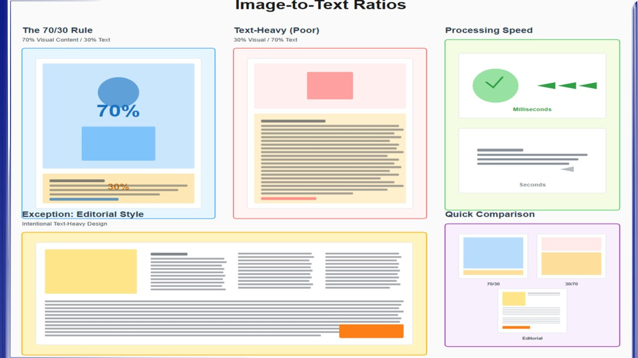
The 70/30 Rule (And Why It’s Just a Starting Point)
The general principle: 70% imagery, 30% text creates effective balance for most advertising contexts.
Why This Ratio Works:
Visual Dominance Captures Attention: Humans process images 60,000× faster than text. The brain dedicates roughly 50% of its processing power to visual information. Large, compelling imagery stops the scroll, captures the glance, demands attention.
Sufficient Text Provides Context: 30% text allocation allows enough space for headline, value proposition, supporting detail, and clear call-to-action. Enough information to convert interest into action.
Psychological Balance: This ratio prevents two extremes: Visual-only ads that confuse (”What is this even advertising?”) and text-heavy ads that overwhelm (”Too much work to read”).
But here’s the critical insight: 70/30 is the starting point for average contexts with average products for average audiences. Your specific situation probably isn’t average.
When to Break the 70/30 Standard
Your optimal ratio depends on five critical factors. Get these wrong and even perfect execution of the wrong ratio wastes money.
Factor #1: Product Complexity
Simple Products (80-90% Visual):
Products that are self-explanatory, visually appealing, and require minimal consideration benefit from image-heavy approaches.
Examples:
Beverages (you can see what it is instantly)
Fashion (the look sells itself)
Food (appetite appeal is primary driver)
Consumer electronics with established category understanding (everyone knows what headphones do)
Why It Works: The product tells its own story visually. Additional text adds little value and might actually dilute impact by distracting from visceral response.
Real Example Coca-Cola: Often runs ads that are 90% imagery: The iconic bottle, condensation, ice, happiness moments. Minimal text because everyone already knows what Coke is and what it delivers. The visual triggers the craving. Text would just get in the way.
Complex Products (40-60% Visual):
Products requiring explanation, trust-building, or feature differentiation need substantial text support.
Examples:
B2B software (requires feature explanations)
Financial services (needs trust signals and detail)
Insurance products (must explain coverage and value)
Healthcare services (requires credibility and specifics)
Technical equipment (specifications matter)
Why It Works: Purchase decisions depend on understanding features, benefits, and differentiation. Beautiful imagery without supporting information leaves critical questions unanswered.
Real Example Enterprise Software: Successful ads typically show 40-50% dashboard/interface imagery, 50-60% text explaining specific problems solved, ROI metrics, integration capabilities, and security features. The image proves it’s real and professional. The text closes the sale.
The Complexity Assessment:
Ask yourself: “If I showed this product image to my target audience with zero text, would they know:
What it is?
What it does?
Why they need it?
How it’s different from alternatives?
What action to take?”
If the answer to any question is “no,” you need more text.
Factor #2: Audience Familiarity
Familiar Audiences (75-85% Visual):
When advertising to existing customers or audiences already familiar with your product category, extensive explanation becomes redundant.
Why Less Text Works: They already understand the basics. They don’t need category education. They’re evaluating specific offers or updates. Visual-heavy approach respects their existing knowledge.
Example iPhone Ads: Apple can run ads that are 85% product imagery with minimal text (”iPhone 15 Pro. Titanium.”) because their audience already knows what an iPhone is, what iOS does, and how the ecosystem works. They’re communicating updates, not explaining smartphones from scratch.
Unfamiliar Audiences (50-70% Visual):
New markets, new products, or innovative solutions require more explanation because you can’t assume any baseline understanding.
Why More Text Is Essential: You’re building context from zero. You must educate before you can persuade. You need to establish category, explain benefits, overcome skepticism, and build enough trust for action.
Example Category Creation: When Uber launched, ads needed substantial text explaining what “ridesharing” meant, how it worked, safety measures, and pricing structure. A car photo with “Get a ride” wouldn’t have converted anyone because the concept was entirely new.
The Familiarity Test:
Survey your target audience: “Have you heard of [product category/solution]?”
80%+ yes = familiar audience, visual-heavy works
50-80% yes = moderate familiarity, balanced approach
Below 50% yes = unfamiliar audience, text-heavy required
Factor #3: Purchase Consideration Level
Low-Consideration Purchases (80-90% Visual):
Impulse buys, low-cost items, and emotional purchases benefit from visual-dominant approaches that trigger immediate response.
Characteristics:
Under $50 price point typically
Quick decision timeline (seconds to minutes)
Emotional rather than rational drivers
Low perceived risk
Examples:
Coffee shop promotion
Fashion accessories
Entertainment (movies, concerts)
Snack foods
Why Minimal Text Works: Overthinking kills impulse purchases. Beautiful imagery triggers desire. Text creates friction by engaging rational mind.
Real Example Starbucks Seasonal Drinks: Photos of pumpkin spice lattes occupy 85-90% of ad space. Minimal text: “Pumpkin Spice Latte. Fall is here.” That’s sufficient because decision requires no consideration either you want it immediately or you don’t.
High-Consideration Purchases (40-60% Visual):
Expensive, complex, or risky purchases require substantial information before buyers commit.
Characteristics:
Significant financial investment ($500+)
Extended decision timeline (days to months)
Rational evaluation of alternatives
High perceived risk
Examples:
Cars
Real estate
B2B services
Medical procedures
Legal services
Financial planning
Why Substantial Text Is Critical: Buyers are actively seeking information to de-risk their decision. They want specifications, comparisons, credibility signals, and detailed explanations. Lack of information doesn’t reduce consideration it just sends them to competitors who provide it.
Real Example Luxury Real Estate: Successful ads typically allocate 45% to property imagery, 55% to detailed information: Square footage, location advantages, architectural details, investment potential, neighborhood characteristics, pricing structure. Buyers want this information. Withholding it signals lack of transparency.
The Consideration Assessment:
Map your purchase decision timeline:
Seconds to minutes = low consideration, visual-heavy
Hours to days = moderate consideration, balanced
Days to months = high consideration, text-heavy
Factor #4: Campaign Objective
Brand Awareness (80-90% Visual):
When the goal is recognition and recall rather than immediate conversion, visual dominance creates memorable brand associations.
Objective: Make people remember you exist and what you stand for.
Why It Works: Strong visual branding imprints on memory. Distinctive imagery creates mental availability. Text becomes secondary to visual identity.
Example Nike Brand Campaigns: Often 90% powerful athlete imagery, 10% “Just Do It” plus logo. Not selling specific shoes building brand association with athletic excellence and determination.
Direct Response (50-70% Visual):
When the goal is immediate action (click, call, buy, sign up), sufficient text to drive that action becomes essential.
Objective: Convert viewer to customer right now.
Why It Works: Direct response requires clear value proposition, urgency signals, risk reduction, and explicit call-to-action. All of these require text support.
Example Software Free Trial Ads: Typically 60% product interface imagery, 40% text: Headline promising specific outcome, bullet points highlighting key features, risk-reduction language (”no credit card required”), and prominent CTA. This text isn’t decoration it’s the conversion engine.
Education/Thought Leadership (30-50% Visual):
When positioning as expert or educating market about complex topics, text necessarily dominates to deliver substantive content.
Objective: Build authority and trust through valuable information.
Why It Works: You cannot establish expertise through imagery alone. Detailed insights, frameworks, and explanations require text. Imagery supports but doesn’t drive.
Example Consulting Firm Thought Leadership: Often 35% infographic or conceptual imagery, 65% substantive text explaining methodology, research findings, or strategic framework. The text is the value the image just makes it scannable.
The Objective Clarity Test:
Before setting your ratio, complete this sentence: “Success for this ad means the viewer will ___________.”
“Remember our brand” = visual-heavy
“Click/buy/sign up now” = balanced
“Understand our expertise” = text-heavy
Factor #5: Platform and Viewing Context
Social Media Feeds (75-85% Visual):
Fast-scrolling environments demand immediate visual impact. Users aren’t in “reading mode” they’re in “scrolling mode.”
Platform Behavior:
Average view time: 1-2 seconds per post
Thumb-stopping required before any text gets read
Mobile-first viewing (smaller screens)
Distraction-heavy environment
Why Visual-Heavy Works: You have a split-second to stop the scroll. Only powerful imagery accomplishes this. Once stopped, minimal text delivers the message before they scroll again.
Example Instagram/Facebook Feed Ads: Best-performing ads typically 80% striking imagery, 20% punchy headline plus CTA. Trying to include more text fights platform behavior rather than working with it.
Search Ads (50-70% Text):
Users are actively seeking information. They’re in problem-solving mode, not entertainment mode.
Platform Behavior:
Intent-driven (they searched for solution)
Comparing alternatives actively
Reading mode engaged
Seeking specific information
Why Text-Heavy Works: They came to find answers. Text-heavy approaches deliver what they’re actively seeking. Too much imagery feels like distraction from information they want.
Example Google Search Ads: Display ads on search network perform best with 60-70% text: Headline addressing search query, clear value proposition, specific features/benefits, strong CTA. Limited imagery supports credibility without distracting from information.
Print Publications (50-60% Visual):
Magazine and newspaper readers are in consumption mode. They expect and tolerate more text than digital environments.
Platform Behavior:
Longer attention spans (already committed to reading)
High-quality reproduction expectations
Often saved and referenced multiple times
Premium context (quality publication signals quality advertiser)
Why Balanced Approach Works: Readers are already in text-consumption mindset. Beautiful imagery captures attention, but substantial copy can be consumed without friction.
Example Magazine Ads: Full-page ads often use 55% dramatic product photography, 45% detailed copy explaining story, features, benefits, and brand heritage. Readers who paused to look at the image will read substantial copy.
Email (60-70% Text):
Email recipients expect information. They opened the email to learn something. Visual-only approaches underdeliver on that expectation.
Platform Behavior:
High intent (they subscribed to hear from you)
Seeking value/information/offers
Often scanning multiple emails quickly
Image blocking common (images may not load)
Why Text-Heavy Works: Even if images don’t load, message must communicate. Text ensures this. Plus, email audiences specifically signed up for information from you give it to them.
Example E-commerce Email Campaigns: Product images occupy 30-40%, but 60-70% is dedicated to compelling copy: Subject line, headline, offer details, product benefits, urgency language, clear CTA. Images support but text drives action.
Billboard/Out-of-Home (90-95% Visual):
Viewing time measured in seconds while viewer is moving. Reading substantial text isn’t physically possible.
Platform Behavior:
3-7 second viewing window (if you’re lucky)
Viewer is driving, walking, or moving
Cannot pause to read
Physical distance from ad
Why Extreme Visual Dominance Required: Seven words maximum is the outdoor advertising rule. Anything more won’t be read. One powerful image plus handful of words is all that’s possible.
Example Billboard Campaigns: Best practice: 95% striking imagery, 5% text (brand name plus 3-5 word message maximum). “Taste the Rainbow” with Skittles imagery. “Just Do It” with athlete. “15 Minutes Could Save You 15%” with logo. That’s it.
The Platform Assessment:
Before designing, answer: “How will people actually encounter this ad?”
Fast scrolling, mobile, distracted = visual-dominant
Active searching, desktop, focused = text-friendly
Moving viewer, distance, seconds = extreme visual
Expected information delivery = text-accommodating
The Strategic Ratio Decision Framework
Use this systematic approach to determine optimal ratio for any specific ad:
Step 1: Score Your Context (Use This Worksheet)
Product Complexity:
Self-explanatory visual product = 0 points
Some explanation helpful = +1 point
Significant explanation required = +2 points
Complex/technical product = +3 points
Audience Familiarity:
Existing customers/established category = 0 points
Moderate market awareness = +1 point
Limited awareness = +2 points
Entirely new concept = +3 points
Purchase Consideration:
Impulse/emotional buy under $50 = 0 points
Low consideration $50-$200 = +1 point
Moderate consideration $200-$1000 = +2 points
High consideration $1000+ = +3 points
Campaign Objective:
Brand awareness/recall = 0 points
Engagement/interest = +1 point
Lead generation = +2 points
Direct sale/conversion = +3 points
Platform Viewing Context:
Fast scroll/outdoor/mobile = 0 points
Social media standard feed = +1 point
Content consumption mode (email/blog) = +2 points
Active search/research mode = +3 points
Step 2: Calculate Your Text-Need Score
Add up your points: _____ (Range: 0-15 points)
Step 3: Apply the Ratio Formula
0-3 points: Visual-Dominant (80-90% image, 10-20% text) Simple product, familiar audience, impulse purchase, awareness goal, fast-scroll platform. Minimal text required.
4-7 points: Visual-Heavy (70-80% image, 20-30% text) Moderate complexity, some familiarity, standard consideration, engagement goal, typical social platform. Classic 70/30 ratio applies.
8-11 points: Balanced (50-70% image, 30-50% text) Complex product, moderate unfamiliarity, careful consideration, conversion goal, content-consumption platform. Substantial text needed.
12-15 points: Text-Heavy (30-50% image, 50-70% text) Highly complex, unfamiliar, expensive, conversion-focused, search/research platform. Text drives decision.
Step 4: Validate Your Ratio Decision
Before committing, verify:
The Glance Test: At your proposed ratio, can viewers grasp core message in 3 seconds? If no, ratio isn’t working.
The Information Sufficiency Test: Does the text allocation provide enough information to drive your intended action? If no, increase text.
The Visual Impact Test: Does imagery allocation create sufficient stopping power? If no, increase imagery.
The Platform Appropriateness Test: Does this ratio match how people use this specific platform? If no, adjust for context.
The Audience Respect Test: Does this ratio respect your audience’s intelligence and information needs? If no, rebalance.
Real-World Ratio Disasters (And How to Avoid Them)
Disaster #1: The Over-Designed Restaurant Menu Ad
The Situation: High-end restaurant running Instagram ads for new seasonal menu. Hired designer created stunning food photography absolutely gorgeous plating, perfect lighting, mouthwatering presentation. 95% imagery, 5% text (”New Menu. Reserve Now.”).
The Problem: High-end dining is high-consideration purchase ($150-300 per couple). Potential diners had questions: What cuisine style? Dietary accommodations? Signature dishes? Price range? Ambiance?
The Disaster Results:
Click-through rate 40% below industry average
Reservation conversion rate near zero
Comments filled with questions: “What kind of food?” “How much?” “What’s special?”
Competitor that showed menu items with descriptions captured the market
The Fix: Redesigned with 60/40 ratio: Beautiful food photography (60%), but added menu highlights, price indicators, cuisine style, and chef credentials (40%). Reservations increased 280%.
The Lesson: Even visually-driven industries need sufficient context when purchase requires consideration. Beautiful imagery without necessary information creates interest but not conversion.
Disaster #2: The Text-Heavy Fashion Brand
The Situation: Emerging fashion brand wanted to position as “thoughtful and sustainable.” Created Instagram ads explaining their supply chain ethics, manufacturing process, environmental impact calculations, and fair labor practices.
Design: 30% product photography, 70% dense text blocks explaining values.
The Problem: Instagram is fast-scroll environment. Fashion is primarily visual-emotional purchase. Their target audience (18-34) wasn’t stopping to read paragraph-length text on social feeds.
The Disaster Results:
Engagement rate 85% below industry average
Zero viral sharing (no one shares text-heavy ads)
Comments: “TLDR” and eye-roll emojis
Budget wasted on ads nobody engaged with
The Fix: Flipped to 85/15 ratio: Stunning lifestyle photography showing the product (85%), minimal text (”Sustainably Made. Shop Now” + sustainability badge). Detailed story told on landing page after click.
Engagement increased 340%. Conversion rate up 180% because interested buyers got full story after clicking, not in the ad itself.
The Lesson: Match your ratio to platform behavior, not your desire to tell your complete story. Social ads capture attention and drive clicks. Landing pages deliver details.
Disaster #3: The Invisible B2B Software
The Situation: B2B SaaS company created LinkedIn ads following “people don’t read” advice. Ads were 90% abstract conceptual imagery (gears, light bulbs, upward arrows), 10% vague headline (”Transform Your Workflow”).
The Problem: Enterprise software is extreme high-consideration purchase ($50k-500k annual contracts). Decision-makers actively seek specific information: What problems does it solve? Integration capabilities? Security certifications? ROI metrics?
The Disaster Results:
Click-through rate 15% (industry average 35-50% for relevant B2B ads)
Zero qualified leads
Sales team: “Clicks from people with no idea what we actually do”
$180,000 ad spend, zero closed deals attributed
The Fix: Redesigned with 40/60 ratio: Clean dashboard screenshots showing actual product (40%), detailed text explaining specific problems solved, key features, and measurable outcomes (60%).
Qualified lead generation increased 450%. Click-through rate jumped to 48%. Sales attributed $2.4M in closed deals to campaign.
The Lesson: B2B buyers are information seekers. Vague imagery and minimal text signals lack of substance. Give them the specifications and proof points they’re actively seeking.
Platform-Specific Ratio Recommendations
Instagram Feed & Stories
Optimal Ratio: 80/20 (image-dominant)
Why:
Average view time: 1.7 seconds per post
Mobile-first (small screens)
Entertainment/inspiration mindset
Visual platform culturally
Text Allocation Strategy:
3-7 word headline maximum
1-2 sentence value proposition
Clear CTA (3-4 words)
Brand name/logo
What Works: Lifestyle imagery, user-generated content, bold product photography, aspirational scenes, memes/humor.
What Fails: Dense text blocks, multiple paragraphs, detailed explanations, small text requiring zoom.
Example Template:
80%: Striking lifestyle photo showing product in context
15%: Punchy headline + CTA button
5%: Logo/brand mark
Facebook Feed
Optimal Ratio: 70/30 (visual-heavy)
Why:
Slightly longer view time than Instagram (2-3 seconds)
Mixed content mindset (social + information)
Older demographic more tolerant of text
Desktop viewing more common
Text Allocation Strategy:
Headline (5-10 words)
Supporting text (1-2 sentences)
Value proposition bullets (3 maximum)
Clear CTA
What Works: Product benefits, social proof, clear offers, before/after imagery, relatable situations.
What Fails: Generic stock photos, text-on-image overkill, cluttered layouts, unclear purpose.
Example Template:
70%: Clear product/benefit visualization
20%: Headline + 2 benefit bullets
10%: CTA button + brand
Optimal Ratio: 50/50 to 60/40 (balanced)
Why:
Professional/information-seeking mindset
Higher tolerance for text
Longer reading attention spans
Desktop viewing dominant
B2B context requires detail
Text Allocation Strategy:
Professional headline (8-12 words)
Problem/solution statement (2-3 sentences)
Key differentiators (3-4 bullets)
Credibility signals (stats, logos)
Clear CTA
What Works: ROI metrics, case study highlights, thought leadership, industry insights, product capabilities.
What Fails: Vague benefits, consumer-style emotional appeals, insufficient detail, lack of credibility signals.
Example Template:
50%: Dashboard screenshot or infographic
40%: Headline + problem statement + key benefits
10%: CTA + credibility badge
Google Display Network
Optimal Ratio: 60/40 (balanced)
Why:
Intent-based viewing (they’re researching)
Competing with content they came to read
Need quick value communication
Multiple sizes/formats required
Text Allocation Strategy:
Clear headline (6-10 words)
Specific value proposition (1 sentence)
Differentiator or offer (1 phrase)
Strong CTA
What Works: Clear product shots, specific offers, problem-solution clarity, brand recognition elements.
What Fails: Busy/cluttered designs, unclear messaging, weak differentiation, vague imagery.
Example Template:
60%: Clean product/solution visualization
30%: Headline + specific offer
10%: CTA button
Email Marketing
Optimal Ratio: 30/70 to 40/60 (text-heavy)
Why:
Subscribers expect information
Images often blocked initially
Message must work text-only
Reading mindset engaged
Direct relationship established
Text Allocation Strategy:
Compelling subject line (critical)
Headline (6-10 words)
Body copy (3-5 short paragraphs)
Bullet points highlighting key info
Multiple CTAs throughout
P.S. for urgency/bonus
What Works: Storytelling, detailed offers, personalization, clear value, multiple CTAs, scannable formatting.
What Fails: Image-dependent messaging, vague value, single CTA only, wall-of-text, no hierarchy.
Example Template:
35%: Hero product image
55%: Headline + story/offer + bullets + urgency
10%: Primary CTA (repeated 2-3 times)
Outdoor/Billboard
Optimal Ratio: 95/5 (extreme visual)
Why:
3-7 second viewing window
Viewer is moving/driving
Physical distance from ad
Cannot pause to read
Seven-word maximum rule
Text Allocation Strategy:
Brand name
Three to seven words maximum total
Large, high-contrast text
Absolutely no small print
What Works: Iconic imagery, bold colors, massive scale, simple memorable message, brand recognition.
What Fails: Any sentence longer than 7 words, phone numbers, websites (except shortest URLs), multiple messages, complex imagery.
Example Template:
95%: Bold, simple, iconic image
5%: Logo + 3-7 word message
The Testing Framework: Finding Your Optimal Ratio
Don’t guess. Test systematically to discover what actually performs for your specific context.
The A/B Testing Protocol
Test Setup:
Create three versions of the same ad:
Version A (Visual-Heavy): 80/20 ratio
Dramatic imagery dominating
Minimal text (headline + CTA)
Emotional/visceral appeal
Version B (Balanced): 60/40 ratio
Strong imagery presence
Moderate text (headline + benefits + CTA)
Emotional + rational appeal
Version C (Text-Heavy): 40/60 ratio
Supporting imagery
Substantial text (headline + detailed benefits + proof + CTA)
Rational/informational appeal
Keep Constant:
Same core message/offer
Same color scheme
Same typography
Same CTA
Only ratio varies
Run Simultaneously:
Same audience targeting
Same time period
Same budget allocation
Same platform placement
Measure These Metrics:
Attention Metrics:
Click-through rate (which ratio captures attention best?)
View-through rate (which holds attention longest?)
Engagement rate (which generates interaction?)
Comprehension Metrics:
Bounce rate after click (did they understand message?)
Time on landing page (confused or engaged?)
Secondary action rate (exploring further?)
Conversion Metrics:
Conversion rate (which drives action?)
Cost per conversion (which is most efficient?)
Quality of conversion (which attracts right audience?)
Analyze Results:
Look for patterns:
Did visual-heavy capture attention but fail to convert?
Did text-heavy convert well but get ignored initially?
Did balanced approach perform best overall?
Did results vary by demographic segment?
Common Findings:
Younger audiences (18-34): Often prefer visual-heavy (75-85%) Older audiences (50+): Often prefer more text (50-65% visual) Mobile viewers: Need visual-heavy (80%+) Desktop viewers: Tolerate more text (60-70% visual) Weekend viewers: More visual-receptive (leisure mindset) Weekday viewers: More text-receptive (task mindset)
Iterate and Refine:
Based on data:
Eliminate worst performer
Create new variation testing winner vs. slight modification
Continue iterating toward optimal ratio
Test seasonally (ratios may shift with context)
The Integration Challenge: Ratio Affects Everything Else
Your image-to-text ratio isn’t isolated decision it cascades through every other design principle.
Ratio Impacts Visual Hierarchy
Visual-Heavy Ratios (80/20):
Hierarchy must work through imagery composition primarily
Text becomes accent, not driver
Image must communicate message independently
Typography serves supporting role
Text-Heavy Ratios (40/60):
Hierarchy must work through text treatment primarily
Typography variations create importance levels
Images support but don’t drive
Text formatting becomes critical
The Integration Point: Your hierarchy strategy must match your ratio. Can’t create text-based hierarchy in 90% visual ad.
Ratio Impacts Color Strategy
Visual-Heavy Ratios:
Color strategy lives primarily in imagery
Text color mainly serves readability
Background color supports image impact
Accent colors highlight CTA only
Text-Heavy Ratios:
Color strategy must work across text blocks
Background color affects text comfort
Multiple text colors create hierarchy
Color contrast critical for scanability
The Integration Point: More text = more color complexity to manage. Visual-heavy is simpler color-wise.
Ratio Impacts Typography Decisions
Visual-Heavy Ratios:
Type must be bold, impactful, large
Fewer type hierarchy levels needed
Display fonts get more latitude
Spacing less critical (less text)
Text-Heavy Ratios:
Type must prioritize readability
Multiple hierarchy levels required
Body text font choice critical
Spacing essential for comfort
The Integration Point: Text allocation determines typography complexity. More text = more nuanced type system required.
Ratio Impacts Grid System
Visual-Heavy Ratios:
Simpler grids work (fewer elements)
Can break grid more freely
Asymmetry easier to execute
White space more flexible
Text-Heavy Ratios:
Complex grids needed (more elements)
Grid discipline more important
Alignment critical for professional look
White space must be systematic
The Integration Point: Text volume demands grid sophistication. Visual-heavy ads can be more compositionally free.
Your Ratio Decision Checklist
Before finalizing any ad’s image-to-text ratio, verify:
Audience Alignment
☐ This ratio matches how my audience actually consumes information ☐ I’ve validated this through research, not assumptions ☐ Age/demographic segments all work with this ratio ☐ Mobile vs. desktop viewing both accommodated
Platform Appropriateness
☐ This ratio matches platform’s typical viewing behavior ☐ Technical requirements met (image file sizes, text limits) ☐ This ratio performs well historically on this platform ☐ Not fighting platform culture and user expectations
Message Completeness
☐ Sufficient information to drive intended action ☐ Critical questions answered adequately ☐ Value proposition clear and compelling ☐ CTA obvious and actionable
Visual Impact
☐ Enough imagery to stop scroll/capture glance ☐ Image quality sufficient for allocated space ☐ Imagery relevant and message-supporting ☐ Visual elements create emotional response
Objective Alignment
☐ Ratio serves campaign objective (awareness vs. conversion) ☐ Information density matches consideration level ☐ Urgency or patience appropriate for ratio ☐ Can measure success with this ratio
Integration Coherence
☐ Ratio works with visual hierarchy strategy ☐ Color strategy appropriate for ratio ☐ Typography system matches text volume ☐ Grid system accommodates ratio ☐ Composition style suits ratio
Competitive Positioning
☐ Aware of category norms for ratio ☐ Intentional about matching or breaking conventions ☐ Differentiation through ratio is strategic, not accidental ☐ Standing out or fitting in is deliberate choice
The Evolution of Your Ratio Mastery
Ratio decisions get more intuitive and accurate with experience:
Stage 1: Formula Dependency (First 10 Ads)
You’re applying formulas mechanically. Everything is 70/30 because that’s the rule. Results are inconsistent because you’re not adapting to context.
Growth Activity: Score every project using the framework. Start noticing patterns in what scores lead to what ratios.
Stage 2: Context Awareness (10-50 Ads)
You’re starting to intuitively adjust ratios based on product, audience, and platform. Still checking yourself against formulas, but getting faster at assessment.
Growth Activity: Before using framework, guess the optimal ratio. Then calculate. See how close your intuition is. Calibrate.
Stage 3: Intuitive Calibration (50-200 Ads)
You immediately know approximate ratio needs. Can articulate why. Rarely need formal assessment. Testing to optimize, not to discover.
Growth Activity: Analyze top-performing competitors’ ratios. Understand why they work in their contexts. Expand your mental models.
Stage 4: Strategic Innovation (200+ Ads)
You use unconventional ratios strategically for differentiation. Can predict how ratio changes will impact performance. Teaching others ratio theory.
Growth Marker: Others ask you to review their ratio decisions. You can diagnose problems instantly.
The Real Cost of Wrong Ratios
Every day you run ads with poorly calibrated image-to-text ratios, you’re:
Wasting Attention You Paid For:
Too much text on visual platforms = scroll-past without engaging (wasted impressions) Too little text for complex products = clicks without conversions (wasted traffic) Wrong ratio for audience = message doesn’t land (wasted creative)
Leaving Money on the Table:
Proper ratio optimization typically improves conversion rates 25-60% A/B testing ratios often reveals 2-3× performance differences Right ratio for context compounds with other optimizations
Damaging Brand Perception:
Text-heavy on Instagram = “They don’t understand this platform” Image-only for complex B2B = “They’re not serious/professional” Wrong ratio signals wrong for audience = “This isn’t for me”
Missing Competitive Advantages:
While you’re guessing, competitors are testing and optimizing Market share shifts to brands matching message to medium effectively Recovery becomes harder the longer you’re off-target
Your Next Campaign: Ratio Implementation
Here’s exactly how to implement ratio strategy in your next project:
Pre-Design Phase (Before Opening Design Software)
Step 1: Complete the Context Assessment
Product complexity score: _____ Audience familiarity score: _____ Purchase consideration score: _____ Campaign objective score: _____ Platform context score: _____ Total score: _____
Step 2: Determine Starting Ratio
Based on total score, my starting ratio is:
___% imagery
___% text
Step 3: List Information Requirements
What must the text communicate?
Core message/value proposition: ___________
Supporting benefits (list 2-3): ___________
Credibility signals needed: ___________
Call-to-action: ___________
Does my text allocation accommodate all of this? If no, adjust ratio.
Step 4: Define Image Strategy
What must the imagery communicate?
Primary visual message: ___________
Emotional tone: ___________
Product/benefit visibility: ___________
Brand personality: ___________
Does my image allocation support this? If no, adjust ratio.
Design Phase (Implementing Your Ratio)
Step 5: Create Layout Foundation
Block out your ratio physically:
Draw rectangle representing ad space
Mark exactly where ratio split happens
Don’t place elements yet just establish proportion
Step 6: Prioritize Within Each Allocation
Within your image space, what’s most important? Within your text space, what’s most critical? Hierarchy works within ratio, not despite it.
Step 7: Integrate Other Principles
Apply visual hierarchy within your ratio constraints Use grid system respecting ratio boundaries Apply color strategy across both image and text zones Select typography appropriate for text volume Create composition flow across ratio split
Step 8: Verify Integration
Does the ratio split feel natural or forced? Do image and text zones work together or fight? Is the ratio boundary obvious or seamless? Could I shift ratio 5-10% and improve integration?
Testing Phase (Validating Your Ratio)
Step 9: Create Ratio Variants
Version A: Your calculated optimal ratio Version B: 10-15% more visual (for comparison) Version C: 10-15% more text (for comparison)
Step 10: Define Success Metrics
Primary metric (conversion/engagement/awareness): ___________ Secondary metrics: ___________ Minimum sample size needed: ___________ Test duration: ___________
Step 11: Run Test and Analyze
Which ratio performed best on primary metric? Were there demographic differences in response? Did one ratio attract wrong audience? What does data tell you about your audience’s preferences?
Step 12: Implement and Iterate
Scale winning ratio across campaign Document learnings for similar future projects Test refinements (5% ratio shifts) to optimize further Build ratio intelligence for your specific audience/product
The Ratio Mistakes Even Experienced Designers Make
Watch for these persistent pitfalls:
Mistake #1: Platform Copy-Paste
Creating one ad and using it across all platforms without ratio adjustment.
Why It Fails: Instagram-optimized 85/15 ratio bombs on LinkedIn. Email-appropriate 30/70 ratio gets ignored on Facebook.
The Fix: Create platform-specific versions respecting each platform’s optimal ratio.
Mistake #2: Aesthetic Override
Making ratio decisions based on what “looks better” rather than what performs better.
Why It Fails: Your aesthetic preference isn’t your audience’s information need.
The Fix: Let testing data override aesthetic opinions. Beauty that doesn’t convert is failed design.
Mistake #3: Competitor Mimicry
Copying competitor ratios without understanding their strategic context.
Why It Fails: Their ratio serves their product, audience, and objective not necessarily yours.
The Fix: Understand the strategic reasoning behind successful ratios, then apply principles to your unique context.
Mistake #4: Set-It-and-Forget-It
Determining ratio once and never testing alternatives.
Why It Fails: Audience preferences evolve. Platform behaviors change. Competitive landscapes shift.
The Fix: Regular quarterly testing of ratio variations. Continuous optimization.
Mistake #5: Ignoring Mobile
Designing for desktop ratios, forgetting 70-80% of viewers see mobile version.
Why It Fails: Text that’s readable at desktop scale becomes illegible on mobile, effectively changing ratio.
The Fix: Design mobile-first. Verify text allocation works at smallest expected viewing size.
Advanced Ratio Strategies
Once you’ve mastered fundamental ratio decisions, explore these sophisticated approaches:
Progressive Ratio Strategy
Use different ratios for different funnel stages:
Top-of-Funnel (Awareness): 80/20 ratio visual-heavy for scroll-stopping Goal: Capture attention, create brand awareness
Middle-of-Funnel (Consideration): 60/40 ratio balanced for education Goal: Provide information, build interest
Bottom-of-Funnel (Conversion): 50/50 ratio information-rich for decision support Goal: Address objections, drive action
Why This Works: Ratio matches viewer readiness. Early stage = less patience for text. Late stage = actively seeking information.
Ratio Sequencing
In video or carousel ads, shift ratios progressively:
Frame 1: 90/10 (pure attention capture) Frame 2: 70/30 (introduce message) Frame 3: 50/50 (provide detail) Frame 4: 60/40 (reinforce and CTA)
Why This Works: Respects attention progression. Hook visually, deliver information once engaged.
Ratio Differentiation
Deliberately use unusual ratio for your category to stand out:
If competitors all use 70/30, test 85/15 or 50/50 for differentiation. Category norms create pattern expectations breaking pattern captures attention.
Caution: Only break norms if you understand why they exist and have strategic reason for deviation.
Ratio Personalization
Use different ratios for different audience segments:
Gen Z Segment: 85/15 (extreme visual preference) Millennial Segment: 70/30 (balanced) Gen X Segment: 60/40 (more text-tolerant) Boomer Segment: 50/50 (information-seeking)
Why This Works: Generational differences in media consumption are real. Respect them.
Ratio Integration with Brand Systems
Your ratio strategy shouldn’t exist in isolation it’s part of your complete brand system:
Create Ratio Guidelines
Document in your brand system:
Primary Ratio (Most Common Use): 70/30 Use for: Social media, display ads, standard campaigns
Secondary Ratio (High-Information): 50/50 Use for: B2B, complex products, email marketing
Tertiary Ratio (Pure Awareness): 85/15 Use for: Brand campaigns, outdoor, social stories
Never Use: Below 40/60 or above 90/10 Rationale: Outside these ranges, we lose either impact or information
Ratio Flexibility Zones
Define when ratio can flex:
Fixed Ratio Contexts: Outdoor, short-form video, stories (viewing constraints demand consistency)
Flexible Ratio Contexts: Email, landing pages, print (can adapt to content needs)
Testing Zones: Digital display, social feed (can A/B test variations)
Ratio + Layout Systems
Create templates for your standard ratios:
70/30 Template A: Hero image left, text block right 70/30 Template B: Full-bleed image, text overlay bottom 70/30 Template C: Image top, text below 50/50 Template A: Split screen, image left, text right 50/50 Template B: Text-wrapped around product image
Having pre-designed ratio layouts speeds execution while maintaining consistency.
The Complete Picture: Ratio as System Component
Image-to-text ratio isn’t isolated technique it’s integral part of your complete design system:
Ratio Serves Hierarchy: Your most important message must get adequate space (whether image or text)
Ratio Enables Grid: Your grid system must accommodate your typical ratios without constant fighting
Ratio Influences Color: More text = more complex color management across text zones
Ratio Dictates Typography: Text volume determines how sophisticated your type system must be
Ratio Affects Composition: Visual flow must work across ratio boundaries smoothly
Ratio Guides Mathematical Proportions: Golden ratio can define major ratio split (62/38 instead of 60/40)
When all principles integrate systematically, ratio becomes natural result rather than arbitrary decision.
Your Ratio Mastery Journey
You’ve now mastered the seventh essential principle of effective ad design. You understand:
The Strategic Foundation:
Why 70/30 is starting point, not universal rule
Five critical factors determining optimal ratio
How to calculate ratio needs systematically
Platform-specific ratio requirements
The Practical Application:
Systematic assessment framework
Testing protocols for validation
Platform-specific best practices
Real-world implementation steps
The Integration Understanding:
How ratio impacts all other design principles
Why ratio decisions cascade through entire design
How to maintain ratio consistency across campaigns
When and how to break ratio conventions strategically
The Professional Approach:
Common mistakes and how to avoid them
Advanced strategies for optimization
Brand system integration
Continuous improvement methodology
What’s Next: Putting It All Together
You’ve now learned seven core principles:
Visual Hierarchy (Part 1)
Mathematical Ratios (Part 2)
Grid Systems & Spacing (Part 3)
Color Theory (Part 4)
Typography (Part 5)
Composition Techniques (Part 6)
Image-to-Text Ratios (Part 7)
Each principle is powerful individually. But true design mastery comes from understanding how they integrate systematically how each principle serves and reinforces the others to create advertising that captures attention, communicates clearly, and converts consistently.
In Part 8, we’ll explore exactly that: Putting It All Together. You’ll learn the systematic approach that transforms isolated principle knowledge into integrated design excellence.
Because knowing seven principles doesn’t automatically mean knowing how to apply all seven simultaneously without creating contradictory chaos.
Integration is where good designers become great. It’s where technical knowledge becomes strategic advantage. It’s where your advertising effectiveness multiplies rather than merely adds up.
Why The Complete Ad Design Guidebook?
The Complete Ad Design Guidebook: Mastering Visual Principles for Maximum Impact

Picture two advertisements side by side. The first is cluttered with information, competing colors, multiple fonts, and no clear focal point. Your eyes dart around the page, unsure where to land, and within seconds you’ve moved on without absorbing the message. The second ad features a striking product image positioned deliberately off-center, complemen…
Image-to-text ratio is one principle among many. But when integrated with visual hierarchy, mathematical proportions, grid systems, color strategy, typography, and composition each reinforcing the others systematically the compounding effect transforms advertising performance.
The Complete Ad Design Guidebook provides the full integrated system. Every principle. Every interaction. Every strategic decision. The complete methodology for creating ads that don’t just look professional they perform consistently.
You could piece together this knowledge from dozens of sources over months or years, making expensive mistakes while learning through trial and error.
Or you could get the complete, integrated system in one comprehensive resource and start implementing the full framework in your next campaign.
What The Complete Guidebook Delivers:
Comprehensive Coverage: All nine parts from foundational principles through advanced rule-breaking strategies.
Systematic Integration: How principles work together, not just in isolation. The interactions that create compounding improvements.
Practical Application: Actionable frameworks, decision tools, checklists, and templates for immediate implementation.
Strategic Guidance: When to follow conventions, when to break them, and how to make those decisions confidently.
Real-World Validation: Principles tested across thousands of campaigns and millions in ad spend, not untested theories.
Professional Standards: The systematic approach top agencies use to consistently create advertising that performs.
Ongoing Reference: Resource you’ll return to for every campaign, discovering new insights with each reading as your skill develops.
The difference between knowing individual principles and mastering their systematic integration is the difference between inconsistent results and reliable excellence.
You now understand image-to-text ratios. In Part 8, you’ll learn how this principle integrates with all the others to create the complete system for advertising design excellence.