
Grid Systems & Spacing In Ad Design
When Perfect Alignment Saved $890,000

A luxury hotel chain spent $890,000 on a digital advertising campaign. The creative was beautiful stunning photography, compelling copy, attractive offers. But the ads felt chaotic. Elements floated randomly. Spacing was inconsistent. Some headlines aligned left, others centered, others right with no pattern. Text blocks had different margins. Buttons were different sizes in different positions.
The brand perception surveys came back devastating: “Unprofessional.” “Looks like a budget hotel.” “Can’t trust them with a luxury experience if they can’t even align their ads properly.” Conversion rates were 60% below projection. The visual chaos signaled operational chaos. Potential guests unconsciously questioned whether a brand that couldn’t maintain consistent spacing could maintain consistent service standards.
They redesigned the entire campaign using a systematic 12-column grid with 8-point spacing system. Same photography. Same copy. Same offers. Different structure. Every element aligned to invisible grid lines. Every space between elements used multiples of 8 pixels. The visual consistency signaled professionalism and attention to detail. Conversion rates jumped 340%. Same budget, same media placements, systematic structure.
This is the difference between randomly placing elements where they “feel good” and using mathematical systems to create professional polish that builds trust unconsciously.
Today we’re exploring Part 3 of The Complete Ad Design Guidebook: Grid Systems & Spacing understanding not just making things line up, but using systematic structure to create professional credibility, guide attention efficiently, and maximize comprehension.
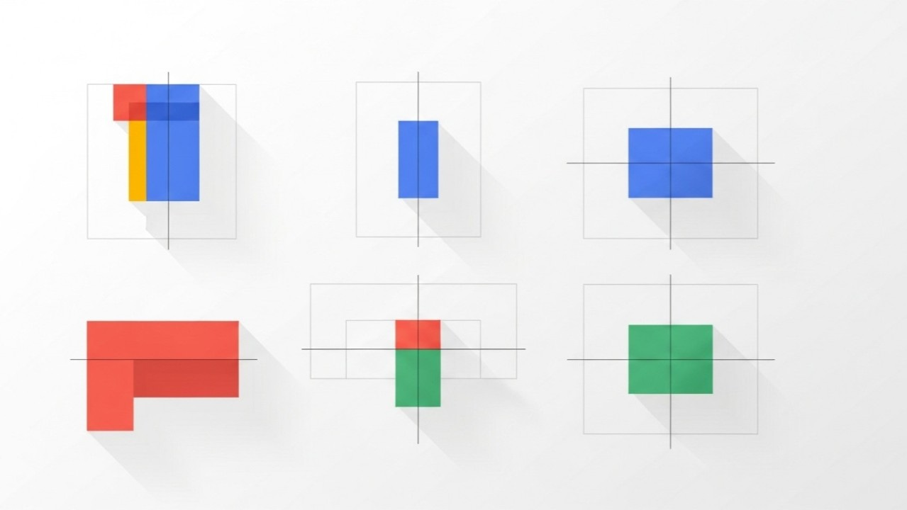
Section 1: Why Grids Matter (And Why Designers Resist Them)
Grids feel restrictive to designers who value creative freedom, but this perspective fundamentally misunderstands their purpose. Grids don’t constrain creativity they channel it. Without systematic structure, you face infinite placement options for every element, leading to decision paralysis and inconsistency. With grid systems, you eliminate 95% of arbitrary decisions, freeing mental energy for the choices that actually impact effectiveness. Grids are liberation through constraint, not restriction through rules.
The psychological reality is that humans unconsciously detect alignment and consistency. When elements align to invisible grid lines, viewers perceive professionalism, attention to detail, and trustworthiness even though they can’t articulate why. When elements float randomly with inconsistent spacing, viewers perceive carelessness, lack of quality control, and unreliability. This perception happens in milliseconds, before conscious processing begins. Poor grid discipline undermines your message before viewers even read your headline. The visual chaos signals that this brand doesn’t have its act together, which makes viewers less likely to trust the product or offer.
Grids serve three critical functions in advertising. First, they create alignment ensuring elements relate to each other in organized ways rather than appearing scattered. Second, they establish rhythm creating consistent spacing that guides eyes smoothly through content. Third, they enable consistency allowing you to maintain professional standards across multiple ads, platforms, and formats. Without grids, every ad becomes a custom challenge requiring hundreds of spacing and alignment decisions. With grids, you establish a system once and apply it consistently, dramatically reducing production time while increasing quality.
The resistance to grids typically comes from misunderstanding what grids allow versus what they prevent. Grids don’t require boring symmetrical layouts they enable asymmetric designs with mathematical precision. Grids don’t demand that every element touch grid lines they provide structure for deliberate placement while allowing strategic violations. Grids don’t eliminate creativity they provide scaffolding that lets creativity focus on message and emotion rather than getting lost in arbitrary spacing decisions. The most creative, innovative advertising designs typically use sophisticated grid systems, not random placement.
Understanding grids as professional infrastructure rather than creative limitation fundamentally changes how you approach design. You stop asking “where should I put this element?” and start asking “which grid position serves this element’s purpose in the hierarchy?” You stop making hundreds of micro-spacing decisions and start applying systematic spacing rules. You stop recreating alignment from scratch for every ad and start working within established structure. This shift from arbitrary decision-making to systematic application is what separates amateur work (inconsistent, time-consuming, unreliable) from professional work (consistent, efficient, trustworthy).
Why Grids Create Professional Perception:
Unconscious Alignment Detection: Human visual system detects misalignment within 0.5 degrees poor alignment signals carelessness
Consistency Signals Quality: Systematic spacing across elements signals attention to detail and quality control
Rhythm Guides Attention: Consistent spacing creates predictable rhythm that reduces cognitive load
Professionalism Through Structure: Organized layouts signal organized operations viewers trust structured brands
Efficiency Through System: Grids reduce decision-making by 80%+, freeing mental energy for strategic choices
Common Grid Misconceptions:
✗ “Grids make everything look the same”: Grids provide structure; creativity happens within structure ✗ “Grids are too restrictive”: Grids eliminate arbitrary decisions, not creative decisions ✗ “Grids are only for print”: Digital design needs grids even more due to responsive requirements ✗ “Grids prevent innovation”: Most innovative designs use sophisticated grids, not random placement ✗ “Grids take too much time”: Initial setup takes time; execution becomes 3-5× faster with grid system
Section 2: Grid System Types and When to Use Each
Column-based grids are the foundation of most advertising design, dividing the canvas into vertical columns with consistent gutters (spaces between columns). The number of columns determines flexibility: 6-column grids provide simple structure suitable for straightforward layouts, 12-column grids offer maximum flexibility for complex compositions, and 4-column grids work for simple mobile-first designs. Column grids excel for text-heavy content, multi-element layouts, and responsive designs that need to adapt across screen sizes. They provide clear zones for content placement while maintaining consistent vertical rhythm.
The strategic selection of column count depends on your design complexity and responsive requirements. A 12-column grid is versatile because elements can span 12 (full width), 6 (half), 4 (third), 3 (quarter), or any other divisible combination, enabling countless layout variations within consistent structure. A 6-column grid is simpler but less flexible elements can span 6, 3, or 2 columns easily but odd divisions become awkward. For mobile-first advertising where you’re primarily designing for narrow viewports, 4-column grids often provide sufficient structure without unnecessary complexity.
Modular grids combine columns and rows to create a matrix of consistent rectangular units. Each module provides a placement area with defined proportions. Modular grids are ideal for content-heavy layouts requiring organization of multiple element types product grids for e-commerce, editorial layouts for content-heavy ads, dashboards for data visualization. The systematic module structure creates clear zones while enabling creative arrangements within the system. Modular grids require more upfront planning but provide superior organization for complex content.
Baseline grids establish horizontal lines creating consistent vertical rhythm for text. Every line of text aligns to baseline grid increments, ensuring consistent spacing regardless of font size variations. Baseline grids are essential for typography-heavy designs, editorial-style advertising, and maintaining vertical rhythm across multiple text elements. The baseline grid typically uses your body text line-height as the base increment if body copy has 24px line height, baseline grid uses 24px increments. Headlines, subheads, and other elements align to these baselines, creating harmonious vertical spacing.
Hierarchical or manuscript grids provide simpler structure than column grids, typically defining just margins and a few key alignment points. These grids work for minimalist designs with few elements, single-focal-point advertising, and layouts prioritizing flexibility over structure. While less systematic than column or modular grids, hierarchical grids still provide essential alignment and consistency while allowing maximum creative freedom. They’re appropriate when you have strong enough design judgment to make good decisions within looser structure, but risky for teams requiring more prescriptive systems.
Grid System Selection Framework:
Column-Based Grids:
Best For: Text-heavy content, multi-element layouts, responsive design, standard advertising formats
Column Options: 4 columns (simple mobile), 6 columns (moderate complexity), 12 columns (maximum flexibility)
Advantages: Clear vertical structure, easy responsive adaptation, familiar to most designers
Limitations: Can feel rigid without creative application, requires discipline to use effectively
Modular Grids:
Best For: Complex layouts, e-commerce product grids, editorial content, data visualization
Structure: Rows + columns creating rectangular modules for element placement
Advantages: Organizes complex content clearly, enables creative arrangements within system
Limitations: Requires more upfront planning, can feel restrictive if modules too small/numerous
Baseline Grids:
Best For: Typography-heavy designs, editorial advertising, maintaining vertical rhythm
Structure: Horizontal lines at consistent intervals (typically body text line-height)
Advantages: Creates harmonious vertical spacing, ensures text alignment across elements
Limitations: Requires mathematical line-height calculations, can conflict with image dimensions
Hierarchical/Manuscript Grids:
Best For: Minimalist designs, single-focal-point ads, maximum flexibility needs
Structure: Margins and key alignment points without systematic column structure
Advantages: Maximum creative freedom, works for unconventional layouts
Limitations: Requires strong design judgment, less consistency across multiple ads
Selection Decision Tree:
Need to organize complex multi-element layout? → Modular grid (rows + columns)
Need responsive design adapting across devices? → Column-based (12 columns standard)
Need to maintain vertical text rhythm? → Baseline grid (body line-height increments)
Need simple mobile-optimized structure? → 4-column grid (mobile-first approach)
Need maximum layout flexibility? → Hierarchical grid (margins + alignment points)
Need standard versatile system? → 12-column grid with baseline overlay (most common)
Section 3: The 8-Point Grid System for Spacing
The 8-point grid system establishes that all spacing, margins, padding, and element dimensions use multiples of 8 pixels (or points in print). Instead of arbitrary spacing like 13px here, 19px there, 27px elsewhere, you use only 8, 16, 24, 32, 40, 48, 56, 64, etc. This mathematical constraint creates visual rhythm, speeds decision-making, and ensures consistency. The 8-point system works because 8 is divisible by 2 and 4, enabling half and quarter divisions (4px and 2px) when needed for fine adjustments while maintaining systematic structure.
The psychological benefit of systematic spacing is that consistent intervals create rhythm and predictability that reduces cognitive load. When spacing follows a pattern, viewers unconsciously perceive order and professionalism. Random spacing creates visual noise requiring extra mental processing to understand relationships between elements. The 8-point system is particularly effective because the increments are large enough to be visibly distinct (8px differences are clearly noticeable) while small enough to provide flexibility for most design needs. Smaller systems (4-point) require too many decisions; larger systems (16-point) lack nuance.
Implementation means applying 8-point increments systematically across all spacing decisions. Margins around the ad canvas use 8-point multiples typically 32-48px for digital ads, creating breathing room without wasting space. Padding within elements (buttons, cards, containers) uses 8-point multiples buttons might have 12px vertical and 24px horizontal padding. Spacing between elements (paragraphs, sections, groups) uses 8-point multiples 16px between related items, 32px between sections, 48px between major content blocks. Element dimensions follow 8-point multiples when possible button heights of 40px or 48px, icon sizes of 24px or 32px.
The responsive adaptation of 8-point systems acknowledges that strict adherence becomes impractical across all screen sizes. The pragmatic approach uses 8-point increments as default but allows exceptions when mathematical precision creates worse outcomes than slight deviations. For example, if your grid column width calculates to 94px, using 96px (next 8-point multiple) might work better than forcing 94px. The principle is systematic spacing, not dogmatic adherence. Use 8-point increments for 90%+ of spacing decisions, allowing tactical exceptions when necessary for functionality.
Testing reveals that 8-point spacing systems dramatically reduce design time while improving consistency. Designers report 30-50% faster execution because spacing decisions become automatic “this needs separation, so 32px” rather than “should this be 28px or 34px or 30px?” Teams report better cross-designer consistency because systematic rules eliminate subjective spacing preferences. QA processes become faster because spacing errors are obvious any value not divisible by 8 is immediately suspect. The initial discipline required to implement 8-point systems pays dividends through faster, more consistent execution.
8-Point Grid Implementation:
Base Spacing Scale (8px increments):
4px: Micro-spacing, fine adjustments only (exception to 8-point rule)
8px: Minimum spacing, tight relationships between closely-related items
16px: Standard spacing for related elements, paragraph spacing, list item gaps
24px: Moderate spacing for loosely-related elements, comfortable separation
32px: Section spacing, separation between distinct content groups
40px: Major section spacing, breathing room between primary containers
48px: Large section breaks, hero-to-content transitions
64px: Maximum standard spacing, major content block separation
80px+: Extra-large spacing for dramatic separation (special cases)
Common Spacing Applications:
Margins (Canvas Edge to Content):
Mobile: 16-24px (tight space constraints)
Tablet: 24-32px (moderate breathing room)
Desktop: 32-48px (generous margins for professional polish)
Print: 0.5-1 inch (36-72pt) depending on format size
Padding (Within Elements):
Buttons: 12-16px vertical, 24-32px horizontal (comfortable click target)
Cards/Containers: 16-24px all sides (content breathing room)
Input Fields: 12-16px vertical, 16-24px horizontal (text comfort)
Headers: 16-24px vertical, 24-32px horizontal (prominence without waste)
Element Spacing (Between Items):
Paragraph Spacing: 16-24px (comfortable reading rhythm)
Related Items: 16px (grouped elements like list items)
Section Transitions: 32-48px (distinct content areas)
Major Blocks: 48-64px (primary content separations)
Element Dimensions (Following 8-Point):
Button Heights: 40px (compact), 48px (standard), 56px (prominent)
Icon Sizes: 16px (small), 24px (standard), 32px (large), 48px (hero)
Input Heights: 40px (compact forms), 48px (standard), 56px (prominent)
Container Heights: Use 8-point multiples when possible (320px, 480px, 640px)
Implementation Rules:
✓ Default to 8-Point: Use 8, 16, 24, 32, 40, 48, 56, 64, 72, 80 for 90%+ of spacing decisions ✓ Allow 4px Exception: Use 4px and 12px for fine-tuning when 8px increments too coarse ✓ Systematic Application: Apply same spacing values to same relationships consistently ✓ Document System: Create spacing reference showing exact values for each spacing type ✗ Don’t Use Random Values: Avoid arbitrary spacing like 13px, 19px, 27px, 35px ✗ Don’t Overthink: When uncertain between two 8-point values, test both and choose better
Section 4: Safe Zones, Bleed, and Technical Requirements
Safe zones define areas where critical content must remain to avoid cropping across platforms, devices, and printing processes. Different platforms crop ads differently Facebook’s mobile feed crops differently than desktop, Instagram Stories crops differently than Feed, print bleeds crop at trim lines. Critical content (headlines, CTAs, logos, faces) placed outside safe zones risks getting cropped partially or entirely, rendering ads ineffective. Understanding and respecting safe zones is the difference between professional execution that works reliably and amateur execution that breaks unpredictably.
The standard safe zone rule for digital advertising is keeping critical content at least 5-10% away from all edges. For a 1200×630px Facebook ad, this means a safe zone of approximately 60-120px from each edge. This buffer accommodates platform cropping variations, device aspect ratio differences, and unpredictable display contexts. Less critical elements (background imagery, decorative elements, color fields) can extend to edges or beyond, but text, faces, logos, and CTAs must stay within safe zones. The conservative approach uses larger safe zones (10%+) for maximum reliability; the aggressive approach uses smaller safe zones (5%) for maximum space utilization with calculated risk.
Print advertising requires understanding bleed the area beyond trim lines where imagery extends to ensure no white borders after cutting. Standard print bleed is 0.125 inch (9pt) beyond trim on all sides. If designing an 8×10 inch print ad, your canvas should be 8.25×10.25 inches with imagery extending to all edges but critical content staying at least 0.25-0.5 inch inside trim lines. The bleed area is always cut off but prevents alignment errors during trimming from creating visible white edges. Many print designers create two safety zones: bleed zone (0-0.125 inch from trim, imagery only), danger zone (0.125-0.25 inch from trim, avoid critical content), safe zone (0.25+ inch from trim, all critical content).
Platform-specific technical requirements vary dramatically and must be researched for each placement. Instagram Feed supports 1:1 square or 4:5 portrait with specific dimension requirements. Instagram Stories requires 9:16 vertical with safe zones accounting for interface elements (profile icons, swipe-up affordances). Facebook Feed supports multiple aspect ratios but previews crops to 1.91:1. Google Display Network requires responsive ads working across 15+ aspect ratios. YouTube pre-roll ads must account for skip button placement. Outdoor advertising has viewing-distance requirements affecting minimum text sizes. Email requires accommodating image-blocking where text must work without imagery loading.
Testing across actual platforms and devices reveals cropping issues invisible in design software. Export ads at final dimensions and view them in actual contexts upload test ads to platform ad managers and preview how they appear, view on actual mobile devices at various orientations, print proofs at actual size and inspect trim alignment, test email clients with and without images loading. The discipline of testing in real contexts catches issues before spending budget. The shortcut of assuming design software preview matches reality causes expensive mistakes when ads deploy cropped, illegible, or broken.
Safe Zone Standards by Platform:
Social Media Platforms:
Facebook Feed:
Recommended Size: 1200×630px (1.91:1 ratio)
Safe Zone: 60-120px from all edges (5-10%)
Critical Note: Mobile crops tighter than desktop test both
Text Overlay: Keep under 20% of image area (old rule, now suggestion)
Instagram Feed:
Recommended Size: 1080×1080px (1:1 square) or 1080×1350px (4:5 portrait)
Safe Zone: 54-108px from edges for square, more for portrait
Critical Note: Preview in actual app interface elements overlap edges
Instagram Stories:
Required Size: 1080×1920px (9:16 vertical)
Safe Zone: Top 250px (profile area), Bottom 250px (swipe-up area), 100px side margins
Critical Note: Safe zone is approximately 30% of canvas design for narrow center zone
LinkedIn:
Recommended Size: 1200×627px (sponsored content)
Safe Zone: 60-120px from edges
Critical Note: Professional audience expects clean, uncropped presentation
Google Display Network:
Required: Responsive ads working across 15+ aspect ratios
Safe Zone: 15-20% from all edges (extreme cropping variations)
Critical Note: Preview all possible crops square, vertical, horizontal, banner
Print Advertising:
Standard Print Bleed:
Bleed Extension: 0.125 inch (3mm, 9pt) beyond trim on all sides
Safe Zone: 0.25-0.5 inch (18-36pt) inside trim for critical content
Danger Zone: 0.125-0.25 inch from trim (avoid text, logos, faces)
Magazine Full-Page:
Trim Size: Varies by publication (8×10.75” common)
Live Area: 0.5 inch inside trim (7×9.75” for 8×10.75” trim)
Bleed Size: 8.25×11” with 0.125” bleed
Outdoor/Billboard:
Safe Zone: Minimum 10% from edges (often 15-20% for visibility)
Critical Note: Viewing distance determines minimum element sizes
Live Area: Varies by location and mounting research specific placement
Email Marketing:
Max Width: 600-650px (wider often causes horizontal scroll)
Safe Zone: 20-30px margins all sides
Critical Note: Images often blocked text must work without images
Mobile Preview: Test at 320-375px width (most common mobile sizes)
Safe Zone Workflow:
Research platform requirements before designing (dimensions, aspect ratios, safe zones)
Create guides in design software showing safe zones visibly during design
Place critical content (headlines, CTAs, logos, faces) within safe zones only
Extend backgrounds/imagery to edges or bleed area for seamless appearance
Export at exact required dimensions (no assuming platforms will resize correctly)
Test in actual contexts (upload to platform, view on devices, print proofs)
Document issues for future campaigns (which platforms crop unexpectedly, etc.)
Section 5: Responsive Grids and Cross-Platform Consistency
Responsive grids adapt systematically across device sizes rather than requiring custom layouts for each breakpoint. The modern approach uses fluid column widths defined as percentages rather than fixed pixels, allowing grids to scale continuously across viewport sizes. A 12-column grid might define column widths as 8.33% of container width, making columns automatically resize as viewport changes. This fluid approach requires fewer breakpoints (typically 3-4: mobile, tablet, desktop, large desktop) because the grid adapts continuously rather than snapping to fixed dimensions at specific breakpoints.
Breakpoint selection should reflect actual device usage in your audience, not arbitrary standard breakpoints. Analyze your analytics to determine actual viewport sizes your visitors use if 40% use 375×667 (iPhone SE), 30% use 414×896 (iPhone 11/12/13), and 20% use 390×844 (iPhone 14/15), your breakpoints should accommodate these specific sizes rather than theoretical standards. The common breakpoints are 320px (small mobile), 375px (standard mobile), 768px (tablet), 1024px (small desktop), 1440px (large desktop), but your audience might require different thresholds.
Column reduction strategy determines how 12-column desktop grids adapt to narrower mobile viewports. The typical approach reduces columns at each breakpoint: 12 columns on desktop (1200px+), 8 columns on tablet (768-1199px), 4 columns on mobile (375-767px), 2 columns on small mobile (320-374px). Elements spanning multiple columns on desktop stack or reflow on mobile a 4-column element on 12-column desktop grid becomes full-width on 4-column mobile grid. This stacking behavior must be designed intentionally rather than hoping it works automatically.
Consistency across platforms requires systematic documentation of grid systems, spacing rules, and adaptation behaviors. Create detailed grid specifications showing column counts, gutter widths, margins, and spacing values for each breakpoint. Document how specific elements should behave at each breakpoint does this sidebar stack below content on mobile or disappear entirely? Do these three columns become single column or remain side-by-side? Systematic documentation prevents inconsistent implementations and enables faster execution across team members.
Testing responsive behavior requires viewing designs at actual sizes on actual devices, not just resizing browser windows. Browsers at 375px width don’t perfectly simulate actual mobile devices touch targets feel different, font rendering differs, pixel density affects sharpness. The disciplined testing process uses device emulators for quick checks during design, actual devices for final validation before launch, and analytics-informed breakpoint selection based on real audience data. The shortcut of browser-resize testing misses critical real-world issues causing poor mobile experience and reduced conversion.
Responsive Grid Framework:
Breakpoint Standards (Adjust Based on Your Analytics):
Small Mobile (320-374px):
Columns: 2 or 4 columns
Margins: 16-24px sides
Gutters: 16px between columns
Behavior: Most elements stack full-width, minimal side-by-side layouts
Mobile (375-767px):
Columns: 4 or 6 columns
Margins: 16-24px sides
Gutters: 16-24px between columns
Behavior: Primary content full-width, occasional 2-column layouts for smaller elements
Tablet (768-1023px):
Columns: 8 columns
Margins: 24-32px sides
Gutters: 24px between columns
Behavior: Mix of stacked and side-by-side, 2-3 column layouts common
Desktop (1024-1439px):
Columns: 12 columns
Margins: 32-48px sides
Gutters: 24-32px between columns
Behavior: Full grid utilization, multi-column complex layouts
Large Desktop (1440px+):
Columns: 12 columns (content max-width often constrained)
Margins: 48-64px sides or centered container
Gutters: 32px between columns
Behavior: Content container max-width prevents excessive line lengths
Element Behavior Rules:
Text Content:
Desktop: 6-8 columns for optimal readability (50-75 characters per line)
Tablet: 6-8 columns, occasionally full-width for headlines
Mobile: Full-width (4 columns), optimal line length happens naturally in narrow viewport
Images:
Desktop: Variable hero images 8-12 columns, supporting images 4-6 columns
Tablet: Larger images 6-8 columns, smaller images 4 columns or stacked
Mobile: Full-width (4 columns) typically, except small icons/thumbnails
Buttons/CTAs:
Desktop: Fixed width (160-240px typical), left or center aligned
Tablet: Fixed or flexible width based on context
Mobile: Often full-width (minus margins) for easy thumb tapping
Multi-Item Layouts (Products, Cards, etc.):
Desktop: 3-4 items per row (3-4 columns each on 12-column grid)
Tablet: 2-3 items per row (4 columns each on 8-column grid)
Mobile: 1-2 items per row (2-4 columns each on 4-column grid)
Testing Checklist for Responsive Grids:
☐ Analytics Review: Actual viewport sizes your audience uses (Google Analytics demographics) ☐ Breakpoint Validation: Chosen breakpoints accommodate 90%+ of actual user viewports ☐ Column Reduction Logic: Clear rules for how elements reflow at each breakpoint ☐ Touch Target Sizing: All interactive elements meet 44×44px minimum on mobile ☐ Text Readability: Line lengths remain 50-75 characters across breakpoints ☐ Image Optimization: Images load appropriate sizes for viewport (not desktop images scaled down) ☐ Spacing Consistency: 8-point spacing system maintained across breakpoints ☐ Safe Zone Verification: Critical content remains visible at all breakpoints ☐ Device Testing: Viewed on actual iPhone, Android, tablet, not just browser resize ☐ Performance Validation: Page loads quickly on 3G connection (mobile reality check)
Cross-Platform Consistency System:
Document These Specifications:
Grid Structure: Column counts, gutter widths, margins for each breakpoint
Spacing Values: All standard spacing using 8-point system
Typography Scale: Font sizes, line heights, weights for each breakpoint
Element Behaviors: How each component adapts across breakpoints
Safe Zones: Platform-specific safe zones for each ad placement
Color System: Exact values ensuring consistency across devices
Component Library: Reusable elements (buttons, cards, forms) with responsive behavior defined
Implementation Process:
Design mobile-first: Start with smallest viewport, expand to larger (easier than reverse)
Establish grid system: Define columns, gutters, margins systematically
Apply 8-point spacing: Use systematic spacing at all breakpoints
Test continuously: View on actual devices throughout design process
Document patterns: Capture reusable responsive behaviors for future campaigns
Measure and optimize: Track performance across devices, optimize weak points
Why The Complete Ad Design Guidebook?
The Complete Ad Design Guidebook: Mastering Visual Principles for Maximum Impact

Picture two advertisements side by side. The first is cluttered with information, competing colors, multiple fonts, and no clear focal point. Your eyes dart around the page, unsure where to land, and within seconds you’ve moved on without absorbing the message. The second ad features a striking product image positioned deliberately off-center, complemen…
Grid systems and spacing are powerful, but grids combined with visual hierarchy, mathematical ratios, color strategy, typography, composition techniques, and image-to-text ratios each principle reinforcing the others systematically creates compounding effectiveness that transforms advertising performance. The Complete Ad Design Guidebook provides the full integrated system. Every principle. Every interaction. Every strategic decision. The complete methodology for creating ads that look professional, communicate clearly, and convert consistently.
You could spend months piecing together grid knowledge from scattered sources, making expensive mistakes while learning which systems work in which contexts and which spacing rules optimize for credibility. Or you could get the complete, battle-tested system in one comprehensive resource and start implementing proven grid strategies in your next campaign.
The difference between randomly placing elements where they “feel right” and implementing systematic grid structures is the difference between amateur chaos and professional polish. Grids create unconscious trust through alignment, systematic spacing creates rhythm that guides attention, and technical precision prevents cropping disasters. You now understand grid systems and spacing. In Part 4, you’ll master color theory for advertising ensuring your systematic structure frames colors that capture attention and drive emotion strategically.